Where Taupe Porcelain Tile Works Best
That range of applications reflects how well taupe porcelain tile adapts across spaces with different demands on moisture resistance, surface texture, and design tone.
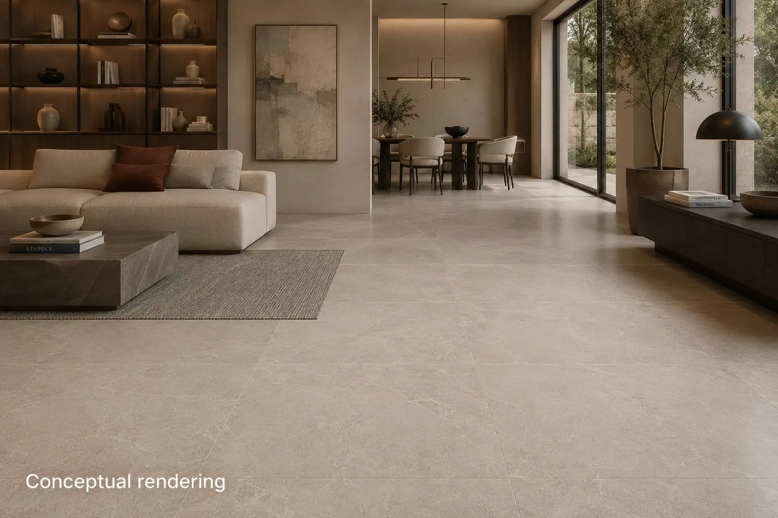
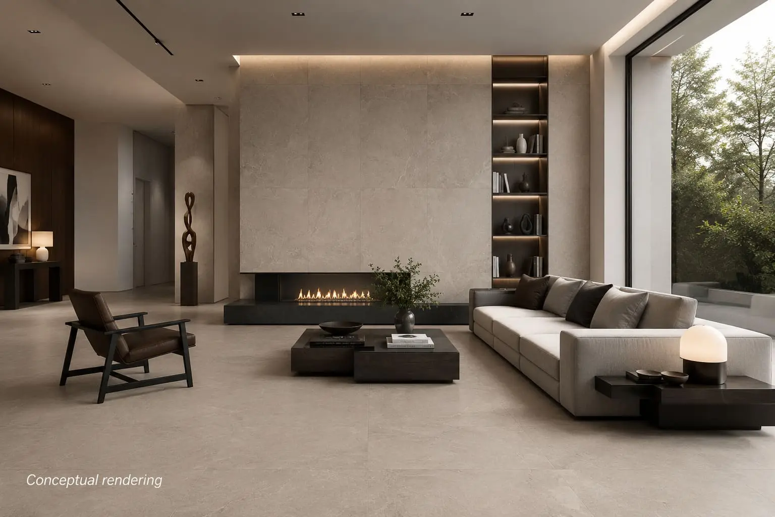
On living room and hallway floors, taupe porcelain tile creates a cohesive, grounded foundation that suits a range of furniture styles. Large-format sizes visually expand the room, reduce grout lines, and give open-plan spaces a sense of continuity. The warm gray-brown tone adds depth without overpowering other design elements, keeping the overall palette calm and inviting.
In the kitchen, taupe porcelain tile works on both floors and backsplash walls. It complements white, gray, and natural wood cabinetry without competing for visual attention, and its stain and moisture resistance makes it practical where spills are common.
On bathroom floors and shower walls, taupe porcelain tile creates a calm, spa-like atmosphere. Matte or lightly textured finishes provide the traction wet floor zones require, and finish selection matters here since ANSI A326.3 sets a minimum wet DCOF of 0.42 for level interior surfaces walked upon when wet. This shade works well with white fixtures, brushed nickel hardware, and warm-toned wood vanity elements.
High foot traffic areas such as entryways and mudrooms are well served by this material's density and durability. The taupe tone also manages visible wear well, keeping the surface looking clean between cleanings.
Frost-rated taupe porcelain tile also extends well to patios, walkways, and covered exterior areas, where its low water absorption supports durability through seasonal temperature changes.
Why Choose Taupe Porcelain Tile
Performing across all those spaces depends on more than color. It requires a material that holds its own on both design and technical grounds, and taupe porcelain tile delivers on both.
From a design standpoint, taupe reads warmer than gray and more restrained than beige. That balance makes it compatible with Scandinavian, soft modern, warm minimal, and transitional interiors without a full palette overhaul. It pairs naturally with warm whites, ivory, light oak, walnut porcelain tile, linen textiles, and matte black or brushed metal fixtures. It also adapts well to stone-look and concrete-look surface patterns. Grout color choice can also shape the finished look, with warm gray or off-white tones reinforcing the tile's neutral palette.
From a technical standpoint, glazed porcelain floor tile is evaluated for surface wear resistance under ASTM C1027, which classifies tiles by Visible Abrasion Classification from Class 0 (not recommended for floors) through Class V (heavy commercial), commonly referred to as the PEI rating. For most residential floors, a Class III or IV rating is sufficient. Floor tiles in wet interior spaces should carry a minimum wet DCOF value of 0.42 per ANSI A326.3, making finish selection important for bathrooms and moisture-prone areas. Porcelain also meets a minimum breaking strength of 250 lbf per ASTM C648, as required by ANSI A137.1, supporting its use in high-traffic zones.