Emerald Green Subway Tile
Dramatic Color That Commands Attention
The deep saturation creates stunning visual contrast against
white cabinetry, light countertops, and neutral walls without overwhelming
spaces.
This intensity excels in strategic applications kitchen backsplashes
behind ranges, powder room feature walls, and shower accent surfaces where you
want statement-making impact. Unlike lighter options that whisper elegance,
this jewel tone anchors designs with confidence.
Emerald green subway tile establishes
clear visual hierarchy, drawing the eye to featured surfaces while
complementing rather than competing with architectural details throughout your
home.
Emerald Green Subway Tile: Transform Spaces with Jewel-Toned Depth
Emerald green subway tile combines nature-inspired color
with timeless rectangular format to create dramatic focal points in kitchens,
bathrooms, and accent walls. This saturated jewel tone offers deeper intensity
than sage or mint variations while maintaining botanical warmth.
Available in
ceramic and porcelain compositions with glossy or matte finishes, these tiles
deliver sophisticated luxury across contemporary, traditional, and transitional
design aesthetics. At our showrooms,
this richly pigmented option bridges classic elegance with 2025's boldest color
trends.
Our Complete Subway Tile Collection
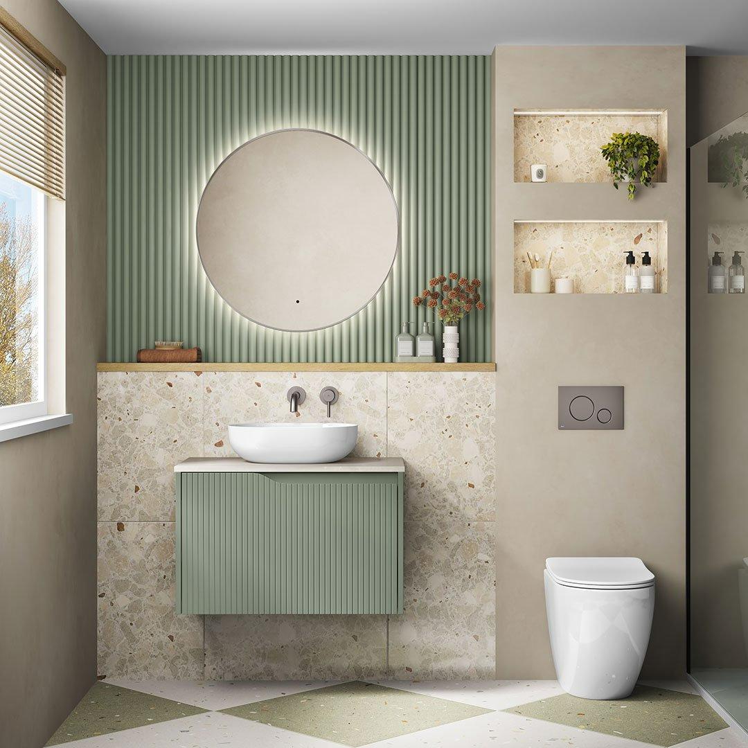
Coordinating With Complementary Materials
Brass and gold fixtures create luxurious environments where
warm metallic accents enhance the natural depth. Natural wood cabinetry in
medium walnut or dark oak tones provides organic warmth that complements
botanical undertones beautifully.
White or cream stone countertops offer clean
contrast that prevents interiors from feeling too heavy. Consider pairing with
lighter green
variations in adjacent rooms to maintain cohesive flow. Black or charcoal
grout emphasizes individual tile edges for graphic contemporary looks, while
matching dark grout produces seamless color fields.
Chrome and stainless steel
fixtures provide cooler contrast options that highlight blue-green undertones.
Explore different
color options to see how this rich hue compares to other botanical tones.
Installation Patterns and Format Considerations
Traditional horizontal brick bond layouts create classic
appeal that lets color take center stage. Vertical stacking adds height
emphasis in standard ceiling rooms while maintaining contemporary
sophistication.
Herringbone arrangements introduce dynamic movement and
architectural interest. The rectangular format provides structural balance that
prevents the bold hue from overwhelming spaces. Available formats include
standard 3x6, elongated 4x8, and modern 3x12 dimensions.
Larger formats like 4x8 options
minimize grout lines for sleeker contemporary aesthetics, while traditional
sizes suit vintage-inspired kitchens and bathrooms.
Lighting Effects and Material Selection
Natural and artificial lighting dramatically transforms how
this saturated shade presents throughout the day. Southern exposures with
direct sunlight showcase full vibrancy and blue-green undertones, while
northern exposures provide consistent indirect light.
Warm incandescent bulbs
shift the hue toward richer forest tones, while neutral LED lighting maintains
truest color accuracy. Testing 4x4 samples through our comprehensive sample
program ensures you understand how the shade performs under your conditions.
Porcelain varieties offer superior moisture resistance for high-humidity
bathroom environments.
Ceramic options provide excellent value with stunning
color saturation. Glossy finishes maximize light reflection, while matte
finishes deliver contemporary sophistication. Visit our kitchen
applications showcase to explore how finishes integrate with various
cabinetry styles.
Inspiration and Solutions to Elevate Your Space
Frequently Asked Questions
Dark charcoal or black grout creates graphic contemporary contrast. Matching dark grout produces seamless monochromatic walls. White or cream grout offers classic contrast but requires more maintenance.
Yes, when used strategically. Install on single accent walls behind vanities or in shower surrounds. Pair with white or light tiles on remaining walls to maintain brightness.
This option offers significantly more saturation, creating bolder statements with jewel-tone richness while maintaining botanical warmth.
White or cream cabinetry creates classic contrast. Natural wood in walnut or oak tones complements botanical depth. Black cabinetry produces sophisticated, moody kitchens.
Absolutely. Restaurants, boutique hotels, and retail environments use these tiles to create memorable, sophisticated interiors that maintain longevity.