Blue Subway Tiles Kitchen
Practical Performance in Kitchen Environments
Find more ideas on our blog
Blue Subway Tiles Kitchen: Transform Your Cooking Space with Coastal Elegance
Selecting the perfect backsplash transforms ordinary
cooking spaces into extraordinary culinary retreats. Blue subway tiles kitchen brings a
refreshing coastal sensibility while maintaining the timeless
appeal of classic rectangular formats.
From soft powder hues to deep navy
tones, this versatile color family works beautifully with stainless steel
appliances, white cabinetry, and natural wood elements. The calming properties
create a serene cooking environment that reduces stress during meal preparation
while adding sophisticated visual interest.
Nova Tile and Stone offers an
extensive selection of shades ranging from sky blue to sapphire, each designed
to complement modern and traditional kitchen aesthetics. Visit our showroom locations to experience
how different saturations appear under various lighting conditions.
Get A $1 Tile Sample Now
Color Variations and Design Impact
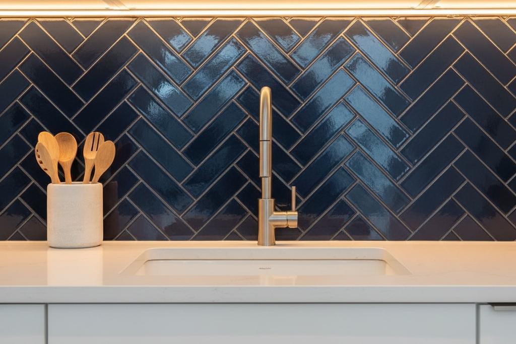
Navy blue creates dramatic sophistication when paired
with brass fixtures and marble countertops, establishing a luxurious foundation
for culinary spaces. Lighter powder shades expand compact kitchens visually
while maintaining cheerful brightness throughout the day.
Medium cobalt tones
strike the perfect balance between bold statement and versatile backdrop,
complementing both warm and cool color palettes. Teal subway tiles provide a blue-green blend with rich color and similar versatility. For color selection
guidance, consider how natural light affects your chosen shade north-facing
kitchens benefit from warmer undertones, while south-facing spaces accommodate
cooler saturations.
The rectangular format provides clean horizontal lines that
make walls appear wider while the color itself introduces personality without
overwhelming surrounding elements. White cabinets create striking contrast,
butcher block countertops add warmth, and gray concrete achieves industrial
harmony with these ocean-inspired wall treatments.
Creating Cohesive Kitchen Design
Successfully integrating this shade requires coordination
with existing elements. Lighter saturations like sky or powder work
exceptionally well in smaller kitchens, reflecting natural light and creating
airy expansiveness.
Deeper navy or cobalt tones anchor larger spaces with
dramatic impact. Consider undertones carefully some variations lean toward teal
with green hints, while others present true navy characteristics that pair
differently with fixtures.
Brass hardware adds warmth to cooler shades, brushed
nickel maintains contemporary neutrality, and matte black creates striking
punctuation. Our comprehensive sample program ships free, allowing evaluation
of how your selected shade appears in actual lighting before committing to your
complete order.
Frequently Asked Questions
Lighter variations like powder or sky tones work exceptionally well in compact spaces, reflecting more natural light and creating an airy, expansive feeling that makes small kitchens appear larger while maintaining the calming benefits this color provides.
This shade strikes an excellent balance between personal expression and broad market appeal. The color has enduring popularity that resonates with many buyers, particularly when executed with quality materials and thoughtful design coordination.
Absolutely. When paired with classic white cabinetry, traditional hardware finishes like brass or bronze, and timeless countertop materials, this color adds contemporary freshness without abandoning traditional sensibilities that honor your home's architectural character.
Maintenance remains straightforward with regular cleaning using mild dish soap and water to preserve the finish. Periodic grout sealing protects joints from staining, while darker grout colors naturally conceal minor discoloration better than lighter options.
Begin by identifying undertones in your chosen variation whether it leans cool or warm. Then select complementary finishes that harmonize with these undertones, including cabinet hardware, countertop materials, and flooring that creates cohesive visual flow throughout your kitchen space.