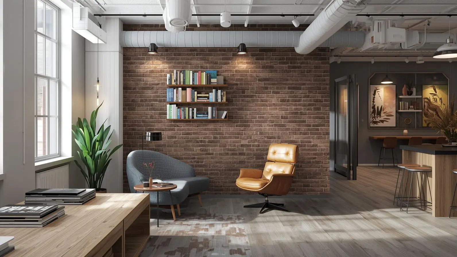
Tile color selection directly impacts both your emotional well-being and property value through color psychology principles. Each color triggers specific psychological responses: red tiles increase energy and appetite (ideal for kitchens), blue tiles reduce stress and blood pressure (perfect for bedrooms and bathrooms), while neutral colors like white and gray maximize resale value by appealing to broader buyer preferences.
Quick Color Impact Reference:
- Red: Increases energy, passion, and appetite - best for accent walls and kitchens
- Blue: Reduces stress, promotes calm, slows heart rate - ideal for bedrooms and bathrooms
- Green: Most restful color for eyes, promotes harmony and emotional safety
- White: Makes spaces appear 20-30% larger, maximizes light reflection
- Gray: Creates sophisticated neutrals, increases perceived home value
- Brown: Adds warmth and stability, works well with earth-tone schemes
Key Selection Factors:
- Room size: Light colors make small spaces appear larger
- Lighting conditions: Natural vs. artificial light dramatically changes color appearance
- Traffic levels: Darker tiles hide wear better in high-traffic areas
- Resale considerations: Neutral colors (white, gray, beige) offer best ROI
Understanding tile color psychology empowers homeowners to create spaces that enhance daily mood while making strategic design investments. The right color choice transforms ordinary rooms into environments that support your lifestyle and potentially increase home value by 5-10% according to real estate professionals.
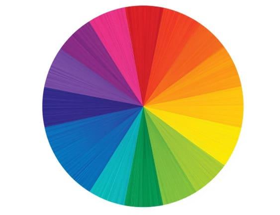
The Color Wheel
In physics, color represents how our eyes and brain interpret wavelengths of light bouncing off surfaces.
When considering color, we typically reference the paint color wheel, which establishes red, yellow, and blue as primary colors from which all other hues originate. Blending primary colors produces secondary colors: green, orange, and purple (or violet). Mixing all these colors generates tertiary colors, completing the color wheel: yellow-green, blue-green, blue-purple, red-purple, red-orange, and yellow-orange.
Grasping these color wheel fundamentals can enhance your color wheel application in interior design:
- Complementary colors: Colors positioned directly across from each other on the color wheel (such as violet and yellow or orange and blue), complementary colors generally function well as accent colors.
- Triads: Triads represent colors forming a triangle on the color wheel, like red, blue, and yellow or violet, green, and orange. While triads can serve as accent colors, they require balance to prevent overwhelming the space.
- Analogous colors: Analogous colors are groups of three colors positioned adjacent to each other on the color wheel, such as red, orange, and red-orange.
- Monochromatic colors: Monochromatic color schemes utilize just one color but can incorporate varying shades, for instance, ranging from mint to forest green.
- Cool and warm colors: Cool colors encompass blues, greens, and purples, colors reminiscent of water or grass that evoke refreshing feelings. Warm colors, reds, oranges, yellows, and pinks, remind us of fire or sunshine, creating warm sensations. Using cool or warm tones can help establish specific moods in a space.
- Noncolors: Noncolors are hues absent from the color wheel (such as white, gray, black, beige, and brown), yet remain crucial to interior design.
Tile Color Psychology
What psychology lies behind each tile color? Let's explore.
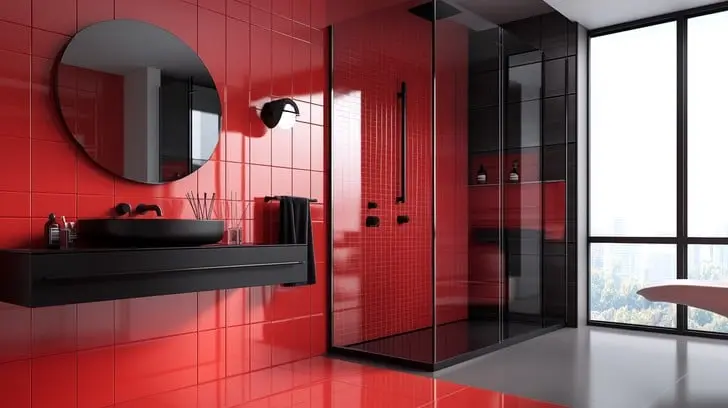
Red Tile
Starting with arguably the most striking color on the color wheel, red tile simultaneously evokes love, passion, and desire alongside determination, power, energy, strength, danger, and war. Consider red tile as a tool for heightening senses, elevating energy levels, and generating excitement, the type of color that makes memorable first impressions and sparks conversation.
Naturally, the red shade you select significantly affects the impact:
- Light red: Love, passion, sexuality, sensitivity, and joy
- Pink: Love, romance, and friendship
- Reddish brown: Fall and harvest
- Dark red: Willpower, vigor, courage, leadership, and longing
How to use red tile: Red tile works excellently as an accent to warm up a "cool" space or can create dramatic impact when used in larger applications or entire rooms (imagine a red tile alcove or bathroom). Kitchen renovation projects can also benefit from red tile, since red reportedly increases appetite. When used for tile feature walls, red can visually alter the proportions of long and narrow rooms.
Combine red tile with other colors to modify its effect. For example, when paired with soft grays and magentas, red can make spaces feel feminine and cozy. Earth tones combined with rustic red tile create warm and natural atmospheres. Generally, purple-reds convey quiet intimacy while orange-reds are energizing.
Pink has become the signature color for breast cancer awareness, and pink tile is emerging as a trending method to add elegance and feminine strength to home décor. Pastels like blush tile create serene and sophisticated styles, bold hues establish boho and industrial chic aesthetics, and orangish pinks such as coral tile provide vibrant, buoyant, yet comforting vibes.
Shop Red Tiles at Nova Tile And Stone →
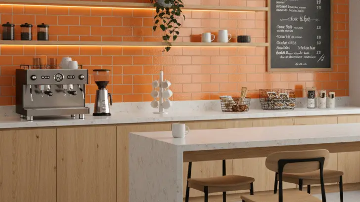
Orange Tile
If your space requires an energy boost, orange tile might be perfect for you. Orange evokes the tropics, sunshine, and joy while conveying happiness, enthusiasm, encouragement, fascination, creativity, success, determination, stimulation, and attraction. It combines yellow's warm and welcoming aspects with red's excitement, producing varying effects depending on the shade:
- Bright orange: Adventure and warmth
- Red-orange: Thirst for action, domination, pleasure, passion, and desire
- Dark orange: Confidence and ambition
- Gold: Prestige, wisdom, illumination, and wealth
While people tend to either love or hate orange, executive director of the Pantone Color Institute and color expert Leatrice Eisemen explains that orange is climbing the ladder of consumer preferences, suggesting we may see more orange tile in future projects.
How to use orange tile: Orange tile can overwhelm when used extensively, so consider it as an accent color or for smaller applications like backsplashes. Like red, orange stimulates appetite, making it excellent for kitchen tiles. Orange is also perfect for high-energy rooms such as exercise spaces, and as an added benefit, ceramic tiles offer water-resistance and slip- (and sweat-) resistance!
Generally, brighter orange shades require less coverage. Similarly, paler and more subdued oranges, such as apricot, peach, terra cotta orange, and dusty orange, work ideally for larger tile applications or spaces and more relaxing areas like bedrooms. Remember that deep orange tile, while bold during daylight, can feel warm and cozy in evening light.
Consider mixing bright orange tile with yellow and pink accents to invoke energy and excitement, and apricot orange tile with deep grays and browns for calmer atmospheres. Pair orange tile with gold, brown, and red tile accents or other interior décor for harvest or fall feelings.
Explore Orange Tiles at shop by size →
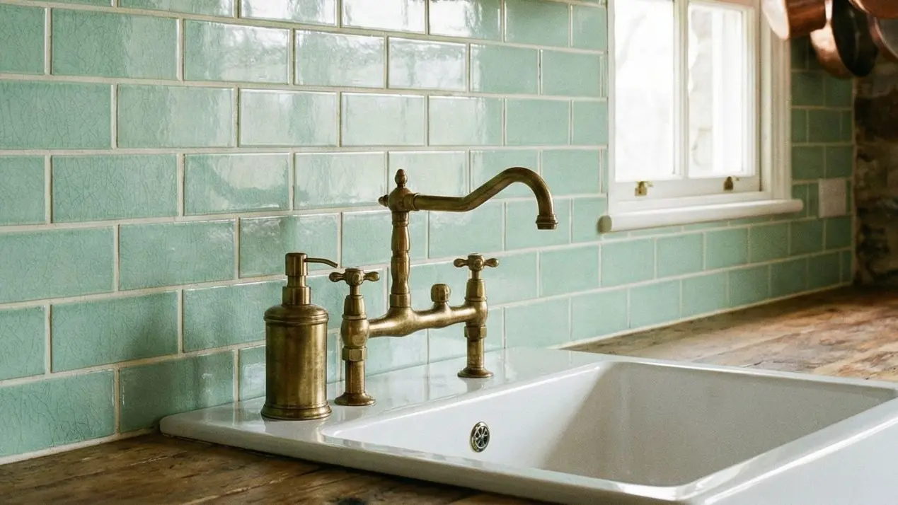
Green Tile
The color of grass, leaves, and other natural elements, green is also the most restful color for eyes. Green conveys renewal, growth, fertility, freshness, and harmony; using green tile can provide emotional safety, security, and calmness to spaces.
- Yellow-green: Joy and cheeriness
- Aqua: Protection and emotional healing
- Olive green: Peace
- Dark green: Ambition
How to use green tile: Green tile works in any room of the house. Explore these ideas for incorporating green tile into your home:
- Different green tile shades can add contrast to monochromatic color schemes
- When paired with wood tones, green tile establishes natural and organic aesthetics
- Accent light green tile with gray for modern vibes
- White color schemes can benefit from lime green tile pops
- Mix blue-green tile with grays and whites to create relaxing atmospheres
- Emerald green tile makes for dramatic and elegant spaces
- Evergreen, spruce, and other deep greens create muted looks and hushed moods
- Sea green tile lends open and airy feelings to rooms
- Celery green tile is popular and versatile, appearing warm and relaxing in living rooms, bright and clean in bathrooms, and light and airy in kitchens
Discover Green Tiles at shop by type →
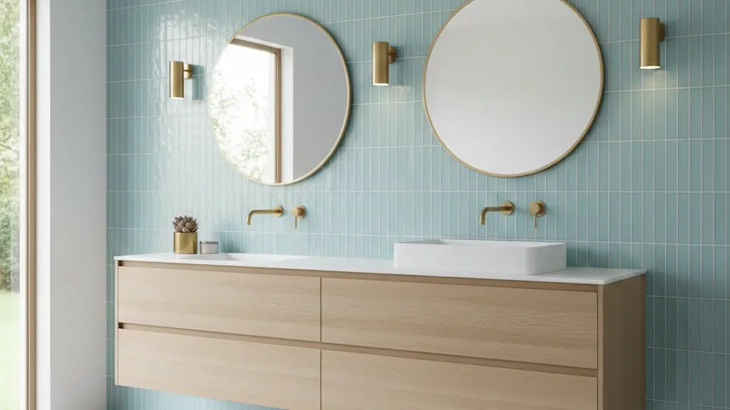
Blue Tile
Reminiscent of both sky and ocean, blue tile evokes freshness and calm feelings, plus strength, dependability, truth, confidence, loyalty, trust, intelligence, wisdom, faith, and heaven. This elemental color offers serious benefits for both body and mind, reducing blood pressure, slowing heart rate and metabolism, and producing calming effects. Naturally, the impact depends on the specific blue shade. For example:
- Light/pastel blue: Understanding, healing, health, tranquility, and softness
- Dark blue: Seriousness, integrity, power, and knowledge
- Midnight blue: Luxury
How to use blue tile: The calming effect of blue tile makes it excellent for any space where you want to relax, such as bedrooms, bathrooms, or kitchens. If you're gathering bedroom floor tile ideas, soft sky blues and muted teal tones can promote restfulness while subtly enlarging spaces.
Blue tile is also trending for creative blue backsplash designs. While classic blue is Pantone's 2020 color of the year, numerous blue tile shades allow specific mood creation with your design:
- Bright French blue tile and sunflower yellow accents make cheerful combinations
- Sapphire blue tile adds energy bursts to spaces
- Sky blue, baby blue, and other light blue tile makes rooms feel tranquil, and can even visually enlarge rooms if used on ceilings
- Navy blue tile and other dark shades lend dramatic touches
- Blue and green tile create classic combinations that are reportedly calming
- Teal and turquoise tile create beachy aesthetics
- Vibrant blue tile works well as statement or accent pieces
- Blue and white tile create refreshing looks when combined
- Midnight blue tile accented with amethyst hues creates ultimate luxurious looks
Shop Blue Tiles at shop by color →
White Tile
White conveys purity, cleanliness, perfection, innocence, completion, wholeness, peace, calm, hope, comfort, encouragement, and protection and signifies blank palettes or clean slates. White tile alleviates emotional turbulence and creates order and efficiency senses, helping to declutter your mind and life. Consequently, white tiled interiors feel clean and fresh, think of Scandinavian design with its tendency toward all-white spaces and sparse decoration, plus Hygge design that uses white, light, and neutral colors for simplicity and to promote space and calm senses.
How to use white tile: White tile can make rooms look bigger but can also seem cold, sterile, or barren if not balanced with other colors or accent pieces. The white tile undertone also makes significant differences: White tile with yellow undertones looks soft, creamy, and relaxing, which excellently softens any warm or neutral color scheme. White tile with blue undertones looks crisp and striking.
All-white tile bathrooms have been popular trends since the Victorian era, and white subway tile is a classic backsplash choice. White tile pairs beautifully with black tile in classic designs such as octagon and dot patterns and checkerboard tile. White tile's broad use makes it a staple for many décor styles, such as farmhouse, transitional, and minimalism.
Browse White Tiles at Mozart marble-look porcelain tiles →
Gray Tile
Gray brings calmness, serenity, and sophistication. While solid grays and grays with cool undertones signalize strength and confidence, softer grays and grays with warm undertones create delicacy, comfort, and thoughtfulness senses.
How to use gray tile: Gray tile is often used as neutral backdrops to make other colors pop. Mixing different gray shades or tones can also create understated elegance looks. Additional ideas for using gray tile include:
- Greige tile is perfect when you can't quite decide between gray or beige
- Slate-gray tile with chartreuse accents creates stylish looks with personality
- Cloud gray tile with fawn or ecru accents establishes soft and inviting atmospheres
- Dove gray tile combines well with violets and plums for soothing and soft aesthetics
- Gray shades are emerging as backdrops for industrial chic approaches to home and workplace décor
- Natural stone look-tile allows you to embrace gray color schemes but with more visual interest
Shop Gray Tiles at shop by style →
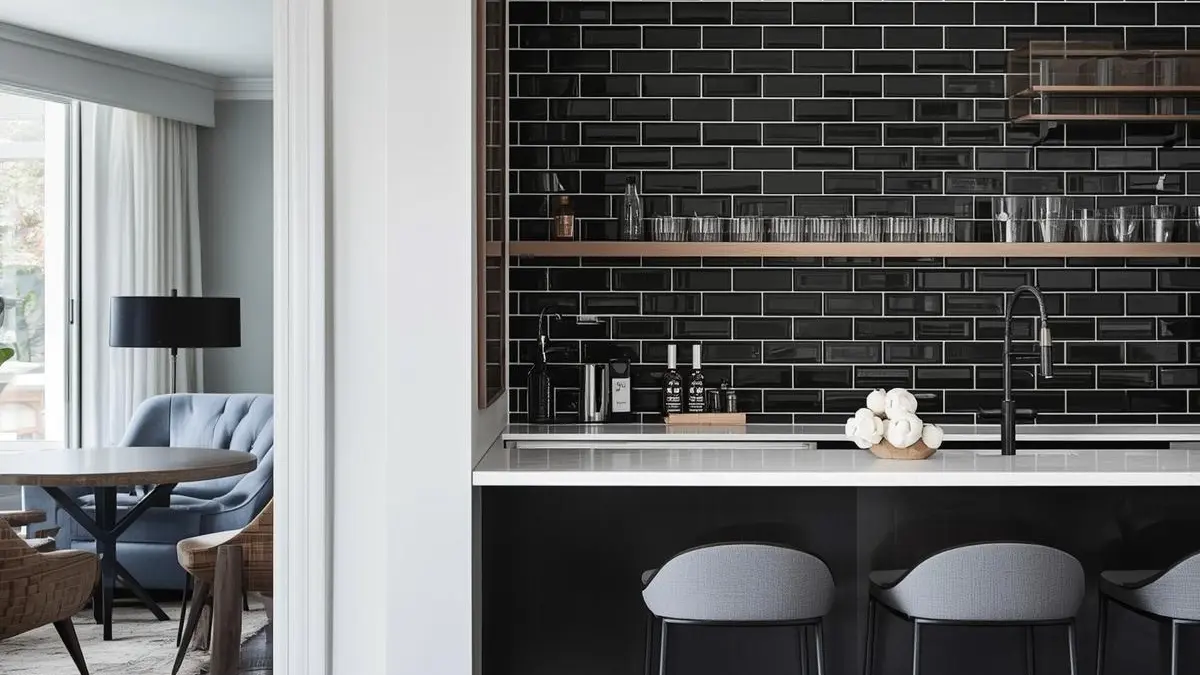
Black Tile
Black tile is associated with luxury, elegance, and sophistication and, when used heavily in color schemes, creates mystery, drama, and power senses. This go-to color manages to be simultaneously traditional and modern, a fail-proof option to create timeless and chic looks.
How to use black tile: Black tile can be somewhat overwhelming when used heavy-handedly, so be sure to limit it to single applications or small rooms (for example, black tile bathrooms are currently trending). Black tile also works excellently as accent or contrasting elements, as it helps balance other colors so they stand out more.
Black and white tile is a classic combination, whether in patterns such as checkerboard tile or octagon and dot tile, black marble-look tile with white veining, or pairings of black tile with stark white grout that emphasizes layout patterns. Red and silver are also classic complements to black tile.
Browse Black Tiles at Odyssey square porcelain tiles →
Brown Tile
The color of wood, brown symbolizes nature and evokes nature's stability, security, groundedness, and relaxing quality. This robust, weighty color adds earthy richness to interior décor that makes spaces feel warm and inviting, encouraging your family and friends to stop and unwind.
How to use brown tile: Brown tile often has traditional looks, but that's not always the case, the mood your brown tile creates relies heavily on the brown shade and any other design elements in the space. Design tips for brown tile include:
- A lovely way to use brown tile is to contrast dark and light shades and mix textures, such as wood-look tile
- Brown tile is a good choice to emphasize (and tone down) bolder colors such as orange or lime green
- Blues and greens both benefit from brown accents
- Pair brown tile with aqua accents to create light and airy vibes, or with burgundy for swanky looks
- Light brown tile shades lend warm sophistication to spaces and create inviting neutrals for minimalism, farmhouse, and traditional décors
- For feminine color schemes ideal for young girl's bathrooms or bedrooms, combine brown and pink tile
- Soften masculine brown tile with lighter shades of other colors
- Combining brown tile with cool blue accents elicits earth and sky looks and feelings
Discover Brown Tiles at shop →
Multicolor Tile
Maybe our exploration of different colors has helped you realize you want to incorporate multiple colors into your tile application. If that's the case, you have numerous options:
- Alternate tiles of different colors to create unique designs (think checkerboard tile), or simply sprinkle same-shaped tiles of another color into your layout to add visual interest
- Colorful bathroom floor tile ideas like checkerboard patterns or staggered transitions are fun ways to add creativity and vibrancy to your space
- Patterned tile offers limitless options for multicolor geometric, floral, Art Deco, Spanish-modern, and other designs
- Mosaic tile allows you to creatively combine tiles of different colors and shapes
- Trending ombre tile blends one tile color into another, usually from light to dark or vice versa
- Use staggered tile transitions to go from one color tile to another
- Variegated tile exhibits different shades in irregular streaks or patches to create natural or rustic looks and is a common beauty trait of handmade tile. Variegated looks are also never more glamorous than in gemstone-look ceramic tile
- Shimmery iridescent tile creates multiple color impressions, depending on lighting and viewing angle
- Options for different grout colors can completely change your tile's look and draw attention to your unique layout
If you're searching for colorful bathroom floor tile inspiration, exploring options like Odyssey hexagon options or vibrant patterned tiles can help you create bathrooms that truly stand out.
Explore Multicolor Options at products we carry →
Conclusion
Understanding tile color psychology empowers you to create spaces that not only look beautiful but also positively influence your daily emotions and well-being. The colors you choose for your tiles can transform ordinary rooms into extraordinary environments that support your lifestyle, enhance your mood, and reflect your personal style.
From the energizing warmth of red and orange tiles to the calming tranquility of blue and green options, each color serves a unique purpose in interior design. Neutral colors like white, gray, black, and brown provide versatile foundations that can either stand alone for minimalist elegance or serve as perfect backdrops for bolder accent colors.
At Nova Tile & Stone, we understand that selecting the right tile color is more than just an aesthetic choice, it's an investment in your daily happiness and comfort. Our extensive collection of over 50,000+ tile designs ensures you'll discover the perfect colors to create the atmosphere you desire in every room of your home.
Whether you're drawn to dramatic statements with deep, rich colors or prefer the serene simplicity of neutral tones, the key is choosing colors that resonate with your personality and support the activities in each space. Remember that lighting, room size, existing décor, and personal preferences all play crucial roles in how colors will appear and feel in your specific environment.
Take advantage of our $1 sample program to test how different tile colors look in your actual space under our specific lighting conditions. Our design experts are always available for free consultations to help you navigate the exciting world of tile color selection and create the home of your dreams. Explore our Mozart elongated hexagon tiles for sophisticated design options.
Frequently Asked Questions
How do I choose the right tile color for a small bathroom?
For small bathroom update, lighter colors like white, light gray, or pale blue work best as they reflect light and create the illusion of more space. White tile is particularly effective because it maximizes light reflection and makes the room feel larger and brighter. You can add personality with colorful accents through grout, fixtures, or decorative borders while keeping the main tile color light and airy.
Can I mix different tile colors in the same room?
Absolutely! Mixing tile colors can create stunning visual effects and add personality to your space. Popular approaches include using a neutral base color with colorful accent tiles, creating patterns like checkerboard designs, or implementing ombre transitions from one color to another. The key is maintaining balance, use the 60-30-10 rule where 60% is your dominant color, 30% is your secondary color, and 10% is your accent color for the most harmonious results. For expert guidance on types of tiles that work well together, consult design professionals.
Which tile colors work best for increasing home resale value?
Neutral tile colors typically offer the best return on investment for resale value. White, light gray, and beige tiles appeal to the broadest range of buyers and provide timeless elegance that won't look dated in a few years. These colors also allow potential buyers to envision their own décor and personal style in the space. If you want to add character, consider using neutral base tiles with the option to change accent colors through accessories and grout.
How does lighting affect tile color appearance?
Lighting dramatically impacts how tile colors appear in your space. Natural light reveals colors most accurately, while artificial lighting can shift color perception. Warm LED lights enhance reds, oranges, and yellows, making them appear more vibrant, while cool LED lights bring out blues, greens, and grays. Glossy tiles reflect more light and can appear brighter, while matte tiles absorb light and may appear slightly darker. Always test tile samples in your actual space under both natural and artificial lighting before making your final decision. Style by Emily Henderson recommends this practice as essential for successful tile selection.
What tile colors work best for high-traffic areas like kitchens and entryways?
For high-traffic areas, choose darker or medium-toned tiles that hide dirt and wear better than light colors. Brown, gray, black, and darker green tiles are excellent choices as they're practical and stylish. These colors camouflage daily wear, footprints, and spills while maintaining their appearance over time. Additionally, consider tiles with slight texture or pattern variations, as they further help disguise everyday wear and provide better slip resistance in busy areas. Visit our Nova Tile & Stone showroom to see these options in person or explore stunning small kitchen floor ideas for inspiration.
For more inspiration and expert advice, explore resources from The Inspired Room, Houzz design professionals, and flooring choice guides. Our Mozart hexagon tiles offer elegant marble-look options for sophisticated designs. Understanding ceramic tile standard can also help ensure you're making informed decisions about quality and performance. Visit our local showroom to explore Mozart bullnose tiles and other premium options, or learn more from the non-profit org that provides technical resources for proper tile installation and maintenance.