Pastel subway tiles bring gentle color saturation that adds personality to kitchen spaces without overwhelming existing design elements, making them increasingly popular as homeowners seek alternatives to stark white backsplashes. These soft hues including blush pink, mint green, powder blue, lavender, and butter yellow deliver enough visual interest to define cooking spaces while maintaining versatility to adapt as decor preferences evolve. Subway tiles originated in early 20th century transit systems but evolved into versatile building materials with the classic rectangular format grounding these delicate colors through familiar proportions that have proven their enduring appeal across multiple design movements.
The rise of pastel installations reflects broader shifts in how people approach kitchen aesthetics. Rather than defaulting to completely neutral schemes, today's homeowners embrace subtle color as a way to personalize spaces while preserving long-term flexibility and resale value through tasteful restraint. Pastel subway tiles occupy the ideal middle ground between bold statement colors and entirely neutral palettes, offering visual warmth that white tiles cannot provide while avoiding the commitment level of saturated jewel tones or dramatic subway tile with dark grout combinations. Whether arranged in subway tile layouts like herringbone subway tile backsplash patterns, chevron subway tile configurations, or installed as vertical subway tile features, these gentle hues adapt to both traditional farmhouse settings and sleek contemporary environments. When planning your kitchen renovation, browse options organized by color to discover the full range of pastel possibilities available in various finishes, sizes, and material compositions that support creative backsplash ideas and modern subway tile patterns. Explore different tile types to understand how ceramic and porcelain options perform in kitchen environments.
Color Psychology Creates Welcoming Kitchen Environments
Color temperature and saturation levels directly influence how people experience kitchen spaces on both conscious and subconscious levels. Pastel shades register as approachable and non-threatening because their low saturation reduces visual intensity while maintaining enough color presence to activate emotional responses. In kitchens where families gather, cook meals, and share conversations, these gentle hues foster relaxation without inducing the sterile feeling that pure white surfaces can create.
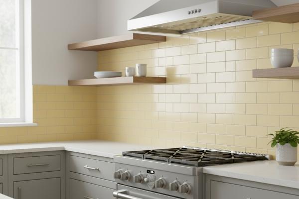
Different pastel families serve distinct psychological purposes. Mint green and sage tones evoke growth, freshness, and natural elements, making them particularly effective in spaces where food preparation connects to health-conscious lifestyles. Products like matte porcelain subway tiles in soft green shades deliver this effect beautifully. Blush pink and peach shades introduce warmth and nurturing qualities that complement the hospitality functions kitchens serve. Powder blue and periwinkle create calm, orderly feelings that help busy cooks maintain focus during meal preparation. According to research from the Natural Stone Institute, color choices in material selection significantly impact how people interact with built environments.
The reflective properties of glazed pastel tiles amplify natural light while softening its intensity. Glossy porcelain options maximize this light-enhancing effect while maintaining easy-clean surfaces. This quality becomes especially valuable in kitchens with limited natural light or north-facing windows where brightness needs enhancement but glare becomes problematic. Glossy ceramic subway tiles in pastel shades strike this balance effectively.
Material Performance for Long-Term Kitchen Installations
Pastel subway tiles primarily utilize ceramic or porcelain bodies with colored glazes applied during manufacturing. The ANSI A137.1-2022 standard for ceramic tile establishes performance requirements that affect how these materials withstand kitchen conditions. Porcelain options offer superior water absorption resistance below 0.5%, making them ideal for areas behind sinks or near dishwashers where moisture exposure occurs regularly. Ceramic versions with higher absorption rates work perfectly for standard backsplash applications where direct water contact remains minimal.
The glaze layer protecting pastel colors must resist common kitchen chemicals including acidic ingredients like tomato sauce, vinegar, and citrus juice that contact surfaces during food preparation. High-quality glazed tiles maintain their color integrity when properly manufactured, as the firing process permanently bonds pigments into the glass-like surface. Professional tile organizations like the Ceramic Tile Foundation provide guidance on identifying products manufactured to appropriate specifications.
The substrate preparation and installation methods specified in ANSI A108/A118/A136-2024 standards directly impact how pastel tiles perform over decades rather than years. These installation principles apply to both indoor and outdoor tile applications, though kitchen installations involve different moisture considerations. Professional installers certified through programs like the Certified Tile Installer program understand these requirements and execute installations that protect your investment. Additional resources from TCNA explain the differences between porcelain and ceramic performance characteristics. Find qualified professionals through established retailers who maintain relationships with certified installers.
Layout Pattern Options Enhance Pastel Impact
Traditional running bond patterns with offset horizontal rows provide the safest layout approach for pastel tiles because the familiar arrangement lets color take center stage without competing visual elements. This classic subway tile layout works especially well when introducing pastels for the first time, as the straightforward pattern prevents the space from feeling too busy or experimental.
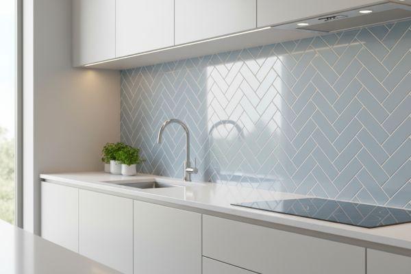
Herringbone subway tile backsplash installations create dynamic visual interest that elevates pastel colors from gentle to sophisticated. The 45-degree angled pattern produces continuous zigzag lines that guide the eye across the backsplash surface, making smaller pastel tiles feel more impactful than their size suggests. This layout works particularly well with muted tones like sage green or dusty rose because the geometric precision balances the softness of the color family. Resources from Tile Letter magazine provide detailed technical guidance on achieving professional herringbone results.
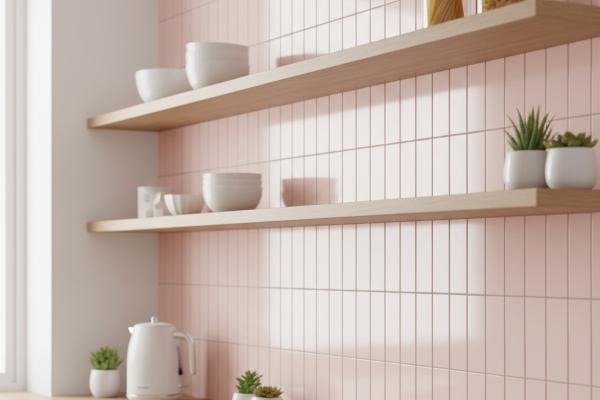
Vertical subway tile arrangements introduce height emphasis that makes standard 8-foot ceilings feel taller while creating modern visual interest. This orientation works especially effectively with narrow pastel tiles in 2x8 or 3x9 formats, as the vertical lines draw attention upward rather than across. The layout suits contemporary kitchen designs where clean lines and minimal ornamentation define the aesthetic.
Basketweave subway tile arrangements using rectangular tiles create texture and depth through alternating horizontal and vertical pairs that form woven patterns. This traditional layout brings vintage charm that complements pastel colors beautifully, as both elements reference historical design periods. The basketweave pattern works particularly well in kitchens with vintage-inspired fixtures where cohesive aesthetic storytelling matters.
Coordinating Pastel Tiles with Cabinetry and Countertops
White painted cabinets create the most versatile backdrop for any pastel tile selection because the neutral foundation allows the tile color to define the space's personality without competing elements. Crisp white cabinetry makes pastel tiles appear more saturated and vibrant, as the contrast emphasizes color presence. This pairing works across all design styles from farmhouse to contemporary.
Natural wood cabinets in light oak, maple, or birch tones harmonize beautifully with warm pastel families including peach, butter yellow, and soft coral. The organic grain patterns and honey-colored wood complement the gentle saturation levels in pastel glazes, creating cohesive warmth throughout the space. Grey painted cabinets in light to medium values provide contemporary sophistication that elevates pastel tiles beyond casual or vintage associations.
Countertop material selection significantly impacts how pastel tiles read within the overall design composition. White quartz or marble countertops create high contrast that makes pastel tiles the focal point. Light grey quartz options provide subtle neutrality that lets pastel tiles shine without stark contrast. When coordinating these elements, visit comprehensive tile showrooms where you can view material samples together under consistent lighting.
Grout Color Selection Strategies
White grout creates clean separation between pastel tiles while maintaining brightness and emphasizing the tile color as the primary visual element. This traditional approach works across all pastel families because white provides neutral contrast that doesn't compete with or alter how the tile color reads. The combination produces crisp, fresh results that suit both modern and traditional kitchen aesthetics.
Matching grout colors to the tile hue creates seamless, monochromatic surfaces where grout lines nearly disappear into the overall field. This approach makes small pastel tiles read as continuous color fields rather than individual pieces, producing calming uniformity that suits minimalist aesthetics.
Light grey grout offers practical advantages by hiding minor staining better than white while maintaining enough contrast to define individual tile edges. This compromise solution works across all pastel families because grey's neutral quality doesn't clash with any color temperature.
Design Style Compatibility Across Kitchen Aesthetics
Modern farmhouse kitchens embrace pastel subway tiles as perfect expressions of the style's core principles balancing rustic charm with contemporary livability. Soft mint green or butter yellow tiles complement the white painted cabinetry, farmhouse sinks, and open shelving that define this popular aesthetic. When exploring materials for farmhouse-inspired projects review tiles organized by style to see how different formats support specific design aesthetics.
Contemporary kitchens utilize pastel tiles to soften the potentially stark feeling that all-white or grey schemes can create while maintaining the clean lines and minimal ornamentation the style requires. Cooler pastels like powder blue or sage green work particularly well because their color temperature aligns with the style's preference for sophisticated restraint.
Coastal kitchen designs naturally embrace pastel tiles in blue and green families that reference ocean and sky without literally reproducing beach house clichés. Soft aqua, seafoam, or sky blue tiles create the fresh, breezy feeling coastal kitchens require while working in geographic locations far from actual coastlines.
Material Sourcing and Quality Evaluation
Imported tiles from European manufacturers often provide the most extensive pastel color selections because international markets have embraced colored tiles more enthusiastically. Italian and Spanish producers particularly excel in developing sophisticated pastel glazes with consistent color from batch to batch. When evaluating imported tiles, verify that products meet North American tile standards to ensure compatibility with local installation practices.
Domestic tile manufacturers have expanded their pastel offerings in recent years as market demand has grown for alternatives to white subway tiles. When evaluating products from various manufacturers, consider both imported and domestic options to find the best balance of quality, cost, and availability for your specific project. Quality levels vary significantly among manufacturers, making it essential to evaluate specific products rather than assuming all tiles meet equivalent standards. Resources from the Ceramic Tile Distributors Association help identify reputable suppliers.
Batch consistency matters significantly with pastel tiles because subtle color variations that go unnoticed in white or grey tiles become obvious in tinted glazes. Order 10-15% extra tiles beyond calculated square footage to ensure you have matching replacements if damage occurs years after installation.
How to Choose the Right Pastel Shade for Your Space
Step 1: Evaluate Fixed Elements
Start by assessing your kitchen's unchangeable features including cabinet finishes, countertop materials, flooring, and architectural elements. These permanent components establish color temperature and saturation boundaries that guide appropriate pastel selections. Cool-toned fixed elements pair naturally with blue, green, and lavender pastels, while warm-toned foundations work better with peach, pink, and yellow families. When planning your material selections, explore options organized by size to understand how tile dimensions affect visual impact.
Step 2: Consider Personal Color Preferences
Choose tiles based on your authentic preferences rather than purely on current trends. You will interact with these tiles daily for years, making personal satisfaction more important than design trend alignment. If blue makes you feel calm, select blue-toned pastels regardless of whether pink currently dominates design publications.
Step 3: Evaluate Existing Visual Activity
Assess how much pattern and visual activity already exists in your kitchen before adding pastel color. Spaces with patterned flooring or busy countertops benefit from simpler pastel applications, while cleaner kitchens can handle more adventurous installations involving complex geometric patterns.
Step 4: Test Samples in Your Space
Request samples through local tile retailers and tape large boards to your walls. View them at different times of day under various lighting conditions, and live with the colors while cooking and moving through the space for several days.
Step 5: Order Extra Materials
Calculate square footage accurately, add 10% for cuts and breakage, and consider ordering additional boxes if your layout involves complex patterns. Having extra tiles from your original batch guarantees perfect color matching for future repairs.
Comparing Pastel Subway Tiles to Alternatives
Feature | Pastel Subway Tiles | White Subway Tiles | Glass Mosaic Tiles |
Color Options | Wide pastel range | Limited neutrals | Extensive colors |
Maintenance | Low; wipe clean | Low; wipe clean | Moderate; textured |
Durability | Excellent glazed | Excellent glazed | Good; can chip |
Installation Cost | Moderate | Moderate | High complexity |
Design Flexibility | High patterns | High patterns | Very high custom |
Trend Longevity | Growing acceptance | Timeless classic | Style-specific |
This comparison reveals that pastel subway tiles occupy the sweet spot between personality-driven options and completely neutral tiles. They deliver sufficient color interest to personalize kitchens while maintaining the practical advantages that make subway tile kitchen ideas popular.
Pros and Cons of Pastel Subway Tiles
Advantages:
- Distinctive personality without overwhelming boldness makes spaces feel personalized while preserving resale value
- Versatility across multiple design styles allows integration into existing aesthetics without complete overhauls
- Superior durability compared to paint provides permanent color requiring only simple cleaning
- Wide layout pattern options create visual interest without requiring exotic materials
- Excellent value proposition combines reasonable costs with straightforward installation
Disadvantages:
- Color commitment level exceeds neutral options making future design changes potentially more complex
- Batch variation risks require careful material ordering and may complicate future repairs
- Limited market saturation means fewer showroom samples and potentially longer sourcing timelines
- Coordination complexity increases when selecting grout colors and complementary materials
Pastel subway tiles represent thoughtful design evolution rather than risky trend-chasing. Their growing popularity reflects homeowners seeking meaningful personalization within familiar formats that have proven their practical value. When executed with proper planning, quality materials, and professional installation, pastel subway tiles create kitchen environments that feel both contemporary and timeless. Visit experienced tile retailers who can guide material selection based on your specific requirements and connect you with qualified installers. For additional guidance, reach out through our contact page to discuss your project needs with knowledgeable professionals.
Frequently Asked Questions
Do pastel subway tiles work in small kitchens?
Yes, pastel subway tiles work beautifully in small kitchens because their soft color saturation adds interest without overwhelming limited square footage. Lighter pastel shades like powder blue, mint green, or butter yellow actually help small spaces feel larger by reflecting light while providing more warmth than stark white tiles. Stick with simpler layout patterns like traditional running bond rather than busy herringbone arrangements to prevent small kitchens from feeling cluttered.
How do I clean pastel glazed tiles without damaging the color?
Clean pastel glazed subway tiles with mild dish soap mixed with warm water and a soft cloth. The glazed surface protects the color beneath, so normal cleaning doesn't fade properly manufactured tiles. Avoid abrasive scrubbing pads, harsh chemical cleaners, and undiluted acidic products like straight vinegar that can etch glazes over time. Daily wipe-downs prevent buildup requiring aggressive cleaning.
Will pastel tiles look dated in five years?
Pastel tiles used thoughtfully within classic subway tile formats have longevity because they balance contemporary color trends with timeless tile shapes that have remained popular for over a century. Choose pastel shades you genuinely love rather than installing colors purely from design magazines, as authentic personal connection outlasts trend cycles.
Can I mix different pastel colors in one backsplash?
You can mix pastel colors in single installations, but success requires careful planning. Limit combinations to two or three pastel shades maximum, and ensure they share similar saturation levels and color temperatures to maintain visual harmony. Create intentional patterns like ombre gradients or geometric blocks rather than haphazard mixing.
What's the cost difference between pastel and white subway tiles?
Pastel subway tiles typically cost 15-40% more than equivalent white tiles from the same manufacturer due to specialized glaze formulations and smaller production runs. Domestic pastel tiles average $8-$15 per square foot while white subway tiles commonly cost $4-$10 per square foot. The total project cost difference usually amounts to several hundred dollars for typical 30-50 square foot backsplash installations.