Brown subway tiles pair best with soft whites, creams, sage green, warm beiges, and soft grays for classic looks, while contemporary designs benefit from navy blue, crisp white with black accents, and terracotta tones. The optimal color choice depends on your tile's undertones (warm browns with red/orange/yellow notes versus cool browns with gray/blue undertones), grout color selection, and lighting conditions in your space.
When selecting complementary colors for brown subway tiles, consider these key factors: warm brown tiles naturally harmonize with earth-toned palettes including terracotta, cream, and golden yellows, while cool brown tiles work beautifully with slate gray, soft blues, and crisp whites. Your grout color significantly impacts the final appearance—matching grout creates seamless looks ideal for minimalist styles, whereas contrasting grout (dark brown or charcoal) emphasizes tile patterns for contemporary aesthetics.
This comprehensive guide explores effective color combinations for brown subway tiles, covering both timeless pairings and modern approaches. You'll discover how undertones, grout selection, texture variations, and lighting conditions influence your final results, helping you design cohesive, welcoming spaces with lasting appeal in kitchens, bathrooms, and beyond.
Identify Your Brown Tile Undertones First
Start by examining the undertones present in your brown subway tiles before selecting complementary colors. Brown encompasses various shades that lean toward warm or cool tones, directly affecting how they interact with surrounding colors.
Warm brown tiles feature red, orange, or yellow undertones, creating cozy, inviting atmospheres. These variations pair naturally with earth-toned palettes including terracotta, cream, and golden yellows, establishing cohesive warmth throughout your space. Explore our tiles by color collection to see how different brown shades work with various color schemes.
Cool brown tiles contain gray, taupe, or blue undertones, producing sophisticated, modern aesthetics. These tones harmonize beautifully with cooler colors like slate gray, soft blues, and crisp whites, generating clean, contemporary environments.
Test your tile undertones by placing white paper beside them. The stark contrast reveals subtle undertones more clearly. This technique proves particularly valuable in spaces where lighting changes throughout the day, as natural and artificial light shift color appearance. Recognizing these undertones enables better coordination with furniture, cabinetry, and decorative elements, ensuring every room component works together cohesively.
Select Your Grout Color Strategically
Grout selection significantly impacts how your brown subway tiles present themselves, yet many overlook this crucial design element. According to the Tile Council of North America, grout color either emphasizes or minimizes tile patterns, substantially influencing spatial aesthetics.
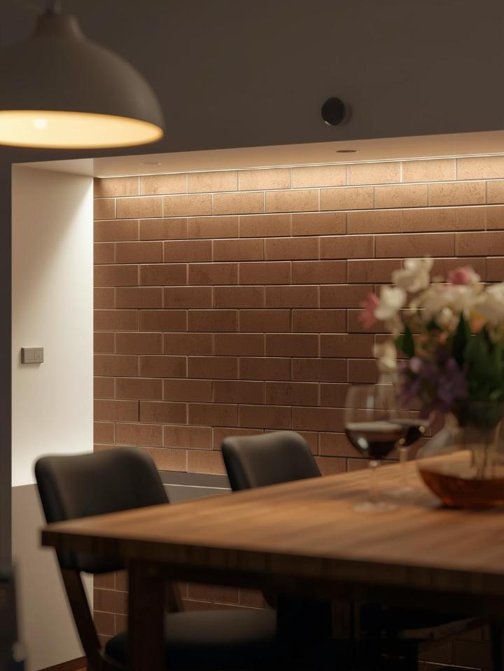
Choose high-contrast grout like dark brown or charcoal against lighter brown tiles to emphasize grid patterns, creating bold, structured appearances. This approach works exceptionally well in contemporary and industrial-style interiors seeking striking, graphic looks. The Ceramic Tile Distributors Association recommends testing grout samples before committing to ensure desired visual effects.
Match your grout color closely to subway tile shades for seamless, unified designs that feel polished and cohesive. This method suits traditional, minimalist, or rustic interiors where tiles should blend naturally into backgrounds without drawing excessive attention to grout lines.
Beyond aesthetics, grout color subtly alters brown subway tile perception. Using cool gray grout with warm brown tiles tones down red undertones, making tiles appear more neutral. Similarly, warm beige grout enhances red or orange notes in brown tiles, amplifying their warmth. Consider these interactions when finalizing your grout selection to achieve desired visual effects.
Classic Color Combinations That Work
Certain color pairings remain timeless through their ability to create harmonious, elegant aesthetics. When combined with brown subway tiles, classic hues like soft whites, creams, and muted greens establish refined designs with versatility and longevity. Browse our tiles by style collection to find options matching your aesthetic preferences.
Soft Whites and Creams
Soft white tones including ivory, cream, and warm off-whites provide timeless contrast to brown subway tiles, ensuring spaces feel bright and inviting rather than dark or heavy. These hues reflect light effectively, proving particularly beneficial in smaller rooms or areas with limited natural illumination.
Pair brown subway tiles with white cabinetry, countertops, and walls to create clean, balanced aesthetics suiting both traditional and contemporary interiors. The National Kitchen & Bath Association emphasizes that this combination prevents visual heaviness while maintaining warmth through brown tile presence.
Incorporate cream-colored elements like linen curtains, upholstered seating, or decorative accessories to soften overall appearance and add layers to your design. Cream's subtle warmth prevents spaces from feeling sterile while complementing brown's natural richness.
Natural Greens
Muted greens like sage, olive, and moss create organic, nature-inspired palettes when paired with brown subway tiles. This combination evokes tranquility and balance, making it ideal for spaces designed for relaxation like bathrooms or cozy kitchen nooks.
Green's versatility allows adaptation across design styles. Soft sage complements farmhouse aesthetics, while deeper olive tones suit bohemian or eclectic interiors. Use green through painted cabinetry, wall colors, or decorative accents such as plants, artwork, and textiles.
This pairing works particularly well in spaces emphasizing natural materials. Combine brown subway tiles with wooden countertops, woven baskets, and ceramic dishware to reinforce earthy, grounded aesthetics resonating with biophilic design principles. The Natural Stone Institute provides extensive resources on incorporating natural elements into your design.
Warm Beiges and Tans
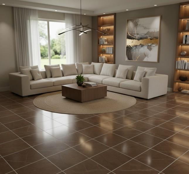
Beige and tan shades establish monochromatic palettes with brown subway tiles, producing cohesive, harmonious designs. This approach works beautifully in transitional spaces blending traditional and modern elements, as neutral tones bridge style gaps effortlessly.
Layer various beige and tan shades throughout your space to add depth without introducing contrasting colors. Consider beige walls, tan cabinetry, and brown subway tile backsplashes creating subtle variation maintaining overall unity. Check out products we carry for a wide range of neutral tile options.
Introduce texture through materials like linen, jute, and natural wood to prevent monochromatic palettes from appearing flat. These textural elements add visual interest while maintaining neutral color schemes.
Contemporary Color Pairings to Consider
Modern design embraces bolder, unexpected color combinations that push traditional boundaries. These contemporary pairings add personality and energy to spaces while maintaining sophistication. Coverings, the premier international tile and stone exhibition, showcases cutting-edge color trends annually.
Crisp White with Black Accents
Combining brown subway tiles with crisp white and strategic black accents creates striking, high-contrast designs with modern edge. White brightens spaces and provides clean backdrops, while black adds definition and drama.
Use white as your primary color through cabinetry, walls, and fixtures, allowing brown tiles to introduce warmth. Add black through hardware, light fixtures, or framed mirrors to establish visual anchors and prevent designs from feeling too soft.
This three-color palette works exceptionally well in contemporary kitchens and bathrooms, where clean lines and minimalist aesthetics dominate. The combination balances warmth (brown), brightness (white), and boldness (black) for sophisticated results.
Soft Grays
Gray has emerged as a favorite neutral in modern interiors, and it pairs beautifully with brown subway tiles. Light to medium grays provide cool contrast to brown's warmth, creating balanced, contemporary aesthetics. Family Handyman's bathroom tile trends highlights gray as a top choice for modern bathrooms.
Choose cooler gray tones to offset warm brown tiles with red or orange undertones. This pairing prevents spaces from feeling too warm or heavy while maintaining inviting qualities.
Incorporate gray through painted walls, concrete countertops, or stainless steel appliances. Mix matte and glossy finishes to add dimension and prevent gray from appearing flat against brown tiles. Our matte porcelain subway tiles offer excellent options for this color scheme.
Navy Blue
Navy blue introduces sophistication and depth when paired with brown subway tiles. This rich, jewel-toned hue creates dramatic contrasts while remaining refined and elegant.
Use navy sparingly as accent color through cabinetry, feature walls, or large decorative pieces. This approach allows brown tiles to remain focal points while navy adds unexpected visual interest.
Navy works particularly well in spaces with ample natural light, as darker colors can make smaller rooms feel cramped. Balance navy's intensity with lighter elements like white countertops or light wood flooring.
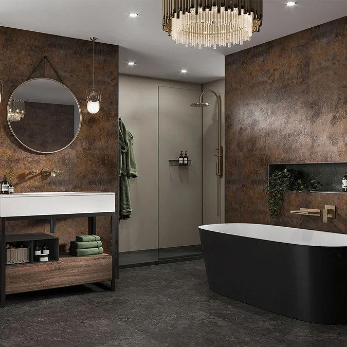
Terracotta and Rust
For spaces embracing earthy, bohemian aesthetics, terracotta and rust tones complement brown subway tiles beautifully. These warm, clay-inspired hues create cohesive palettes celebrating natural materials and organic textures. Consider pairing brown tiles with terrazzo-look tiles for added visual interest.
Introduce these colors through textiles like throw pillows, area rugs, or window treatments. Terracotta planters and ceramic accessories reinforce earthy themes while adding functional decorative elements.
This color combination works exceptionally well in kitchens and dining areas where warm, welcoming atmospheres encourage gathering and connection.
Consider Lighting's Impact
Lighting dramatically affects how colors appear in your space. Both natural and artificial light alter brown subway tile perception and their complementary colors throughout the day.
Natural light changes from warm morning tones to cooler afternoon hues, affecting how brown tiles appear. Test your color selections at different times to ensure satisfaction with how they look in various lighting conditions. Visit our local showrooms in Reno, Minden, Sacramento, or Fernley to see tiles under various lighting conditions.
Artificial lighting also plays crucial roles. Warm-toned bulbs enhance brown's red and orange undertones, creating cozier atmospheres. Cool-toned LED lighting emphasizes gray or blue undertones, producing more contemporary feels.
Install adjustable lighting or use multiple light sources at different temperatures to control your space's mood and appearance. This flexibility allows you to highlight specific colors or create different atmospheres for various occasions.
Layer Textures for Added Depth
Texture adds visual interest and dimension to spaces, preventing them from appearing flat even within limited color palettes. When working with brown subway tiles, incorporate various textures to create dynamic, engaging environments. Tile Letter offers professional insights on combining textures effectively.
Consider matte finishes for walls and cabinetry to contrast with glossy brown subway tiles. This interplay between finishes adds depth without requiring additional colors. Our glossy 3D decorative subway tiles provide excellent textural contrast.
Natural materials like wood, stone, and woven fibers introduce organic textures complementing brown tiles' earthy qualities. Wooden cutting boards, stone countertops, and woven baskets add functional beauty while enhancing overall design.
Metallic finishes provide another textural layer. Brushed brass, copper, or bronze hardware pairs beautifully with brown tiles, adding warmth and subtle shine. For contemporary spaces, consider matte black or stainless steel fixtures offering sleek contrast. The Ceramic Tile Foundation provides guidance on incorporating various finishes and protecting tile edges during installation.
Material Selection Matters
When choosing brown subway tiles, understanding material differences helps you make informed decisions. Ceramic versus porcelain tiles offer different benefits depending on your application. Porcelain tiles provide superior durability and water resistance, making them ideal for high-moisture areas like bathrooms and showers.
Ceramic tiles meeting ANSI A137.1 standards ensure quality and performance. Browse our tiles by type collection to compare ceramic and porcelain options in various brown tones.
Consider tile size when planning your design. Traditional 3x6 subway tiles offer classic appeal, while larger formats create more contemporary looks. Explore our tiles by size to find dimensions that work best for your space.
Conclusion
Selecting colors that complement brown subway tiles transforms your space from ordinary to exceptional. By understanding your tile's undertones, choosing grout strategically, and selecting colors that align with your design vision, you create harmonious, inviting environments with lasting appeal. Whether you prefer classic combinations like soft whites and muted greens or contemporary pairings featuring navy blue and gray, the possibilities are endless.
At Nova Tile and Stone, we're committed to helping Northern Nevada and Northern California homeowners bring their design visions to life. Visit our showrooms in Reno, Minden, Sacramento, or Fernley to explore our brown subway tile selections and take advantage of our $1 sample program.
Our design consultations are always free, and our experienced team can guide you through color selection, grout choices, and installation planning. Learn more about us and discover why we're the trusted tile partner for your project. Browse our complete tile shop or contact us today to get started on transforming your kitchen or bathroom with the perfect brown subway tile palette!
Featured Products
Frequently Asked Questions
What's the best way to determine if my brown subway tiles have warm or cool undertones?
Place a piece of white paper or white tile next to your brown subway tiles. The contrast will reveal underlying tones. Warm browns show red, orange, or yellow hints, while cool browns display gray, taupe, or blue undertones. Test this in both natural daylight and artificial lighting for the most accurate assessment.
Should I match my grout to my brown subway tiles or choose a contrasting color?
This depends on your desired aesthetic. Matching grout creates seamless, unified looks perfect for minimalist and traditional styles. Contrasting grout (like dark charcoal with lighter brown tiles) emphasizes patterns and works well in contemporary or industrial designs. Consider your overall design style and whether you want tiles to blend or stand out.
Can I use brown subway tiles in a small bathroom without making it feel dark?
Absolutely! Pair brown subway tiles with bright whites, light creams, or soft grays to maintain airiness. Maximize natural light, use glossy tile finishes that reflect light, and incorporate mirrors to enhance brightness. Consider using brown tiles as accent walls rather than covering all surfaces, balancing them with lighter colors elsewhere.
What metal finishes work best with brown subway tiles?
Warm metals like brushed brass, copper, and oil-rubbed bronze complement brown's natural warmth beautifully. For cooler brown tiles with gray undertones, consider brushed nickel or matte black fixtures. Chrome and stainless steel work well in contemporary settings where you want to balance brown's warmth with cooler tones.
How do I prevent my brown subway tile design from looking outdated?
Choose timeless color combinations and avoid trendy colors that may quickly feel dated. Classic pairings with whites, creams, and soft grays provide lasting appeal. Focus on quality materials, clean lines, and balanced proportions. Incorporate contemporary elements through easily updated items like hardware, lighting, and accessories rather than permanent fixtures, allowing you to refresh your space's look without major renovations.