Mixing subway tile colors allows you to create personalized backsplash designs that reflect your style while adding depth and visual interest to kitchens and bathrooms. By combining two or more tile colors in intentional patterns, you can establish focal points, define zones, or introduce subtle gradients that elevate standard installations into custom design statements. The key lies in selecting colors with compatible undertones and arranging them in patterns that enhance rather than overwhelm your space, whether you're exploring herringbone subway tile backsplash layouts, chevron subway tile arrangements, or creative backsplash ideas that blend multiple hues.
The flexibility of subway tile layouts makes color mixing accessible for any skill level. You might pair crisp white tiles with charcoal gray for dramatic contrast, blend soft pastels for gentle transitions, or incorporate colored subway tile accents within neutral fields to highlight architectural features. Understanding how different patterns and color placements affect spatial perception-along with broader tile selection considerations helps you make confident decisions about proportion, placement, and grout color selection. This guide examines proven strategies for combining subway tile colors, covering pattern selection, color theory basics, and practical installation considerations.
Color Relationships That Create Balanced Designs
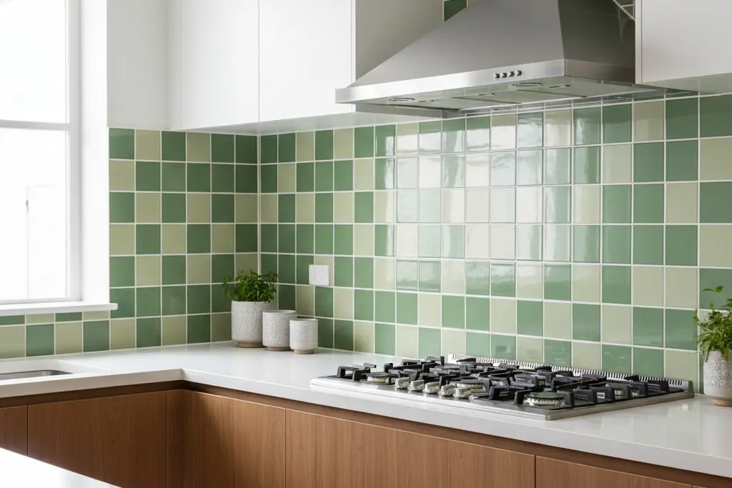
Successful color mixing starts with understanding how different hues interact. Analogous colors sit adjacent on the color wheel, sharing common undertones that create harmonious combinations. Pairing sage green tiles with soft blue creates calming designs ideal for bathrooms. Complementary colors sit opposite each other, delivering high-contrast drama. Navy blue tiles mixed with warm terracotta produce striking visual impact suitable for statement backsplashes. Monochromatic schemes use varying shades of the same color, offering subtle depth without competing tones.
Temperature compatibility matters as much as hue selection. Cool colors containing blue, gray, or green undertones work together naturally, just as warm colors with yellow, orange, or red undertones create cohesive groupings. White tiles with cool undertones pair beautifully with grays and blues, while cream tiles with warm undertones complement beiges and taupes. The Bristol 3x8 Glossy Subway Tile demonstrates how surface finish affects color perception. Testing sample combinations under your actual lighting conditions reveals how colors interact throughout the day.
Proportion determines visual impact when combining colors. The 60-30-10 rule provides a reliable framework: use your dominant color for 60% of the field, a secondary color for 30%, and an accent color for 10%. This distribution creates balanced compositions that feel intentional rather than random. Alternatively, the 80-20 approach places one color as the overwhelming majority with accent colors providing punctuation. Consider how your tile selections by color coordinate with existing elements like countertops, cabinets, and flooring.
Pattern Techniques for Multi-Color Subway Tile Installations
Alternating rows create the simplest color-mixing pattern while delivering substantial visual impact. Install one color in complete horizontal rows, then switch to a second color for adjacent rows. This approach works particularly well with contrasting colors, as each row maintains clear definition. Vary row heights for more complex rhythms by installing three rows of white followed by one row of navy.
Checkerboard patterns alternate tiles within individual rows, creating frequent color transitions. This technique generates busy, energetic surfaces suitable for small accent areas. Reduce visual intensity by using colors with subtle differences rather than high-contrast combinations. The geometric precision required makes porcelain subway tiles with consistent dimensions preferable.
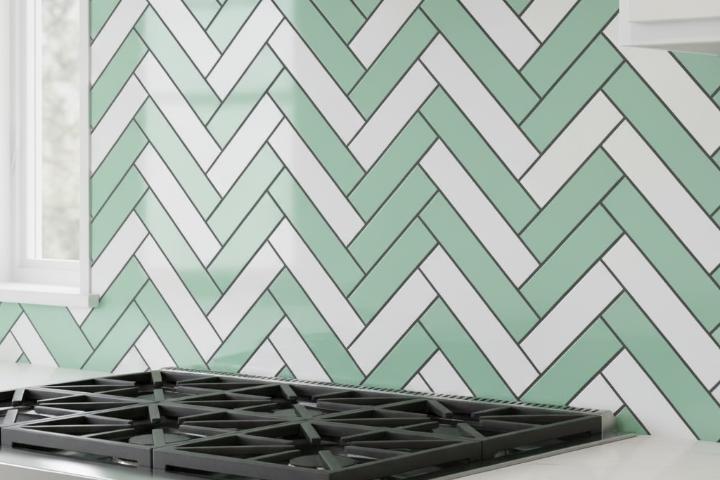
Gradient transitions blend colors progressively from light to dark or between distinct hues. Start with your lightest color at one end, gradually introducing your medium tone, and finishing with the darkest shade at the opposite end. This ombre effect creates sophisticated, contemporary statements that work beautifully in vertical subway tile applications. The Matte Porcelain Subway Tile offers excellent versatility for accent applications.
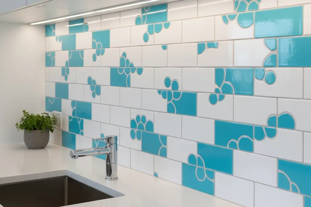
Random dispersion scatters accent tiles throughout a predominantly neutral field without following specific patterns. This organic approach suits relaxed, informal spaces where perfect symmetry feels too rigid. For more structured complexity, basketweave subway tile patterns alternate horizontal and vertical tile pairs to create textile-inspired designs. Establish rules for distribution to prevent clustering, such as maintaining minimum spacing between accent tiles. Random placement works best when accent colors comprise less than 20% of the total installation. Professional designers through the National Kitchen and Bath Association often recommend testing multiple pattern options before finalizing design decisions.
Grout Color Decisions That Affect Final Results
Grout color dramatically influences how mixed-color installations read visually. Matching grout to your dominant tile color creates seamless appearances where individual tiles blend together. Use light gray grout with predominantly white tiles mixed with light blue accents to maintain cohesion. Contrasting grout emphasizes the grid pattern and individual tile shapes. Black grout with white and gray mixed tiles produces bold, contemporary statements where the subway tile with dark grout treatment amplifies the geometric nature of your pattern.
Multi-color installations with more than two tile colors often benefit from neutral grout that doesn't favor any single hue. Medium gray grout serves as universal mediator, working equally well with cool blues, warm beiges, and neutral whites. Consider how grout color affects perceived temperature of your overall scheme. Grout width impacts pattern clarity and maintenance requirements. Standard 1/8-inch spacing provides enough definition for most subway tile kitchen ideas while simplifying cleaning. The technical guidelines from ANSI recommend specific joint widths based on tile size and application.
Material Considerations for Color-Mixed Projects
Material consistency ensures uniform performance across color-mixed installations. Stay within single material categories when mixing colors, choosing all ceramic or all porcelain tiles rather than blending material types. Review available tile materials to understand performance characteristics before committing to your color selections. Porcelain tiles offer superior density and moisture resistance, making them ideal for bathroom applications. Their through-body color construction means chips reveal the same color as the surface. Explore different tile types to understand how material properties affect color mixing possibilities.
Match surface finishes across all colors to maintain visual consistency. Mixing finishes creates unintended focal points as light reflects differently from varying surfaces. The three-dimensional subway tiles add another dimension through sculptural surfaces that cast shadows beyond flat color variations. When planning installations that combine subway tile bathroom trends with modern design principles, consistent sizing across all colors simplifies layout and prevents lippage. According to standards from the Ceramic Tile Foundation, proper tile edge protection becomes especially critical in color-mixed designs where misaligned pieces disrupt visual patterns. Order 10-15% extra beyond calculated needs for cuts, breakage, and future repairs. Browse complete tile selections by size to understand dimension options. The Natural Stone Institute provides additional guidance on mixing natural stone subway tiles with manufactured options when creating unique color combinations.
Comparison: Ceramic vs Porcelain for Color-Mixed Designs
Feature | Ceramic Subway Tiles | Porcelain Subway Tiles |
Color Range | Wider variety of bright, bold colors | More limited palette but consistent through-body color |
Water Absorption | Higher porosity requires sealing | Extremely low porosity naturally resists moisture |
Cost | Lower initial investment | Higher upfront cost but superior long-term value |
Durability | Adequate for residential backsplashes | Superior resistance to chips and heavy use |
Installation | Easier to cut for outlet placements | Requires diamond blades and more experience |
Best Applications | Interior walls, decorative backsplashes | All applications, especially high-moisture zones |
Mini Step-by-Step Guide: Planning Your Color Mix
Step 1: Define Your Color Palette Select 2-3 tile colors that coordinate with existing finishes in your space. Use physical samples from showrooms rather than digital images. Test samples against countertops, cabinets, and paint colors under both natural and artificial lighting.
Step 2: Choose Your Pattern Type Decide whether alternating rows, checkerboard, gradient, or random dispersion best suits your design goals and skill level. Sketch your pattern to scale on graph paper. Simpler patterns prove more forgiving during installation and typically age better.
Step 3: Calculate Tile Quantities by Color Measure your backsplash area in square feet, then calculate the percentage each color occupies based on your pattern design. Add 10-15% waste factor to each color's requirement. Order all tiles simultaneously to ensure batch consistency. Explore the full product catalog to identify backup options.
Step 4: Select Compatible Grout Color Choose grout that either matches your dominant tile color for subtle integration or contrasts all colors for graphic emphasis. Order grout samples and test them against your tile combination. Consider maintenance implications, selecting darker grouts for easier upkeep.
Step 5: Test Your Layout Before Installation Dry-lay at least 3 square feet of your pattern without adhesive to confirm color balance and visual appeal. Photograph the dry layout from various angles. This testing phase prevents expensive mid-installation changes. Professional installers certified by industry standardsrecommend this approach for all color-mixing projects. Visit resources like Coverings expo for additional inspiration.
Begin Your Color-Mixing Journey
Creating custom backsplashes through color-mixed subway tiles transforms standard installations into personalized design statements that reflect your unique style. The techniques covered here provide frameworks for successful projects whether you're combining two subtle shades or orchestrating complex multi-color patterns. Start your planning process by exploring complete tile collections organized by style to understand available colors, finishes, and sizes that suit your vision.
Frequently Asked Questions
Can I mix different tile sizes when combining colors?
Mixing tile sizes alongside colors creates extremely complex installations requiring advanced planning and exceptional installation skills. The different dimensions complicate pattern layout and grout line alignment. If you want size variety, consider using standard subway tiles for your main field and introducing differently sized accent tiles as borders rather than integrating them randomly. When size mixing seems essential, consult qualified installers who understand the challenges involved.
How do I prevent my color-mixed pattern from looking too busy?
Limit your palette to two or three colors maximum, using one color as the clear dominant choice occupying at least 60% of the installation. Increase pattern scale by alternating colors in larger blocks rather than individual tiles. Select colors with subtle differences rather than stark contrasts. Maintain consistent grout color throughout the installation. Reference historic tile applications for inspiration showing timeless approaches to multi-color installations.
Should I match tile finish (glossy vs matte) when mixing colors?
Yes, maintaining consistent finish across all colors prevents unintended visual disruptions. Glossy tiles reflect light dramatically, drawing attention to their locations regardless of color. Mixing glossy accent tiles into matte fields makes accents appear highlighted beyond your color choices alone. The only exception involves deliberate contrast where finish variation reinforces pattern goals.
How many tile samples should I order before committing to my color mix?
Order samples of every color you're considering for your mix, ideally 2-3 tiles per color to evaluate how they look adjacent to each other. Include samples of grout in your top two color choices for complete visualization. Test combinations in your actual space for at least one complete day cycle. This investment of perhaps $10-20 in samples prevents thousand-dollar mistakes. Many retailers including established showrooms offer sample programs.
Can I add colored tiles to an existing installation without replacing everything?
Adding colored accent tiles to existing neutral installations typically requires removing specific tiles to make room for new colors. Individual subway tiles can be carefully extracted using oscillating multi-tools. However, matching new grout to aged grout proves challenging. Review current bathroom trends to determine whether partial updates align with contemporary aesthetics.