Subway tiles in living rooms are rectangular wall tiles, typically measuring 3×6 inches, that create textured accent walls, fireplace surrounds, and architectural features in main living spaces. Originally designed for kitchens and bathrooms, these versatile tiles now serve as popular design elements that add depth, visual interest, and durability to living room walls without the maintenance requirements of traditional paint.
These tiles work effectively in living rooms because they reflect light to brighten spaces, provide easy-to-clean surfaces resistant to scuffs and marks, and offer installation flexibility through various patterns including herringbone, vertical stack, and chevron arrangements.
Available in colors ranging from classic white and soft neutrals to bold hues like navy blue and forest green, subway tiles complement design styles from modern minimalism to traditional interiors. The material's dimensional texture creates shadow effects and visual depth that flat painted walls cannot replicate, making it particularly popular for creating statement walls and focal points in contemporary living spaces.
Why Subway Tiles Work Beautifully in Modern Living Areas
The popularity of rectangular tiles in residential living spaces reflects growing interest in textural variety and architectural detail. Designers and property owners continue discovering how these adaptable materials establish focal points, separate areas, and inject personality into rooms that might otherwise lack visual appeal. Their charm stems from simplicity a straightforward rectangular profile that becomes a foundation for creative expression through shade selection, arrangement, and installation approach.
Living areas enhanced with this classic tile project distinctive appeal that merges nostalgic character with current design thinking. The linear nature creates visual flow and rhythm, guiding attention across surfaces while introducing spatial depth. Unlike standard painted walls that appear flat, tiled treatments capture and bounce illumination in shifting ways, producing delicate shadows and highlights that evolve as daylight moves through your space.
Exploring Color Options Beyond Traditional White
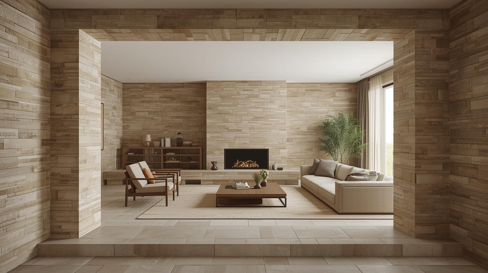
While pristine white maintains timeless status, current living area designs welcome stunning color palettes that expand creative possibilities. Gentle, subdued shades including sage green, dusty rose, and warm terracotta introduce organic coziness to gathering spaces, establishing environments that feel both refined and welcoming. These earth-inspired tones complement natural elements like wood and stone beautifully, creating unified design stories throughout your residence.
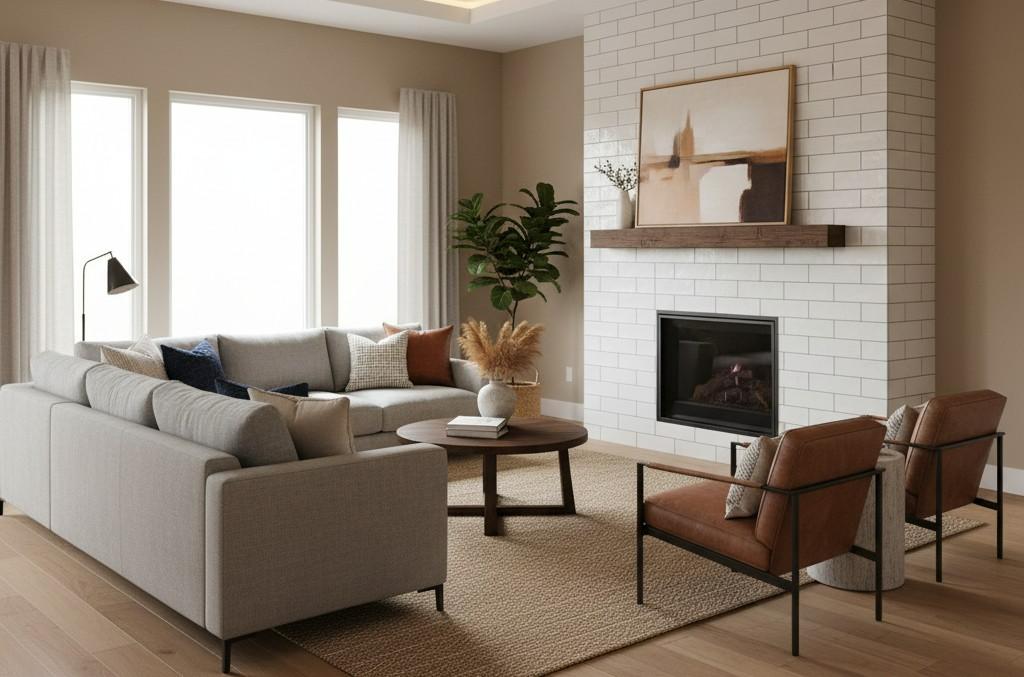
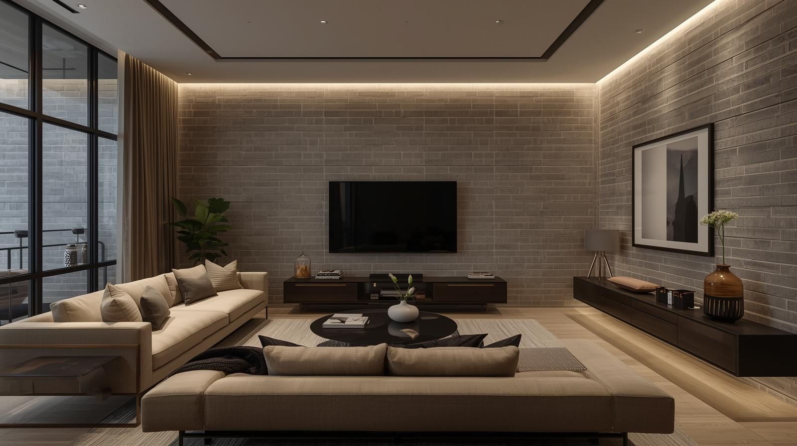
Rich, intense colors make powerful impressions in contemporary interiors. Navy blue, forest green, and charcoal gray options establish moody, cozy atmospheres ideal for relaxed evenings and elegant gatherings. These saturated tones excel as statement surfaces behind media centers or as presentation features for showcasing artwork and treasured items. Glossy finishes on darker shades contribute luxurious dimension, while matte alternatives deliver more subtle, current appeal.
Metallic and iridescent options represent forward-thinking living area trends. Copper, brass, and bronze-toned selections bring warmth and sophistication, capturing illumination in captivating ways. Pearlescent treatments produce gentle color variations based on viewing perspective and lighting circumstances, introducing surprise and visual fascination.
Creative Layout Patterns That Command Attention
Traditional horizontal brick arrangements remain favored, yet current interior designs investigate innovative layouts that transform basic rectangles from ordinary to extraordinary. Vertical stacking produces an elongating impression that makes ceilings appear taller and rooms feel more generous. This contemporary method works particularly well in spaces with modest ceiling heights or limited dimensions.
Herringbone arrangements introduce lively energy and refined geometry to wall surfaces. This classic configuration, where pieces converge at 45-degree angles forming distinctive V-shapes, generates visual fascination without dominating the environment. Herringbone layouts perform beautifully as fireplace treatments, statement walls, or complete room applications, depending on your preferred impact level.
Basket weave and chevron arrangements provide additional alternatives for those pursuing distinctive visual appeal. Basket weave alternates horizontal and vertical pairs producing a woven impression, contributing textural complexity to surfaces. Chevron arrangements, with their sharp, continuous zigzag lines, introduce contemporary dynamism into interiors and perform exceptionally well in modern or mixed-style rooms.
Optimal Placement Strategies for Maximum Impact
Statement surfaces represent the most favored application in living rooms, with excellent reason. A tiled accent wall behind your seating, opposite your primary sitting arrangement, or surrounding a fireplace establishes an immediate focal point that grounds the room's aesthetic. The textured treatment introduces dimension without conflicting with furnishings or artwork, delivering refined backdrop enhancement rather than visual competition.
Fireplace treatments transformed with rectangular tiles become architectural highlights that demand notice. Whether selecting a complete floor-to-ceiling approach or a contained surround, this material delivers heat-resistant beauty and enduring appeal to natural gathering locations. Clean edges complement both traditional mantels and contemporary linear fireplaces, proving remarkably adaptable across various aesthetics.
Partial wall treatments provide balance for those who appreciate this style but prefer avoiding overwhelming applications. Wainscoting-style installations, where material covers lower wall portions topped with trim or molding, contribute architectural distinction while preserving open upper areas. This strategy performs beautifully in transition zones connecting living rooms to dining spaces.
Built-in shelving and recessed areas gain architectural importance when backed with rectangular tiles. Media centers, bookcases, and display niches transform from basic storage into design highlights when lined with material in harmonizing or contrasting shades.
Surface Finishes That Define Space Character
Glossy treatments remain the most recognized option, providing reflective qualities that distribute illumination around interiors and establish spaciousness. The shine contributes sophistication and performs particularly well in spaces with restricted natural light, helping brighten and energize rooms. Options like this glossy finish exemplify this bright, reflective aesthetic.
Matte and satin treatments deliver softer, more current alternatives suiting modern and minimalist preferences. These restrained surfaces establish calm, peaceful environments without the visual intensity of glossy alternatives. Matte finishes conceal fingerprints and smudges more effectively than glossy counterparts, making them practical selections for busy areas or residences with children and pets.
Handmade and artisan pieces bring organic variations and personality that factory-produced alternatives cannot duplicate. Slight differences in shade, thickness, and surface quality produce depth and authenticity, giving interiors a curated, collected-over-time impression. These premium selections often showcase crackle glazes, hand-painted details, or irregular edges that contribute artisanal appeal.
Three-dimensional and beveled options like these dimensional tiles generate dramatic shadow effects and architectural depth. Raised surfaces capture illumination differently throughout the day, producing constantly changing visual fascination. Beveled edges contribute subtle sophistication, establishing defined borders that enhance geometric precision of layouts.
Exploring Dimensional Variety
Traditional 3x6-inch dimensions maintain popularity due to perfect proportions and versatility. This classic size functions in virtually any room and complements both traditional and contemporary design approaches. The familiar scale feels approachable and enduring, making it a reliable yet stylish selection.
Larger format options, typically 4x12 or 4x16 inches, establish streamlined, modern aesthetics with fewer grout lines and cleaner visual continuity. Oversized formats make spaces feel more expansive and current, functioning particularly well in open-concept areas where uninterrupted surfaces enhance continuity.
Mini versions, around 1x3 or 2x4 inches, introduce delicate detail and vintage appeal to interiors. These selections produce intricate visual texture and function beautifully in smaller accent zones or as borders and trim within broader tiled sections.
Mixed sizing produces custom appearances that demonstrate design sophistication. Combining different dimensions within identical installations perhaps larger pieces on primary surface areas with smaller versions as border or accent bands contributes visual fascination and demonstrates thoughtful design planning.
Complementary Design Elements and Coordination
Grout shade selections dramatically influence the overall impression of your installation. Matching grout establishes seamless, monochromatic appearances where pieces blend together for unified surfaces. This strategy performs beautifully with white or light-colored options, producing clean, spa-like serenity. Contrasting grout emphasizes the geometric arrangement of your layout, contributing definition and graphic fascination. For proper technique, consult professional installation resources.
Furniture and decor pairings should enhance rather than compete with your tiled features. Natural wood furniture introduces warmth that balances the coolness of ceramic material, establishing harmonious contrast. Metal accents brass, copper, or matte black echo the linear quality while contributing distinct textural fascination. Soft textiles like plush rugs, velvet upholstery, and woven throws deliver essential tactile contrast to hard, smooth surfaces.
Lighting plays a crucial role in showcasing beauty. Wall sconces positioned to graze across tiled surfaces emphasize texture and generate dramatic shadow effects. Natural light interactions shift throughout the day, making tiled interiors feel dynamic and alive as sunlight moves and produces different reflective patterns.
Art and accessories gain impact when displayed against these backgrounds. The neutral, textured surface acts as refined gallery presentation, allowing artwork, photographs, and decorative objects to command attention without visual competition.
Design Approaches That Welcome This Material
Modern minimalist interiors find perfect expression through neutral palettes with clean, simple layouts. Monochromatic white, gray, or black options in traditional horizontal or vertical stacks establish serene backdrops that emphasize form, light, and space over ornamentation. Classic ceramic options work beautifully for minimalist aesthetics.
Industrial aesthetics embrace this material as authentic nods to urban warehouse and loft conversions. Exposed brick paired with white rectangles establishes textural contrast that defines industrial style. Darker grout lines emphasize the geometric grid arrangement, reinforcing the structured, utilitarian beauty characterizing this design method. Textured surfaces add dimensional interest perfect for industrial spaces.
Scandinavian design principles align naturally with this aesthetic. The emphasis on simplicity, functionality, and connection to natural light makes light-colored options ideal for Nordic-inspired spaces. Soft whites, pale grays, and gentle pastels produce bright, airy environments central to Scandinavian style.
Traditional and transitional spaces incorporate this material to bridge classic and contemporary sensibilities. Pairing ornate crown molding with clean-lined wainscoting establishes beautiful juxtaposition. Rich wood tones, traditional furniture silhouettes, and classic color palettes gain fresh relevance when balanced with simple geometry. Elegant porcelain choices offer traditional elegance with modern durability.
Conclusion
Living room applications have transformed from basic building material to design statement, providing remarkable opportunities to introduce texture, shade, and architectural fascination to your residence's most important gathering space. The adaptability of these straightforward rectangular pieces belies transformative power whether selecting classic white in traditional arrangements or embracing bold shades and innovative layouts, this material delivers sophistication and style to interiors of all dimensions and design preferences.
At Nova Tile and Stone, we offer extensive collections perfect for transforming your living room. Visit our showroom to experience diverse colors, finishes, sizes, and specialty options that bring your vision to reality. Learn more about us and explore the premium brands we carry from leading manufacturers. Our team provides complimentary design consultations to help you select ideal materials, arrangements, and complementary elements for your specific space and aesthetic preferences.
This represents an investment in enduring design that won't feel dated in coming years. According to market trends, lasting appeal combined with contemporary innovations in shade, finish, and dimension ensures your interior will remain stylish and relevant for years ahead. Whether planning renovations or pursuing single impactful change, this classic material offers perfect balance of timeless appeal and modern sophistication. Explore our complete selection organized by material type and premium porcelain to find your perfect match.
Frequently Asked Questions
What colors work best for living room applications?
The ideal shades depend on your desired atmosphere and existing decor. Classic white remains universally favored for timeless appeal and light-reflecting properties that make spaces feel larger and brighter. For those pursuing more personality, soft neutrals like warm grays, beiges, and greiges deliver subtle sophistication without overwhelming interiors. Earthy tones including sage green, dusty rose, and terracotta establish organic, inviting environments perfect for cozy gathering areas. Bold property owners can embrace dramatic alternatives like navy blue, forest green, or charcoal gray for moody, intimate spaces.
Can this material make compact living rooms appear more spacious?
Absolutely! Visual expansion of compact interiors happens through several design strategies recommended by professionals. Light-colored options, particularly whites and soft grays, reflect natural and artificial illumination, producing airy, spacious feeling. Glossy treatments enhance this effect by bouncing light around rooms. Installing in vertical arrangements draws eyes upward, making ceilings appear taller and rooms feel more expansive. Larger format options with minimal grout lines establish cleaner, less interrupted surfaces that trick eyes into perceiving greater space.
How does this compare to painted walls in living rooms?
This material provides distinct advantages over paint, though both have places in interior design. It delivers dimensional texture and depth that flat paint cannot duplicate, establishing visual fascination through shadow effects and light reflection. Exceptional durability and resistance to scuffs, marks, and damage easily affect painted surfaces particularly important in busy gathering areas. However, this represents more significant upfront investment and design commitment. Paint provides easier shade changes and complete design flexibility. Many property owners find perfect balance by combining both using tiled treatments as statement features while keeping larger surface expanses painted. For inspiring design ideas, explore professional portfolio examples.
What arrangements create most visual fascination?
Beyond traditional horizontal brick layout, several configurations dramatically elevate aesthetics. Herringbone, where pieces meet at 45-degree angles forming V-shapes, establishes sophisticated geometric fascination that adds movement and energy. Vertical stacking generates modern, streamlined appearances while visually heightening spaces. Chevron brings contemporary edge through continuous zigzag lines that establish dynamic focal points. Basket weave alternates horizontal and vertical pairs for woven texture. Consider your room's proportions, furniture placement, and overall aesthetic when selecting configurations. For installation best practices and repair guidance, consult certified tile installers.
Is this material appropriate for all living room design approaches?
This demonstrates remarkable versatility across virtually all design aesthetics when selected and styled thoughtfully. Modern and contemporary spaces embrace clean lines and minimalist geometry. Industrial interiors appreciate warehouse origins and urban authenticity. Scandinavian design values simplicity and light-enhancing properties. Traditional residences incorporate as wainscoting or fireplace treatments that bridge classic and current. The key lies in selecting appropriate shades, treatments, and arrangements for your specific style. Understanding material comparisons helps ensure you choose options perfectly suited to your needs. Adaptability explains enduring popularity across changing design trends.