Green subway tiles for kitchens are ceramic, glass, or porcelain tiles measuring 3x6 inches that come in shades like sage, emerald, mint, seafoam, olive, and forest green.
These tiles transform kitchen backsplashes by offering durability, easy maintenance, and timeless appeal while creating calming, nature-inspired spaces. Available at Nova Tile and Stone, they work best with white or cream cabinets, require only mild soap and water for cleaning, and pair well with brass, gold, or matte black fixtures.
Lighter shades like sage and mint suit small kitchens, while deeper tones like emerald need abundant natural light to prevent spaces from feeling cramped.
Why Choose Green Subway Tiles for Kitchens
The resurgence of green in interior design has brought this versatile color to the forefront of culinary trends. These tiles offer the perfect balance between making a statement and creating a calming atmosphere. Unlike bold reds or stark blacks, green tones work harmoniously with natural light and complement a wide range of cabinet colors and countertop materials.
This hue is inherently connected to nature, bringing a sense of tranquility and freshness to your cooking space. Such psychological benefits make the area feel more inviting and less sterile than purely white or gray schemes. The color is also associated with health and vitality, making it an unconsciously appealing choice for a space centered around food preparation and family gathering.
From a practical standpoint, these tiles are incredibly forgiving when it comes to showing dirt, water spots, and minor stains. While white surfaces can quickly show discoloration, and dark ones reveal every water droplet, green sits in a sweet spot that maintains its appearance with minimal maintenance.
Popular Shades for Kitchen Applications
The world of green subway tiles extends far beyond a single shade. Understanding the different tones available will help you select the perfect option for your culinary space's aesthetic and lighting conditions.
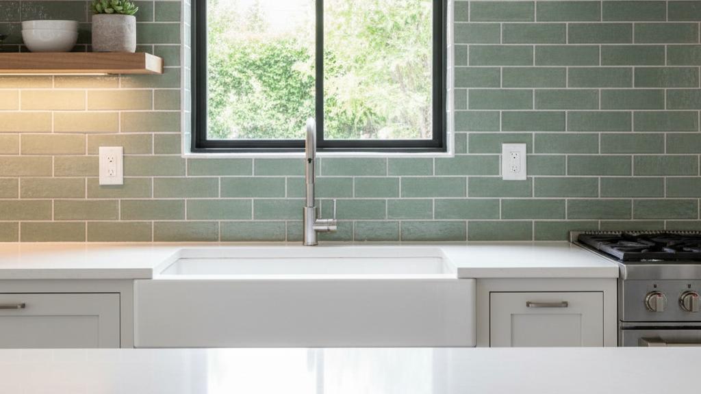
Sage has become one of the most sought-after options for backsplashes. This muted, gray-green tone offers sophistication without overwhelming the space. Sage pairs beautifully with white or cream cabinets, brass or gold fixtures, and natural wood accents. The subtle nature makes it suitable for both traditional and contemporary settings.
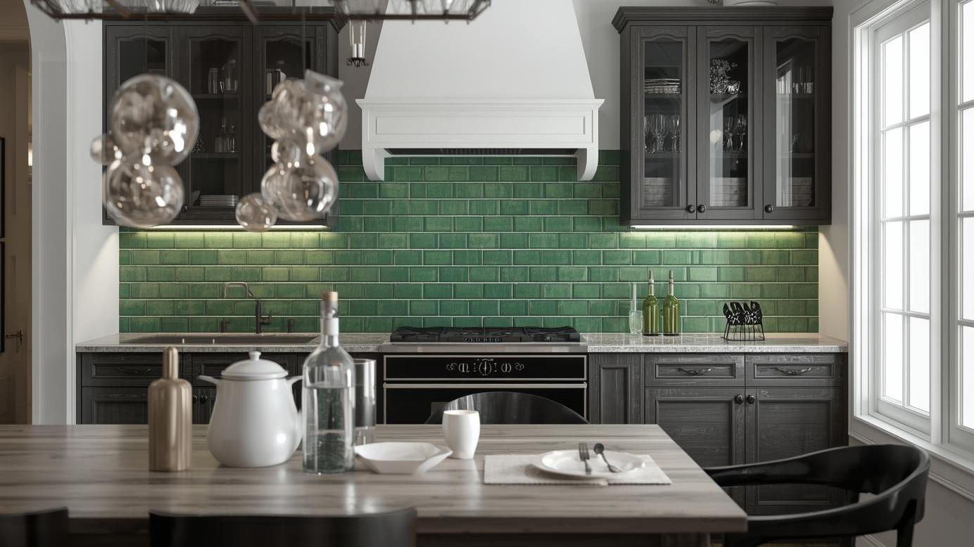
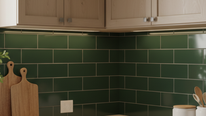
Emerald and Forest tiles make bold, dramatic statements. These deeper, richer tones work exceptionally well in spaces with plenty of natural light or as accent walls. When paired with white grout, emerald creates striking contrast that draws the eye and becomes a focal point. These darker options complement marble countertops, dark wood cabinets, and black or matte fixtures beautifully.
Mint and Seafoam bring a lighter, more playful energy to culinary spaces. These pastel tones are perfect for creating a vintage-inspired or cottage-style atmosphere. Mint evokes 1950s charm while still feeling fresh and modern. They work particularly well in smaller kitchen areas where darker colors might make the space feel cramped.
Olive and Hunter represent earthy, organic options that have gained popularity in recent years. These warmer selections have brown or yellow undertones that create cozy, inviting atmospheres. Olive pairs exceptionally well with natural materials like wood, stone, and terracotta.
Design Ideas for Implementation
The versatility of green subway tiles opens up countless design possibilities. Here are some inspiring approaches to incorporating these tiles:
Full Backsplash Coverage remains the most popular application. Extending tiles from countertop to upper cabinets creates a cohesive, polished look. This approach works particularly well with sage or mint, as the lighter tones won't overwhelm even when covering large areas. Browse tiles by size to find dimensions that suit your project.
Accent Wall Applications allow you to incorporate deeper hues like emerald or forest without dominating the entire space. Consider tiling just one wall behind the stove or sink area, using green as a focal point while keeping other walls neutral. For expert guidance on kitchen layouts, consult the NKBA planning guidelines.
Mixed Material Combinations add texture and visual interest. Try combining subway tile options with open shelving, exposed brick, or contrasting tile shapes. For instance, you might use these on the main backsplash and incorporate mosaic tiles in the same shade as a border or behind the range.
Two-Tone Grout Designs create stunning visual effects. While white grout offers classic contrast, consider dark gray or even black grout with lighter tiles for a more contemporary, graphic look. Conversely, cream or light gray grout with darker options creates a softer, more organic appearance. Learn more about proper grouting techniques for best results.
Choosing the Right Shade
Selecting the perfect tone requires careful consideration of several factors. Your culinary space's natural lighting plays the most crucial role in how the color will appear throughout the day. Areas with abundant natural light can handle deeper options like emerald or hunter without feeling dark or cramped. Spaces with limited natural light benefit from lighter shades like sage, mint, or seafoam.
Cabinet color significantly influences which option will work best. White and cream cabinets provide a neutral backdrop that allows any shade to shine. Light wood or oak cabinets pair beautifully with cooler tones like sage or seafoam, while darker wood cabinets create stunning contrast with lighter mint or pale alternatives.
Your countertop material and color should harmonize with your tile choice. White marble or quartz countertops offer versatility and work with virtually any shade. Black or dark gray countertops create bold, modern aesthetics when paired with lighter tiles. Butcher block or wood countertops complement warmer tones like olive or moss.
Consider your hardware and fixture finishes as well. Brass, gold, and copper fixtures have warm undertones that look spectacular with sage, olive, and deeper options. Chrome, nickel, and stainless steel offer cooler tones that pair well with mint, seafoam, or emerald. Matte black fixtures work universally well, adding modern sophistication to any shade.
Styling Your Space
Once your tiles are installed, thoughtful styling completes the look. Plants and greenery enhance the natural vibe while adding life and texture to the area. Herbs in small pots along the backsplash create a functional and attractive display.
Artwork and decorative pieces should complement rather than compete with your tiles. In spaces with bold emerald or forest options, keep artwork simple and monochromatic. With lighter sage or mint alternatives, you have more freedom to incorporate colorful art and accessories. Explore design inspiration for creative styling ideas.
Textiles like tea towels, oven mitts, and seat cushions offer opportunities to pull colors from your tile palette or introduce complementary hues. Warm neutrals, soft pinks, and golden yellows all pair beautifully with various tones.
Lighting design dramatically affects how tiles appear. Under-cabinet LED lighting ensures your backsplash looks crisp and vibrant during evening hours. Pendant lights over islands or dining areas should have warm bulbs to prevent tiles from appearing too cool or sterile.
Material Options Available
Green subway tiles come in various materials, each offering unique characteristics and benefits. Ceramic options represent an accessible and practical choice, offering excellent durability and easy maintenance that makes them perfect for most applications.
Glass provides a luminous, high-end look that adds depth and dimension. The reflective quality of glossy ceramic tiles can make spaces appear larger and brighter, creating an elegant and sophisticated atmosphere.
Porcelain selections offer superior durability and stain resistance compared to ceramic alternatives. Their dense composition makes them highly resistant to moisture and wear, making them an excellent choice for high-traffic areas where longevity is a priority. Understanding the differences between porcelain and ceramic helps you make informed decisions.
Maintaining Your Backsplash
These tiles require minimal maintenance to keep them looking fresh and beautiful. Regular cleaning with warm water and mild dish soap prevents buildup of grease and food splatters. Avoid harsh chemical cleaners that can dull the glaze or damage grout over time.
For stubborn stains or grease buildup, create a paste using baking soda and water. Apply this gentle abrasive to problem areas, let it sit for a few minutes, then scrub gently with a soft brush or sponge. Rinse thoroughly with clean water.
Grout maintenance requires more attention than the tiles themselves. Clean grout lines regularly with a grout brush and appropriate cleaner. For persistent discoloration, oxygen bleach products safely brighten grout without harmful fumes. Address mold or mildew immediately with a mixture of vinegar and water or commercial mildew remover. Follow professional tile installation guidelines for long-lasting results.
Color Psychology in Design
Understanding color psychology helps explain why green has become such a favored choice. This hue promotes feelings of balance, harmony, and renewal. In spaces where families gather and meals are prepared, these emotional responses create welcoming environments that encourage connection and creativity.
Different shades evoke different moods. Lighter tones like mint and seafoam bring energy and freshness, making them ideal for morning routines. Mid-tones like sage offer calm sophistication suitable for any time of day. Deeper shades like emerald and forest provide grounding, anchoring effects that make spaces feel established and secure. Discover the latest kitchen trends for 2025 to stay ahead of design curves.
Complementary Design Elements
Successful implementation goes beyond just selecting the right tile shade. Consider how other elements interact with your backsplash choice. Flooring should either complement or provide subtle contrast light wood floors pair well with mid to deep tones, while darker floors work beautifully with lighter shades.
Window treatments affect how natural light interacts with your tiles. Sheer curtains allow maximum light penetration, making even deeper shades feel bright and open. Heavier curtains or blinds give you control over lighting intensity throughout the day.
Ceiling color often gets overlooked but plays an important role. White or cream ceilings help reflect light and prevent spaces from feeling closed in, especially when using deeper tile shades. Consider continuing lighter wall colors onto the ceiling for seamless flow. For comprehensive renovation planning, review these house renovation tips.
Long-Term Value Considerations
Investing in quality tiles pays dividends over time. These installations typically last decades with proper care, making them cost-effective compared to alternatives requiring frequent replacement. The timeless appeal of subway tile format combined with the enduring nature of green ensures your investment remains stylish. Consider exploring our complete product range for premium options.
Property value considerations matter too. Well-executed backsplashes increase home appeal to potential buyers. While ultra-trendy choices might date quickly, classic shades like sage or muted emerald maintain broad appeal across buyer demographics. According to market research, ceramic and porcelain tile demand continues to grow steadily.
Professional Installation Benefits
While some homeowners consider tackling tile installation themselves, professional installation ensures proper substrate preparation, precise layout, and expert grouting. Professional installers understand proper waterproofing techniques and can identify potential issues before they become problems. Check out tile replacement tutorials to understand the complexity involved. For personalized assistance, feel free to contact us for expert guidance.
Exploring Additional Options
Beyond standard subway formats, consider unique variations that add character to your space. Ridge or flat textured options provide dimensional interest, while elongated 3x12 formats create modern, streamlined appearances. For sophisticated designs, explore decorative subway tiles that feature 3D patterns or glossy finish options that reflect light beautifully.
Conclusion
Green subway tiles offer an exciting, versatile option that combines timeless appeal with contemporary style. From soft sage to dramatic emerald, the range of shades available through our color collection ensures you'll find the perfect tone to complement your space's unique character. These tiles provide not only stunning visual impact but also practical benefits including easy maintenance and durability.
Whether you're drawn to the calming nature of lighter tones or the bold sophistication of deeper hues, these tiles create spaces that feel both fresh and enduring. By carefully considering factors like natural lighting, cabinet colors, and hardware finishes, you can select the ideal shade that transforms your culinary area into a space you'll love for years to come.
The investment pays dividends through increased home value, personal enjoyment, and a space that stands out from generic white designs. With proper installation and simple maintenance, your backsplash will remain beautiful and functional through years of cooking, entertaining, and family memories. Browse tiles by type or visit our local showroom to explore options in person. Learn more about us and discover why we're the trusted choice for quality tiles, or shop our full inventory to begin your project today. Explore tiles by style to find the perfect aesthetic match.
Frequently Asked Questions
Do green subway tiles make a small space look smaller?
Not necessarily. Lighter shades like sage, mint, or seafoam actually help compact areas feel more open and airy. These softer tones reflect light effectively and create an illusion of spaciousness. However, very dark options like forest or hunter can make smaller spaces feel more enclosed, so reserve these dramatic shades for larger areas with plenty of natural light.
What cabinet colors work best with green subway tiles?
White and cream cabinets are the most versatile choices and work beautifully with any shade. Light natural wood cabinets complement cooler tones like sage and seafoam. Dark navy or black cabinets create stunning contrast with lighter mint or pale alternatives. For a cohesive look, consider two-tone cabinets with white uppers and darker lowers paired with medium-tone tiles.
Are green subway tiles just a passing trend?
While experiencing peak popularity currently, this is far from a fleeting trend. The connection to nature and psychological benefits give it staying power. Choosing classic shades like sage or muted emerald rather than extremely bright or neon variations ensures your space remains stylish for decades. The subway tile format itself is timeless, so the combination of classic tile shape with this color offers longevity.
How do I clean and maintain green subway tiles?
These are remarkably easy to maintain. For daily cleaning, simply wipe down with warm water and a soft cloth or sponge. For weekly deep cleaning, use mild dish soap and water. Avoid abrasive scrubbers that might scratch glazed surfaces. Focus extra attention on grout lines, cleaning them with a grout brush and appropriate cleaner monthly. Professional sealing of grout helps maintain stain resistance and protect against moisture damage.
Can I mix green subway tiles with other tile colors or shapes?
Absolutely! Mixing tiles adds visual interest and personality. Consider pairing these with white hexagonal tiles for a border or accent area. You can also create patterns by mixing two shades in checkerboard or geometric designs. Another popular option is using these for the main backsplash and introducing decorative patterned tiles behind the stove as a focal point. Just ensure your color palette remains cohesive with no more than three primary colors.