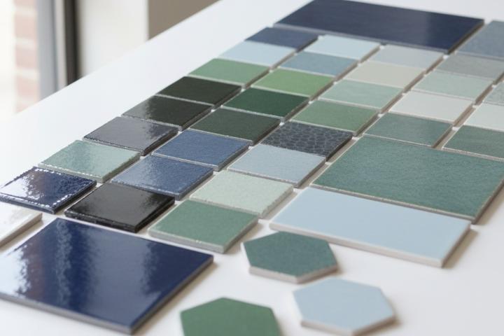
Cool-toned tiles in blues, greens, and grays create calming, sophisticated spaces by bringing nature-inspired hues indoors while maintaining versatility across traditional and contemporary designs. These colors work exceptionally well in bathrooms, kitchens, and living areas where you want serene atmosphere without sacrificing personality.
Whether selecting subway tile layouts in soft sage, planning modern subway tile patterns in charcoal gray, or exploring creative backsplash ideas with oceanic blues, cool tones deliver flexibility warm colors cannot match. The popularity of cool-toned palettes reflects design movements toward biophilic aesthetics connecting interior spaces with natural environments.
Blues evoke water and sky, greens reference foliage, while grays mirror stone and metal. These families adapt seamlessly to subway tile bathroom trends and subway tile kitchen ideas, functioning as neutral backdrops complementing wood tones, metallics, and accents more successfully than stark white. Understanding how cool tones interact with lighting, spatial dimensions, and surrounding materials helps you make confident selections.
When planning your project explore tiles organized by color to see the full spectrum available in multiple formats and finishes. This guide examines strategic approaches to incorporating cool-toned tiles, covering color psychology, pattern applications, finish considerations, and coordination with complementary elements.
Color Psychology and Spatial Perception With Cool Palettes
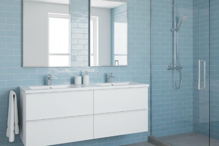
Blue tiles reduce perceived room temperature and create psychological associations with cleanliness, tranquility, and spaciousness. Lighter shades like powder blue expand visual boundaries in compact powder rooms, while deeper navy tones add sophistication to larger master bathrooms.
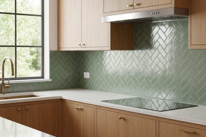
The color works particularly well in herringbone subway tile backsplash applications where pattern complexity benefits from cohesive color unity. Green tiles bridge warm and cool temperature categories depending on undertones. Sage, mint, and seafoam greens pair naturally with gray cabinetry and stainless steel fixtures, making them exceptional for kitchens and bathrooms.
Gray tiles function as true neutrals that ground color schemes without introducing temperature bias. Cool grays with blue undertones complement stainless appliances and chrome fixtures, while the range from light silver to dark charcoal provides options for every space, making gray the most versatile cool-tone option for tiles organized by style preferences.
Room-Specific Applications for Cool-Toned Subway Tile Success
Kitchen backsplashes in cool tones balance warm wood cabinetry and stainless appliances. Light blue 3x6 subway tiles in glossy finish reflect light in galley kitchens, while matte seafoam green reduces glare.
Vertical subway tile installations in pale gray elongate walls, making ceilings feel more generous. Bathrooms benefit from cool tones' associations with water and cleanliness.
Pale blue creates serenity in showers, while gray accent walls establish definition. Basketweave subway tile patterns in two cool tones provide sophisticated texture. Powder rooms accommodate bold experiments with deep teal linear 5x10 glossy 3D decorative subway tile creating memorable impressions.
Finish Selection and Light Interaction Considerations
Glossy finishes in cool tones amplify light reflection, making them strategic for spaces with inadequate illumination. High-gloss blue tiles bounce available light throughout small bathrooms, doubling perceived brightness. However, gloss shows water spots prominently, requiring more frequent maintenance.
Matte finishes absorb light, creating subdued atmospheres that feel organic. Matte gray tiles in subway tile with dark grout combinations deliver industrial aesthetics while hiding minor imperfections and providing slip resistance. Satin finishes offer middle ground with subtle sheen, working beautifully in kitchens without glare.
When browsing products organized by type, note how different finishes affect colors. Natural light direction influences cool tone appearance. North-facing rooms may make tiles feel cold without warm lighting balance, while south-facing spaces with warm sunlight benefit from cool tiles that counterbalance yellow light.
Pattern and Layout Strategies for Cool-Tone Installations
Herringbone patterns in single cool tones create visual movement without color complexity, making narrow galley kitchens feel wider and low-ceilinged bathrooms appear taller. Vertical installations elongate walls while maintaining simplicity that showcases tile color, working exceptionally well with subway tiles in various colors.
Chevron patterns introduce dynamic energy through sharp directional changes, working particularly well as accent walls behind ranges or vanities. Basketweave patterns combine multiple tile sizes to create traditional formality, delivering visual texture while maintaining color cohesion in entryways and mudrooms where durability meets aesthetics.
Coordination With Complementary Materials and Finishes
Wood elements provide essential warmth that prevents cool-toned spaces from feeling sterile. Light oak and maple cabinetry soften blue and gray tile installations, while walnut and cherry woods create sophisticated contrast against seafoam and sage greens.
Metal fixtures in cool finishes like brushed nickel, chrome, and stainless steel share cool undertones that harmonize with blue-gray tile selections, while oil-rubbed bronze and aged brass bring warmth that balances cooler selections. The terrazzo-look options available in cool tones demonstrate how speckled patterns integrate multiple materials visually while maintaining palette cohesion.
Comparison: Cool Tone Performance Across Different Spaces
Color Family | Best Room Applications | Natural Light Requirements | Maintenance Level | Design Longevity |
Light Blue | Bathrooms, powder rooms | Moderate to high | Low - hides water spots well | High - classic spa aesthetic |
Navy Blue | Accent walls, powder rooms | High - needs light balance | Medium - shows dust | High - timeless sophistication |
Sage Green | Kitchens, bathrooms | Low to moderate | Low - forgiving surface | High - bridges warm and cool |
Emerald Green | Powder rooms, accent walls | Moderate to high | Medium - shows water marks | Medium - trend-dependent |
Light Gray | Kitchens, bathrooms, showers | Flexible - works anywhere | Low - hides most marks | Very High - true neutral |
Charcoal Gray | Floors, shower bases, accent walls | Moderate to high | High - shows water spots, dust | High - modern classic |
Step-by-Step Guide: Selecting Your Perfect Cool-Toned Tile
Step 1: Assess Your Space's Natural Light Visit your room at different times to understand how natural light changes. North-facing spaces receive cool light that may intensify blue tones, while south-facing rooms benefit from cooler tiles balancing warm sunlight. Document light quality changes with photos.
Step 2: Evaluate Existing Materials Document cabinet colors, countertops, flooring, and fixtures. Determine if elements lean warm or cool to guide tile selection. Visit local showrooms with material samples to test tiles against actual elements.
Step 3: Request Physical Samples Digital representations prove inaccurate. Order samples of top selections and view them in your space under real lighting. Place samples against existing materials to evaluate compatibility. Many retailers including professional tile suppliers offer affordable sample programs.
Step 4: Consider Long-Term Flexibility Choose cool tones that complement potential future changes. Gray tiles work with more cabinet colors than specific blues or greens, providing flexibility for updates.
Step 5: Verify Installation Requirements Confirm your tile works with your substrate. Calculate actual costs including tile, grout, adhesive, and installation. Review available products to compare options within budget.
Pros and Cons of Cool-Toned Tile Selections
Advantages of Cool-Toned Tiles:
Create calming atmospheres reducing stress in bathrooms
Function as versatile neutrals coordinating with warm and cool accents
Expand spatial perception in compact rooms
Maintain design relevance across trend cycles
Hide soap scum and hard water deposits better than white tiles
Adapt to traditional and contemporary designs
Disadvantages of Cool-Toned Tiles:
May feel cold in limited-light spaces without warm material balance
Require careful undertone matching to avoid clashes
Show dust and water spots on darker selections
Limit future flexibility more than true neutrals
Can make north-facing rooms feel uninviting without warm lighting
May impact resale appeal outside mainstream preferences
Grout Selection Impact on Cool-Toned Installations
White grout creates maximum contrast with dark cool-toned tiles, emphasizing pattern and individual tile placement, though it requires more frequent cleaning as staining becomes visible quickly. Gray grout in matching tones creates seamless appearances where pattern dominates, working exceptionally well in modern designs.
Matching grout allows tile color to serve as the primary design element. Dark grout with light cool-toned tiles creates dramatic grid patterns emphasizing geometric precision. Subway tile with dark grout delivers pattern clarity making herringbone, chevron, and basketweave layouts visually distinct. Understanding tile installation standards ensures professional results.
Maintenance and Material Considerations
Porcelain tiles in cool tones deliver exceptional durability with through-body coloration that makes chips virtually invisible. Porcelain's low porosity prevents moisture absorption, making it suitable for freeze-thaw cycles. When comparing porcelain versus non-porcelain options, consider performance requirements.
Glazed ceramic offers affordable entry into cool-toned palettes, working beautifully in backsplash applications. Glass tiles create luminous installations but show water spots prominently. Understanding tile hardness scales and proper cleaning techniques helps maintain installations.
Professional Installation Best Practices
Substrate preparation determines installation longevity. Cement backer board provides superior performance in wet environments, while level substrates prevent lippage that creates shadows with glossy tiles. Full shower enclosures require waterproof membranes, while kitchen backsplashes need minimal waterproofing.
Layout planning centered on focal points like range hoods prevents awkward cuts. Resources from the National Kitchen and Bath Association, tile industry organizations, information about tile edge protection, tile history and applications, understanding certified installation standards, and layout principles ensure quality installations.
Conclusion
Cool-toned tiles in blues, greens, and grays create calming environments while accommodating diverse preferences. These colors provide sophisticated alternatives to stark white, functioning as contemporary neutrals.
Whether planning subway tile kitchen ideas with seafoam backsplashes or subway tile bathroom trends with charcoal showers, cool tones offer lasting flexibility. Success requires understanding how color, finish, pattern, and lighting interact. Physical samples viewed in actual spaces prevent costly mistakes.
Ready to enhance your space? Browse our selection or visit our showrooms in Reno, Sparks, Carson City, and Sacramento for guidance. Learn more about our commitment to helping Northern Nevada and Northern California homeowners. Explore tiles by size to find the perfect format.
Frequently Asked Questions
Do cool-toned tiles make rooms feel colder or less inviting?
Cool-toned tiles create psychological associations with water and sky that some interpret as cold, but proper balance with warm materials like wood, brass fixtures, and natural fiber textiles prevents spaces from feeling sterile. The color temperature affects perception more than actual room temperature, so strategic lighting and material coordination maintain inviting atmospheres while enjoying cool tones' calming properties.
Which cool tone works best for small bathrooms with limited natural light?
Light gray tiles offer the most flexibility for compact, low-light bathrooms since they expand spatial perception without the coldness risk that blue tones present in dim conditions. Glossy finishes maximize available light reflection, while warm light fixtures balance cool tile temperature. Sage green provides another excellent option that bridges cool and warm temperatures naturally.
Can I mix different cool tones in the same space?
Mixing cool tones works well when you maintain consistent color temperature and saturation levels. Pairing light blue with light gray creates cohesive designs, while combining navy with emerald green requires careful balance through shared undertones. Limit mixing to two cool tones maximum to prevent visual chaos, and use one as the dominant color covering 70% of surfaces while the second serves as accent covering remaining 30%.
How do I prevent cool-toned bathrooms from looking too clinical or institutional? Introduce natural materials like wood vanities, woven baskets, and plants to soften cool tiles' hard surfaces and add organic warmth. Layer textiles including bath mats, towels, and window treatments in warm neutrals. Install warm-toned light fixtures rather than cool white bulbs. Add metallic accents in brass or copper rather than chrome. These elements balance cool tiles while maintaining sophisticated aesthetics.
What's the best grout color for cool-toned tiles?
Gray grout matching your tile's value creates seamless modern appearances, while slightly darker gray adds subtle definition without white grout's high contrast and maintenance challenges. White grout suits traditional designs emphasizing pattern and individual tile placement, though it requires more frequent cleaning. Test grout samples with your actual tile before committing, as seemingly small color differences create surprisingly different visual results.