Subway tiles remain one of the most versatile and adaptable design elements for residential spaces in 2025. Originally developed as a functional solution for transit systems, these rectangular tiles have evolved into creative mediums for expressing personal style. This guide explores eleven contemporary design trends transforming how homeowners use subway tiles from curved installations on rounded surfaces to gradient color transitions, metallic accents, distressed vintage aesthetics, and integrated lighting effects.
What are modern subway tile trends? Contemporary applications include flowing installations on curved surfaces (creating organic movement), ombré gradient color transitions (soft color shifts from floor to ceiling), strategic metallic integration (rose gold, copper, brass accents), framed compositions (tiles as architectural borders), antiqued finishes (weathered, time-worn appearances), monochromatic maximalism (single-color richness with varied textures), material mimicry (wood-look and concrete-look porcelain), vertical orientations (height-enhancing installations), unexpected color pairings (burnt orange with sage green), rich jewel tones (sapphire, emerald, ruby), and backlit LED integration.
At Nova Tile and Stone, we help homeowners explore these design possibilities through personalized consultations, ensuring each installation reflects individual preferences while maintaining timeless appeal. Whether you're drawn to bold jewel tones, weathered vintage aesthetics, or cutting-edge lighting integration, these trends demonstrate how simple rectangular formats can create distinctive, memorable residential spaces.
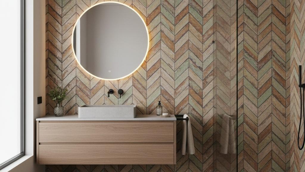
Flowing Installations on Rounded Surfaces
Breaking away from conventional flat installations, contemporary applications now embrace curved architectural features. Designers wrap these tiles around rounded kitchen islands, flowing backsplashes that sweep upward along walls, and even arched entryways throughout homes.
This technique demands precise placement with adjusted grout spacing, producing an optical effect of continuous movement despite the rectangular format. The outcome feels surprisingly natural, softening geometric rigidity while preserving recognizable characteristics. This method excels in environments balancing modern materials with welcoming forms, as highlighted by leading kitchen and bath professionals in their latest design research.
These rounded installations interact beautifully with natural light, casting changing shadow patterns throughout the day. In bathrooms, shower enclosures featuring this approach feel luxurious and enveloping without appearing stark or cold. The technique successfully bridges industrial aesthetics with organic design sensibilities in fresh, compelling ways.
Gradient Color Transitions
Moving beyond basic color blocking, sophisticated gradient installations transform walls into artistic expressions. These ombré effects might transition from deep navy at floor level to soft sky blue near the ceiling, or from rich burgundy to delicate blush across an accent wall.
What elevates this trend is the thoughtful intention behind each installation. Rather than random placement, these designs often reference natural phenomena sunrises, ocean depths, forest landscapes, or abstract emotional concepts. We help clients develop custom color palettes that tell meaningful stories through carefully selected shades.
Technical execution requires meticulous planning of color distribution. Some projects incorporate numerous shades for smooth transitions, while others embrace dramatic shifts for bold statements. The transformation occurs when functional surfaces become experiential elements that influence how occupants feel within a space, a concept explored extensively at industry-leading tile exhibitions.
Metallic Integration and Lustrous Details
While complete metallic installations have merit, refined applications involve strategic integration of metallic accents within standard configurations. Rose gold, brushed brass, copper, and iridescent finishes serve as accent strips, scattered insertions, or border details within predominantly ceramic or porcelain fields.
These metallic moments capture light in ways that add sophistication without overwhelming spaces. In kitchens, a single horizontal copper accent line through an otherwise neutral backsplash can coordinate beautifully with hardware and fixtures. In bathrooms, randomly placed iridescent pieces create jewel-like effects that feel elegant yet understated.
Pearlescent and mother-of-pearl finishes represent another evolution in this category. These tiles shift color based on viewing angle and lighting conditions, adding dynamism to static surfaces. They perform exceptionally well in powder rooms or smaller spaces where enchanting touches enhance the atmosphere.
Framed Compositions and Layered Designs
An emerging strategy treats tile fields as frames for complementary materials or embedded compositions. This might involve creating surrounds for different tile types in the center perhaps penny rounds or terrazzo-inspired designs effectively using rectangular tiles as architectural molding.
Some installations incorporate recessed niches lined with contrasting pieces, creating shadow boxes within larger fields. Others frame mirrors, windows, or artwork, blurring boundaries between functional surfaces and decorative elements. Proper edge protection techniques ensure these framed designs maintain their pristine appearance over time.
This approach proves particularly effective in open-concept layouts where visual separation without physical barriers is desired. A frame of bold-colored tiles around a cooktop area, for instance, can define the cooking zone without requiring different flooring or dividing walls.
Distressed and Vintage Aesthetics
Contrary to pristine perfection typically associated with these tiles, there's increasing interest in versions that appear weathered by time. Pieces with deliberately distressed edges, faded colors, crackled glazes, and uneven surfaces are valued for characterful imperfection.
This trend connects with broader movements toward wabi-sabi philosophy and appreciation for patina. Rather than appearing damaged, these tiles feel collected, as though salvaged from historic buildings or European estates. They bring instant character to new constructions and complement genuinely aged architectural elements in renovations.
Color palettes tend toward muted, sun-bleached tones faded terracottas, chalky whites, dusty blues, and soft greens that appear gently worn by time. When combined with antique or vintage furnishings, these surfaces create cohesive environments that feel layered and authentic, according to current design trends.
Single-Color Abundance
While minimalism has dominated recent years, a counter-movement embraces richness within constrained palettes. Monochromatic approaches mean covering expansive surfaces in a single color while varying finish, texture, and pattern to create visual depth.
Consider a bathroom where floor-to-ceiling tiles in various charcoal gray shades cover every surface, but some pieces are glossy, others matte, some three-dimensional, others flat. Different laying patterns might appear on different walls. The result is visually complex despite limited color range, creating spaces that feel enveloping without overwhelming.
This approach succeeds because the simple rectangular shape provides enough structure to prevent visual chaos even when used abundantly. Browse our collection organized by style to see how monochromatic elements ensure cohesion while varied textures and patterns maintain interest. It's particularly effective in smaller bathrooms or powder rooms where bold gestures create memorable impressions.
Material Mimicry
A fascinating development involves tiles designed to mimic other materials with remarkable realism. Porcelain pieces with advanced manufacturing feature incredibly realistic wood grain, concrete finishes, or even fabric textures that create unexpected juxtapositions.
The appeal extends beyond novelty. Wood-look tiles offer timber warmth with porcelain durability and water-resistance ideal for spaces where real wood proves impractical. Concrete-look versions provide industrial aesthetics without maintenance challenges and cold feel of actual concrete.
What makes this trend particularly engaging is how it plays with perception. From a distance, a backsplash might appear as weathered wood planks or concrete panels, but closer inspection reveals the familiar rectangular format. This element of surprise adds interactive quality to spaces they reveal themselves gradually rather than immediately. Learn more about our company and how we source these innovative materials.
Vertical Orientation and Height Enhancement
While horizontal orientation remains common, vertical installations are gaining traction, particularly where height emphasis is desirable. Installing tiles vertically in longer formats draws eyes upward and makes rooms feel taller and more expansive.
This orientation works exceptionally well in bathrooms with standard ceiling heights, creating illusions of additional vertical space. In kitchens, vertical pieces behind open shelving create striking backdrops that make displayed items visually prominent. Professional installers often reference proven layout strategies to ensure perfect vertical alignment.
Some designers take this further by mixing vertical and horizontal orientations within single spaces, using directional changes to define zones or create visual movement. A bathroom might feature vertical tiles on shower walls and horizontal pieces elsewhere, with orientation shifts marking functional separation. For those considering classic 3x6 dimensions, vertical installation offers a fresh perspective on traditional proportions.
Bold Color Combinations
While single-color installations dominate, adventurous color pairings are emerging that challenge conventional notions of coordination. Think burnt orange paired with sage green, mustard yellow with dusty purple, or coral with navy combinations that might seem risky but create striking, memorable spaces.
These pairings often draw inspiration from mid-century design, retro aesthetics, or nature's own surprising palettes. The key is balancing boldness with enough neutral elements in surrounding spaces to prevent visual fatigue. Explore various subway tile colors to discover unexpected combinations that work beautifully together.
Checkerboard patterns using unexpected color duos create playful, energetic surfaces perfect for powder rooms, mudrooms, or accent walls. Alternating rows of contrasting colors offer subtler ways to incorporate multiple hues while maintaining inherent orderliness. Browse by tile type to see how different materials take color differently.
Rich Jewel Tones
While jewel tones aren't entirely new, how they're being deployed in 2025 feels distinctly different. Rather than using them sparingly as accents, designers embrace full-commitment installations in rich sapphire blues, emerald greens, ruby reds, and amethyst purples.
These saturated colors transform tiles from background elements into statement-making focal points. They perform particularly well in spaces with ample natural light, where color depth can be fully appreciated and intensity doesn't become oppressive. Quality matters significantly look for tiles meeting industry standards for color consistency and durability.
The luxury association comes not just from rich colors but from how they're often paired with metallic grout, brass fixtures, or natural stone countertops that complement the bold hues. This creates environments that feel precious and intimate sumptuous spaces designed for sensory pleasure rather than neutral backdrop living.
Illuminated Installations
Forward-thinking projects incorporate LED strip lighting behind or between tiles, creating glowing effects that transform atmospheres after dark. Backlit glass pieces create ethereal, almost floating appearances, while integrated lighting along grout lines emphasizes grid patterns dramatically. Textured three-dimensional options work particularly well with backlighting due to their sculptural surfaces.
This technique works beautifully in entertainment spaces, wet bars, or bathrooms where ambient lighting creates mood. The tiles themselves become light fixtures, serving dual functional and atmospheric purposes.
Some installations use color-changing LEDs, allowing the same tiled field to present differently for various occasions or moods. This technological integration represents continued evolution from purely decorative surfaces into multifunctional design elements. Consider browsing different size options to find formats that accommodate lighting integration seamlessly.
Conclusion
The journey from transit system necessity to design world favorite continues unfolding in unexpected directions. Today's trends reveal versatility far exceeding what simple rectangular formats might suggest. Whether curved around organic forms, arranged in storytelling gradients, enhanced with metallic accents, or integrated with lighting technology, these tiles prove that limitations often breed the most compelling creativity.
What unites diverse trends is willingness to see these tiles not as safe default choices but as opportunities for genuine expression. The most successful contemporary applications balance inherent orderliness with elements of surprise whether through unexpected colors, unconventional layouts, or integration with complementary materials and technologies. Certified professionals can help bring these ambitious designs to life with expertise and precision.
As we progress through 2025, conversations continue shifting from standardization toward customization, from background element toward design statement, and from purely functional toward genuinely experiential. The evolution shows no signs of slowing. As more homeowners become comfortable pushing boundaries, we'll likely witness even more innovative applications yet unimagined.
The enduring appeal lies in fundamental simplicity paired with infinite adaptability. They provide structure without rigidity, tradition without stuffiness, and familiarity without boredom. Whether you're drawn to bold jewel tones, weathered vintage aesthetics, or cutting-edge technological integration, there's an approach that can bring your vision to life while maintaining timeless qualities that have made these tiles beloved for over a century. Visit our showroom or reach out for guidance to explore these possibilities and create spaces that truly reflect your personal style.
Ready to start your project? Explore our complete selection or discover the premium products we carry to find the perfect tiles for your contemporary design vision.
Frequently Asked Questions
How do curved installations differ in cost from traditional flat applications?
Curved installations typically cost 30-50% more than standard flat applications due to specialized planning, skilled labor, and time required. The pieces themselves may need cutting at varying angles, and grout lines must be carefully adjusted to accommodate curves while maintaining visual appeal. However, the dramatic visual impact and uniqueness often justify additional investment for those seeking distinctive spaces that stand apart from standard installations.
Will bold color choices look dated in a few years?
This depends more on how colors are used than the colors themselves. Bold choices used thoughtfully in appropriate spaces, with complementary neutral elements, and reflecting genuine preferences have staying power. Pieces most likely to feel dated are those chosen purely because they're trendy rather than personally meaningful. Consider whether you're drawn to a color because it resonates with you or because it's currently popular. Authentic choices age better than trend-following ones.
What's the environmental impact of different materials?
Environmental impact varies significantly by material. Ceramic and porcelain have moderate footprints energy-intensive to produce but incredibly durable and often containing recycled content. Glass pieces made from recycled materials offer excellent sustainability credentials. Natural stone has lower manufacturing emissions but requires quarrying. The most sustainable choice often depends on sourcing locally produced materials typically have lower environmental impact due to reduced transportation. Durability matters too; surfaces lasting 50+ years without replacement are inherently more sustainable regardless of material.
How do metallic-finish options perform in terms of durability and maintenance?
Metallic-finish durability depends on whether they're actual metal or porcelain with metallic glazes. Real metal pieces (copper, stainless steel, brass) are extremely durable but can patina over time and may require specific cleaners. Metallic-glazed porcelain or ceramic offers the look of metal with easier maintenance and consistent appearance over time. They're typically as durable as standard glazed versions and clean with the same methods. For high-splash areas like behind sinks, metallic-glazed versions often perform better than actual metal, which may show water spots more readily.
Can these tiles work in commercial or hospitality environments?
Absolutely, and they're increasingly popular in these settings. Restaurants, hotels, boutiques, and office spaces use them in innovative ways to create memorable brand experiences. The durability of porcelain makes them practical for high-traffic commercial environments, while design versatility allows businesses to create distinctive spaces reflecting brand identity. Many hospitality designers favor them precisely because they can be customized extensively while remaining cost-effective and low-maintenance.