Subway tiles are rectangular ceramic or porcelain wall coverings, typically 3x6 inches, available in multiple colors including white, gray, black, blue, green, cream, and terracotta. Each color serves specific design purposes: white brightens small spaces, gray offers modern versatility, black creates dramatic accents, blue brings coastal vibes, green adds natural warmth, while cream and terracotta provide earthy sophistication. The right subway tile color depends on three factors: room lighting (north-facing rooms need warm tones, south-facing can handle cool colors), space size (light colors expand small areas, dark colors add depth to large rooms), and existing finishes (match undertones in cabinetry and countertops). Professional free design consultations help homeowners select colors that complement their specific lighting conditions and design style.
The Enduring Classic Appeal
Traditional 3x6 rectangular formats have been kitchen and bathroom favorites for decades, though modern interpretations now include various dimensions. You'll find choices spanning from small mosaics to elongated pieces in different sizes. This dimensional flexibility encourages creative freedom while preserving the signature sleek lines that characterize this enduring aesthetic.
Beyond shape, what genuinely elevates a room is the color palette. Each tone introduces unique character and functional advantages worth examining before finalizing your decision.
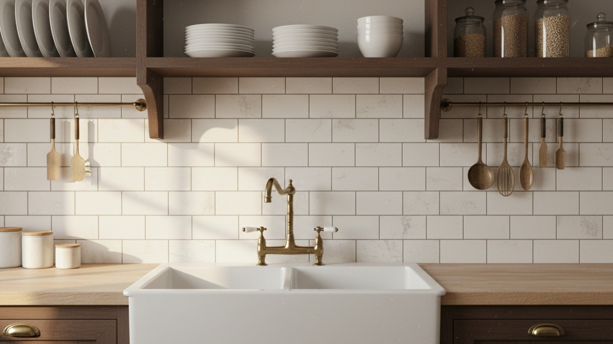
Pure White: The Essential Foundation
Crisp white stands as the quintessential selection, delivering brightness that enhances natural illumination throughout any area. This neutral foundation generates an expansive sensation, making small bathrooms appear larger and narrow kitchens feel more open. The reflective properties distribute light around the environment, minimizing additional fixture requirements during daytime hours.
White options excel across traditional, modern, and transitional styles. They establish the ideal backdrop for introducing personality through accessories, millwork, or distinctive hardware. When matched with dark grout, white produces eye-catching grid designs that introduce visual dimension without creating chaos.
Upkeep requirements for lighter shades warrant consideration. While they display cleanliness beautifully, they also expose dirt more readily than darker selections. Consistent cleaning schedules maintain these surfaces looking immaculate, and the investment typically proves valuable given their lasting sophistication.
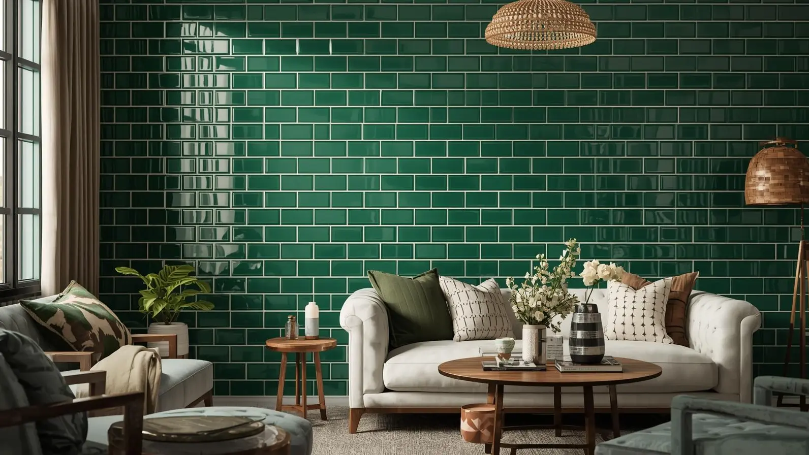
Verde: Natural Warmth
Green shades infuse organic richness and refined character into interior environments. These earthy tones provide depth that bridges indoor settings with outdoor landscapes. This color performs exceptionally in areas where creating a peaceful, spa-inspired ambiance is desired.
Forest-inspired hues match beautifully with brass or gold hardware, establishing luxurious pairings reminiscent of art deco aesthetics. They also harmonize with natural timber elements, stone surfaces, and plant-based motifs. The flexibility extends across both warm and cool undertones depending on your specific green preference.
Think about verde choices for powder rooms requiring dramatic flair, kitchen backsplashes needing character without pattern complications, or shower enclosures that suggest peaceful sanctuaries. The intensity of green influences atmosphere sage options feel gentle and restful, while richer emerald tones demand attention and convey assurance.
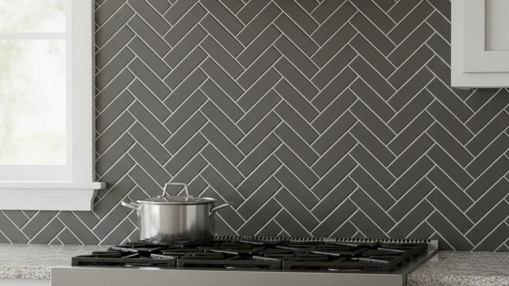
Gray: Modern Elegance
Gray has become today's preferred neutral, supplanting beige in numerous contemporary installations. These tones span from pale silver to charcoal, each contributing different environmental qualities. Paler grays preserve the bright, spacious sensation of white while adding subtle warmth that feels less sterile.
Medium grays provide exceptional flexibility, functioning as transitional connections between vibrant accent hues. They establish harmonious backgrounds allowing statement pieces like colorful artwork, dynamic textiles, or unique hardware to stand out. The quiet refinement of gray matches stainless steel appliances, chrome fixtures, and concrete surfaces effortlessly.
Deeper gray choices approach charcoal territory, creating dramatic opposition when matched with white millwork or light-colored flooring. These richer tones conceal minor flaws and daily wear better than paler options, making them suitable for busy zones.
Temperature considerations matter some lean warm with brown hints, while others tilt cool with blue accents. Reviewing samples under your actual illumination helps guarantee the hue coordinates with current elements rather than conflicting unexpectedly.
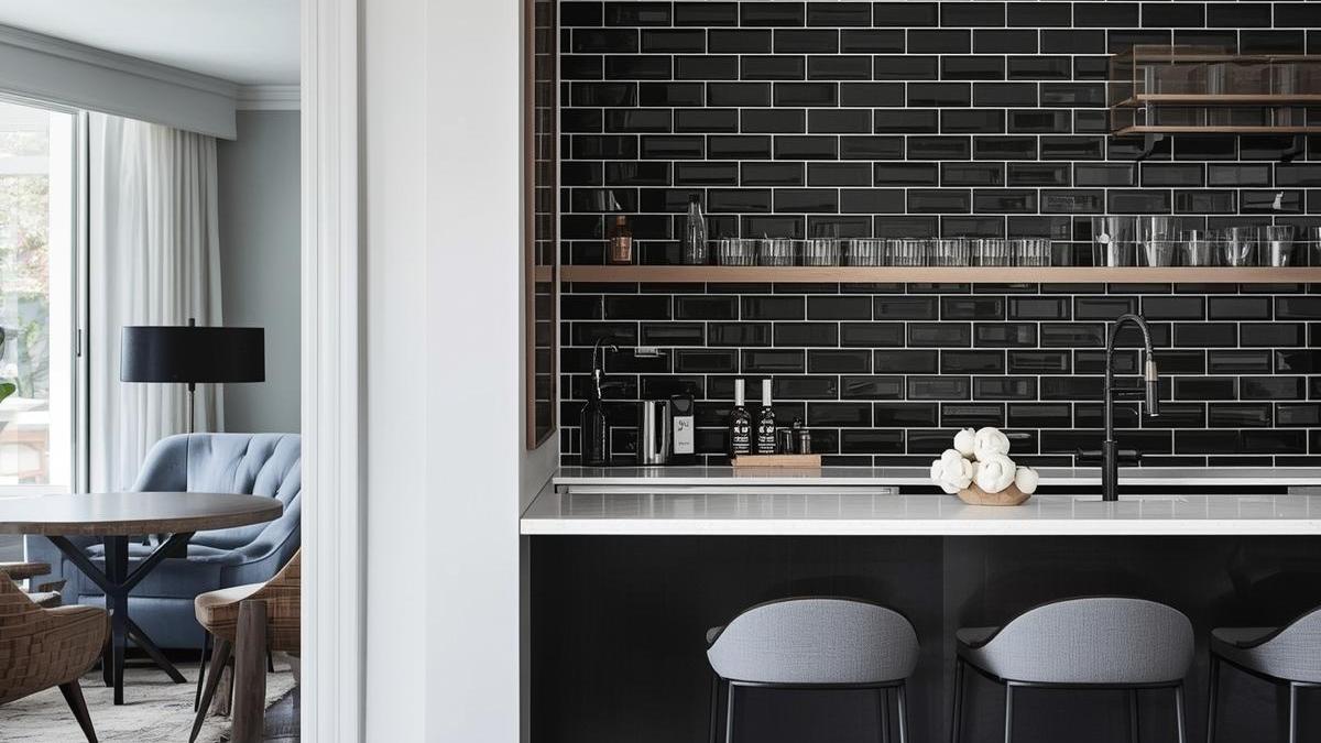
Black: Striking Statement
Black rectangular configurations deliver powerful impressions, converting ordinary areas into exceptional showcases. This bold selection performs particularly well as accent features covering one wall while maintaining others neutral, or establishing striking backsplash focal points behind ranges or vanities.
The commanding nature of black demands careful planning. In smaller bathrooms or kitchens with restricted natural illumination, extensive black coverage can feel heavy. However, strategic positioning creates incredible depth and dimension. Consider black for feature walls anchoring open-concept areas, backsplashes paired with white surfaces for maximum opposition, shower enclosures in spacious bathrooms with excellent brightness, or commercial settings seeking modern, upscale appearances.
Black surfaces require attention to grout choice. White grout highlights the grid design, producing graphic impact perfect for contemporary aesthetics. Black grout produces seamless, monolithic looks that feel sleek and minimalist.
Upkeep proves easier than many expect. While water marks and soap buildup show on dark surfaces, they're usually less noticeable than on white. Regular maintenance prevents accumulation, keeping the sophisticated look intact.
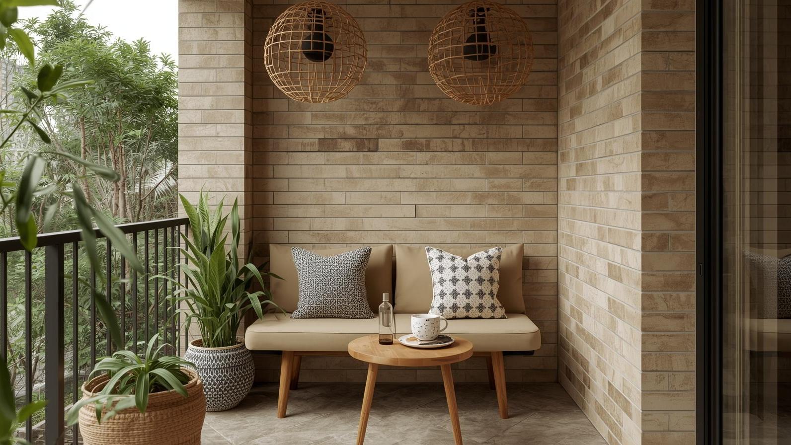
Cream and Ivory: Gentle Warmth
Cream and ivory selections occupy the middle ground between stark white and beige, providing warmth without yellowing worries. These softer neutrals generate inviting atmospheres ideal for traditional farmhouse kitchens, vintage-inspired bathrooms, or transitional environments blending historical and current elements.
The gentle warmth matches antique brass, oil-rubbed bronze, and copper hardware beautifully. Natural wood cabinetry in honey or golden oak tones harmonizes smoothly with cream backgrounds. These hues also combine well with warm gray grout, creating subtle definition without harsh opposition.
Cream varieties perform particularly well in homes with warm lighting schemes or areas receiving abundant southern exposure. The yellowish undertones enhance rather than combat the natural light quality, resulting in unified, comfortable environments.
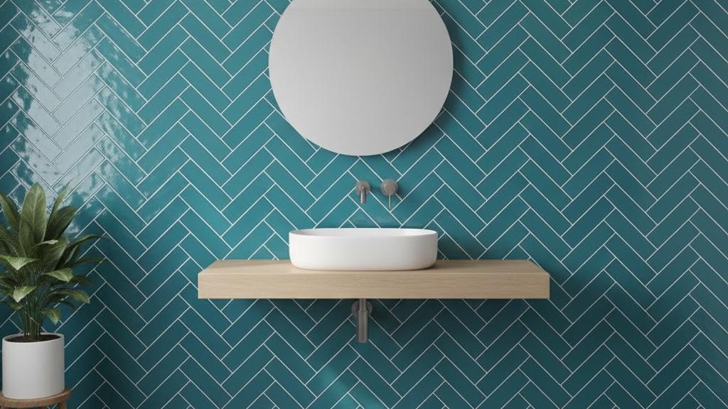
Blue: Coastal and Contemporary
Blue rectangular choices span from soft powder blue to deep navy, each suggesting different atmospheres. Lighter aqua and turquoise tones deliver coastal freshness ideal for beach houses or bathrooms seeking vacation-like serenity. These cheerful options match wonderfully with white trim and natural fiber accents.
Medium blues like cornflower or periwinkle inject character while maintaining flexibility. These mid-range hues match both warm and cool palettes, performing equally well with gold or silver hardware.
Navy and cobalt represent the daring end of the spectrum, providing sophisticated drama. These deep blues work beautifully in powder rooms, mudroom applications, or as kitchen backsplash statements. When paired with white cabinetry and marble surfaces, navy creates timeless refinement reminiscent of classic design periods.
Blue choices often benefit from adequate illumination to prevent appearing dull or murky. Under-cabinet lighting, recessed fixtures, or abundant natural brightness help these hues maintain vibrancy and prevent spaces from feeling cave-like.
Blush and Terracotta: Warm Contemporary Trends
Warmer tones like blush pink and terracotta have gained popularity recently, providing alternatives to cooler neutrals. These earthy hues create inviting, feminine, or bohemian aesthetics depending on styling approach, reflecting current bathroom tile trends.
Blush pink delivers subtle color that feels fresh and modern without appearing juvenile. This sophisticated option performs beautifully in powder rooms, adding gentle character without overwhelming compact areas. Matched with brass hardware and marble surfaces, blush establishes luxurious, magazine-worthy vignettes.
Terracotta and rust tones deliver Mediterranean warmth and organic richness. These earth-based hues match natural materials like wood, leather, and woven textiles. Think about terracotta for spaces embracing southwestern, bohemian, or eclectic design directions, similar to terrazzo look options that celebrate textured, artisanal aesthetics.
Beyond Visual Appeal
While aesthetic attraction drives initial interest, functional factors influence long-term satisfaction. Illumination dramatically affects how colors appear throughout the day. North-facing rooms receive cooler light that can make warm colors appear flat, while south-facing spaces bathe in warm illumination that can intensify already warm hues.
Sample examination proves essential. Ordering samples allows you to view choices in your actual environment under your specific illumination conditions. Observe them at different times morning, afternoon, and evening to understand how natural and artificial light affects appearance.
Grout choice significantly impacts the final look. Matching grout creates seamless, monochromatic looks that feel calm and unified. Contrasting grout highlights the grid design, adding graphic interest and visual texture. High-contrast pairings like white pieces with black grout produce bold, contemporary statements, while low-contrast combinations maintain subtle refinement. According to the Ceramic Tile Foundation, proper grout selection and edge protection ensure lasting installation quality.
The finish matters as well. Glossy surfaces reflect more illumination, creating brighter spaces but showing water marks and fingerprints. Matte finishes provide understated sophistication with easier upkeep. Understanding the differences between ceramic and porcelain materials helps you select the appropriate finish for your application. Textured choices add tactile interest and can improve slip resistance in wet zones.
Creating Unified Design Stories
Successful projects consider how surfaces relate to surrounding elements. Your choice should coordinate with cabinetry, countertops, flooring, and fixtures to create intentional, unified environments rather than disjointed collections of individual components. Browse tiles organized by style to find cohesive design solutions.
For monochromatic schemes, vary textures and finishes rather than hues. Combine glossy white rectangular pieces with matte white cabinetry and polished marble countertops for sophisticated tonal variation. This approach creates depth without relying on multiple colors. The National Kitchen & Bath Association recommends this strategy for achieving timeless elegance.
Analogous palettes pair adjacent hues on the color wheel. Blue-green pairings, for example, create harmonious, nature-inspired schemes. These relationships feel inherently balanced and easy on the eyes.
Complementary schemes use opposite hues for maximum opposition and energy. Orange-toned terracotta with blue accents creates vibrant, eclectic spaces full of character. These bold pairings require confident execution but deliver memorable results, as demonstrated at industry events like Coverings, the premier tile and stone showcase.
Making Your Final Selection
Narrowing choices requires balancing aesthetic preferences with practical realities. Consider your home's architectural style, current finishes, and how long you plan to remain in the location. Neutral selections offer broader appeal for resale purposes, while bolder options reflect personal style more distinctly.
Think about your tolerance for cleaning and maintenance. Some hues conceal imperfections better than others, and your willingness to maintain pristine surfaces should influence your decision. For professional guidance, explore our complete product catalog or visit our showrooms in your area.
Budget considerations extend beyond initial material costs. Complex patterns or high-contrast grout pairings may require more labor time, affecting installation expenses. Professional installers certified by the CTDA ensure proper installation techniques. However, the material itself remains relatively affordable regardless of hue, making this an accessible way to introduce character.
When selecting materials, verify they meet ANSI standards for ceramic tile, ensuring quality and durability. Additionally, consulting Natural Stone Institute guidelines helps when incorporating natural stone elements alongside your subway tile selections.
Conclusion
Choosing the perfect rectangular hue transforms ordinary areas into distinctive environments that reflect your aesthetic vision. Whether you gravitate toward classic white, commanding black, calming verde, or trendy terracotta, Nova Tile and Stone offers diverse options to bring your design dreams to life. Success lies in understanding how different colors interact with your environment, illumination, and current elements to create unified, intentional designs.
Take advantage of professional consultations and sample programs to explore possibilities without commitment. Viewing choices in your actual setting, under your specific conditions, removes guesswork and builds confidence in your decision. Browse our complete tile collection or explore options by color, by type, or by size. With thoughtful consideration and expert guidance, you'll discover the perfect hue to bring your vision to life.
For installation best practices and layout strategies, refer to expert tile layout guidance or consult TCNA's material comparison resources to make informed choices.
Frequently Asked Questions
What's the most versatile hue for resale value?
White and light gray remain the safest selections for broad market appeal. These neutral foundations allow potential buyers to envision their personal aesthetic without requiring immediate renovation. They photograph well, brighten environments, and match virtually any design direction buyers might pursue.
How do I choose between warm and cool tones?
Examine your current elements cabinetry, countertops, flooring and identify their undertones. Warm woods and beige stones harmonize with cream, terracotta, or warm grays. Cool-toned marble and contemporary finishes pair better with pure white, cool grays, or blue options. Your lighting quality also plays a crucial role in this decision.
Can I mix different colors in one space?
Absolutely. Many successful designs combine multiple hues for visual interest. Common approach pairings should feel purposeful rather than arbitrary or confused. Explore various subway tile color options for inspiration.
Do darker colors make small bathrooms feel smaller?
Not necessarily. While dark hues can reduce perceived space if used extensively, strategic application creates depth and drama. Consider using darker tones on single accent walls while keeping other surfaces light, or incorporating them in larger bathrooms where square footage allows bold selections.
How does grout affect the overall appearance?
Grout dramatically influences the final aesthetic. Matching grout creates seamless, unified surfaces where individual pieces disappear into the whole. Contrasting grout highlights the grid design, adding graphic interest and architectural detail. White grout with any colored surface creates bold, contemporary statements, while neutral grout maintains subtlety. For dimensional options, consider 3D decorative subway tiles or classic matte porcelain selections available in multiple colors. Learn more about our company and how we can help with your project.