Warm neutral stone tones are natural stone colors that lean toward taupe, sand, cream, and terracotta instead of stark white or cool gray. Quartzite, marble, granite, and travertine all produce warm neutral coloring, driven by iron oxide, mica, and other minerals in the stone. In Granite Bay, CA, these tones are used in kitchens, bathrooms, and living spaces to complement the area's warm wood tones and natural light. This guide covers what defines a warm neutral stone color, which materials produce it, and how to pair it with cabinetry, flooring, and fixtures.
Granite Bay's homes tend to lean into natural surroundings, from oak-studded hillsides to the open, light-filled interiors common in the area's newer construction and remodels. Warm neutral stone tones tend to complement that setting more naturally than the cool grays and bright whites that dominated design for much of the last decade.
What Makes a Stone Tone "Warm Neutral"
A neutral stone color reads as beige, gray, or off-white without pulling strongly toward any one hue. A warm neutral takes that same restrained palette and shifts it toward yellow, orange, or brown undertones instead of blue or green ones. In practice, this means colors like:
- Taupe, a blend of gray and brown
- Sand and wheat tones, lighter and closer to beige
- Cream and ivory with a soft yellow cast
- Terracotta and warm caramel, deeper and more saturated
These tones sit on the same end of the color wheel as wood, brass, and warm-toned lighting, which is part of why they pair so easily with those materials. A slab with a warm neutral base can still carry contrast through veining or mineral deposits, so the category covers a wide range of looks rather than a single flat color.
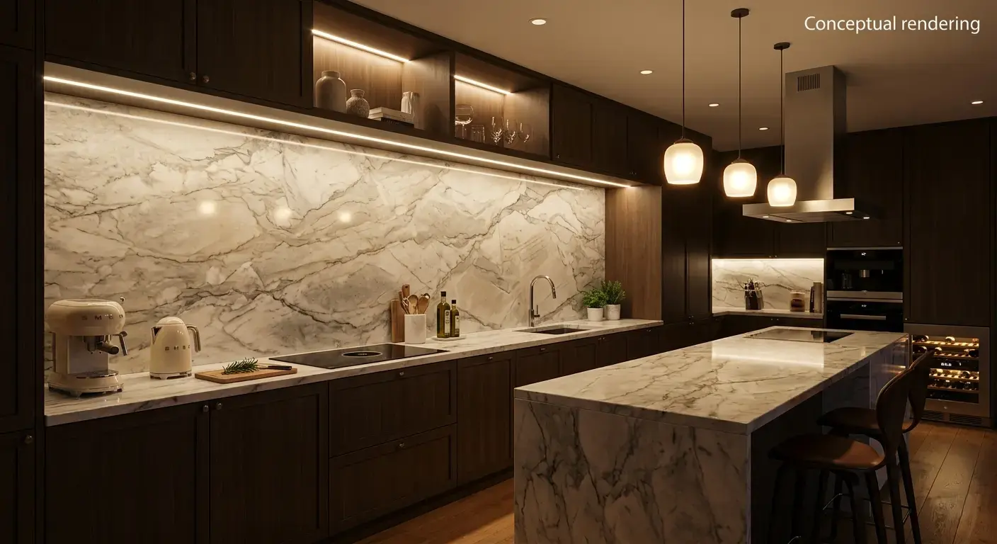
Why Warm Neutrals Suit Granite Bay Homes
Granite Bay sits in a part of the Sacramento region known for abundant natural light and a landscape dominated by oak trees, granite outcroppings, and golden hillsides for much of the year. Interiors that lean into warm, earthy tones tend to feel connected to that setting rather than working against it.
Many homes in Granite Bay also use warm wood flooring, wood beams, or wood cabinetry as a starting point for their interior palette. Cool gray stone can create a visual disconnect next to those warmer wood tones, while a warm neutral slab tends to sit more comfortably alongside them. This is one reason warm neutrals have gained traction as homeowners move away from the all-white, high-contrast kitchens that were common in prior years and toward a softer, more layered look. Homeowners weighing these choices can browse tile, natural stone, and flooring side by side to see how a warm neutral palette carries across an entire home rather than a single room.
Light also plays a role. Granite Bay gets a good amount of direct sun through large windows in many newer homes, and warm neutral stone tends to read as inviting rather than washed out under that kind of natural light. Cooler stone tones can sometimes appear flat or sterile in strongly lit rooms, while warmer tones tend to hold their character.
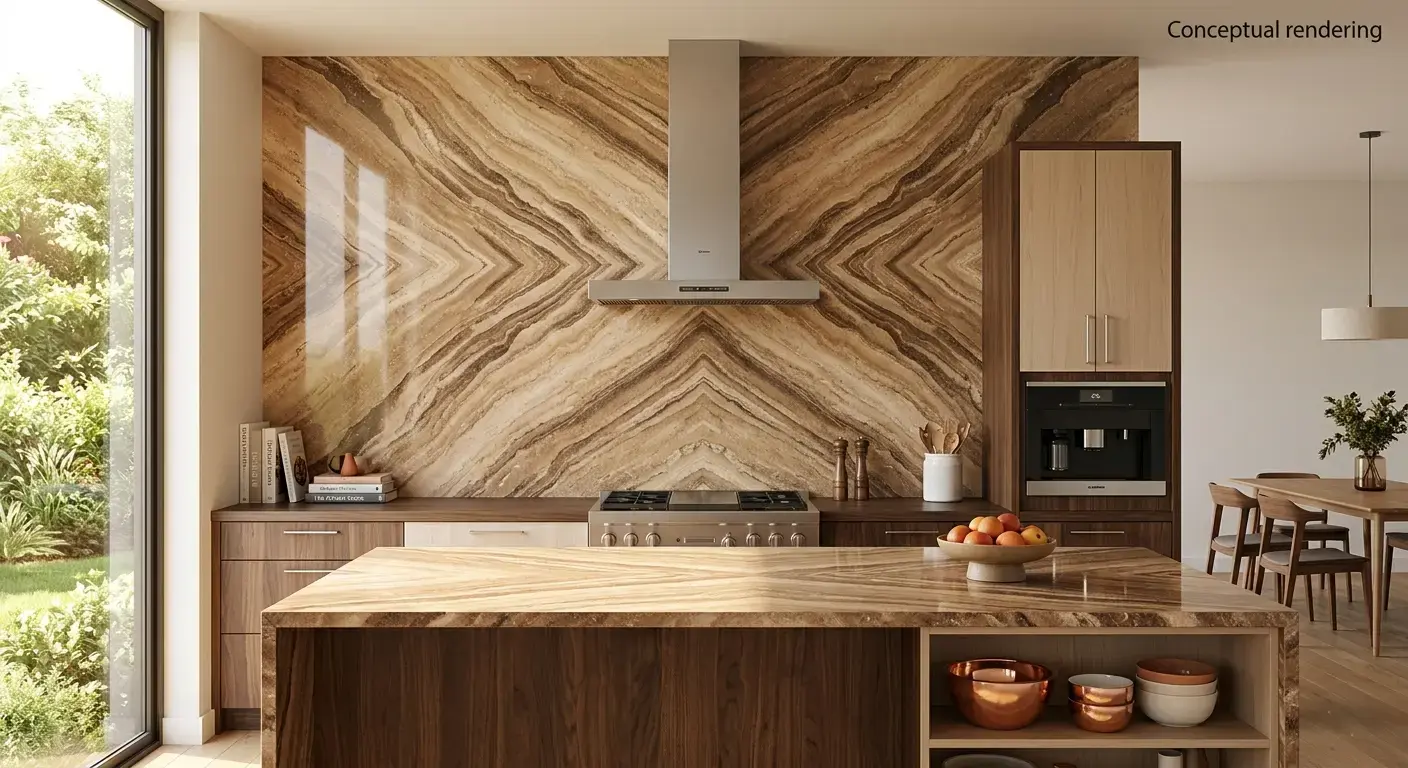
Materials That Deliver Warm Neutral Tones
Several natural stone categories consistently produce warm neutral coloring, though the exact tone varies by quarry and even by block within a quarry.
Quartzite is one of the more reliable sources of warm neutral color. Certain quartzite varieties carry soft cream, sand, or taupe backgrounds, sometimes with subtle golden or amber veining running through them. Because quartzite is a metamorphic stone formed from sandstone under heat and pressure, its warmth often comes from iron oxide content that built up in the original sand deposits.
Marble also produces warm neutral coloring, particularly varieties quarried from regions with iron-rich mineral deposits. These marbles carry cream or beige backgrounds with veining that ranges from soft gold to deeper caramel, rather than the stark white and gray veining associated with more familiar marble types.
Granite offers a wide range of warm neutral coloring, since its mineral composition varies from one stone to another. Warm granite varieties may combine sand or taupe backgrounds with mineral flecks and variations in gold, warm brown, or deep bronze tones.
Travertine is almost always a warm neutral stone by nature. Its coloring comes from mineral deposits formed around natural hot springs, which typically produce tones ranging from pale cream to deeper tan and rust. Travertine's characteristic pitted texture also tends to emphasize its warmth, since the small surface variations catch light differently than a flat, polished surface.
For a broader comparison of how these materials perform over time, resources such as this overview of stone countertop options cover trade-offs in durability, maintenance, and cost across stone types. Because colors and quantities shift as new blocks arrive, checking current slab inventory before settling on a specific look is worth the extra step.
Pairing Warm Neutral Stone With Other Finishes
Warm neutral stone tends to work well with a fairly wide range of cabinetry, flooring, and fixture choices, which is part of its appeal for homeowners who want flexibility.
Cabinetry: Warm neutral stone pairs naturally with wood-tone cabinets, particularly oak, walnut, and white oak finishes that carry their own warm undertones. It also works with painted cabinets in warm off-white, sage, or terracotta shades. Cabinets in cool gray or true white can still work with warm neutral stone, though the contrast becomes more pronounced and worth viewing in person before committing.
Flooring: Warm wood flooring, whether hardwood or luxury vinyl plank, tends to echo the same undertones found in warm neutral stone, creating a cohesive look between countertop and floor. Warm-toned tile flooring, particularly in terracotta or sand colorways, can extend the palette further.
Fixtures and hardware: Brass, bronze, and warm gold hardware finishes tend to read especially well against warm neutral stone, since both draw from the same part of the color spectrum. Matte black hardware can also work, though it introduces more contrast than a warm metal finish would.
Backsplash and wall tile: A warm neutral stone countertop often pairs with a simple, lighter-toned backsplash so the countertop remains the focal point, though some homeowners choose to extend the same stone up the wall for a more continuous look.
Homeowners working with a designer or contractor on a larger renovation may find it useful to review how different stone types compare in day-to-day performance, as covered in this natural stone countertop guide. Contractors and designers managing multiple Granite Bay projects can also apply for a trade account for consistent access to inventory across jobs.
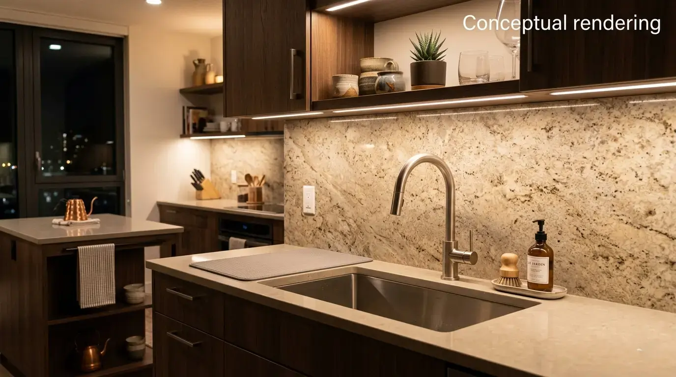
Choosing a Warm Neutral Slab
Because warm neutral tones can vary quite a bit even within the same stone type, viewing the full slab in person is the most reliable way to judge how a particular piece will read in a specific room. Lighting has a noticeable effect on how warm or neutral a stone appears, so a slab that reads a certain way under one type of lighting may read differently under another.
Undertone consistency is also worth checking across the full slab, since some pieces carry warm tones evenly throughout while others shift between warmer and cooler areas depending on where the piece was cut from the block. For larger installations like waterfall islands, where multiple sections of a slab need to align visually, this consistency matters more than it would for a smaller vanity top.
Room orientation also factors into how a warm neutral slab reads over the course of a day. A kitchen with south-facing or west-facing windows tends to receive warmer, more direct light in the afternoon, which can intensify the golden or amber tones in a slab. A north-facing room with more diffused, cooler light may cause the same slab to read slightly more muted.
Once a specific slab feels right, submitting a slab quote request is a straightforward way to confirm pricing and next steps. For homeowners who want additional guidance before reaching that point, booking a free design consultation can help narrow down options based on the rest of a room's palette.
Conclusion
Warm neutral stone tones give Granite Bay homeowners a way to bring natural color into a kitchen or bathroom without the stark contrast of an all-white or all-gray palette. Quartzite, marble, granite, and travertine each offer their own path to that warmth, whether through soft cream backgrounds, golden veining, or scattered warm mineral flecks. Because these tones read differently under different lighting and vary from slab to slab, viewing the actual piece in person remains the most dependable way to confirm how it will look in a finished space. Our Sacramento showroom at 6100 Warehouse Way gives Granite Bay homeowners a place to see a range of warm neutral slabs in person, and our team is available at (916) 913-6682 to help talk through options for a specific kitchen or bathroom project.
Note: Some images on this page may be conceptual renderings created to illustrate design possibilities and may not depict actual installations.
Frequently Asked Questions
A warm neutral stone tone leans toward yellow, orange, or brown undertones rather than blue or gray ones. Common examples include taupe, sand, cream, and terracotta backgrounds, often paired with warm-toned veining or mineral flecks.
Travertine is almost always warm in tone due to its mineral formation process. Certain varieties of quartzite, marble, and granite also produce warm neutral coloring, though the exact tone depends on the specific quarry and block.
Warm neutral stone can pair with gray or white cabinets, though the contrast between the warm stone and cooler cabinetry will be more noticeable than it would be with wood-tone or warm-painted cabinets. Viewing the pairing in person helps confirm whether the contrast level suits the space.
Natural and artificial lighting both affect how warm or cool a stone surface appears. A slab viewed under one type of lighting in a showroom may read slightly differently under the natural light or fixtures in a specific home, which is why viewing a slab in the space it will occupy, when possible, gives the most accurate impression.
Yes. Warm neutral stone tones appear across polished, honed, and other textured finishes. The finish affects how light reflects off the surface and can make the same stone appear slightly warmer or cooler depending on the sheen level.