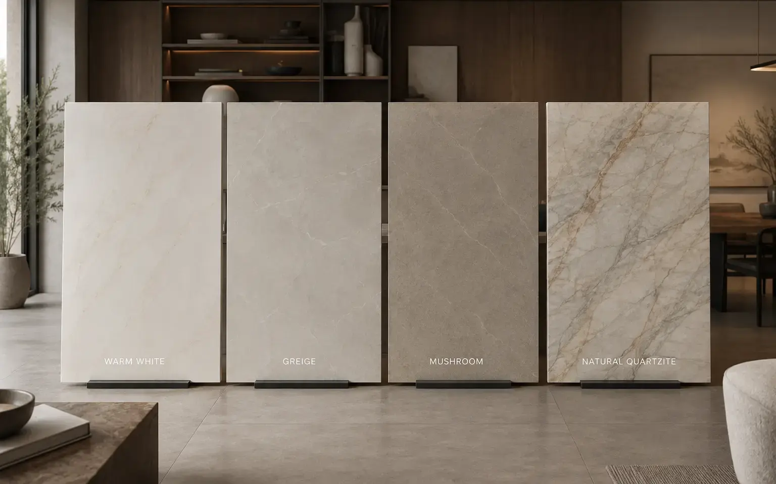
The top countertop colors for 2026 are warm white, greige, mushroom, and natural quartzite with soft, organic veining. These warmer, earthier tones are replacing the stark white and cool gray countertops that dominated kitchens for most of the past decade. Homeowners in Sparks, NV updating a kitchen or bathroom this year have more options that pair naturally with the wood tones and strong natural light common in Truckee Meadows homes.
Warm Whites Are Replacing Stark, Cool Whites
White countertops are not disappearing, but the version homeowners are choosing has changed. Cool, blue-gray whites with dramatic contrast veining are giving way to creamier, warmer whites with soft gold or beige undertones. Designers describe the older look as feeling clinical and unforgiving, since marks and wear show up more easily against a stark white background, while softer, more natural palettes built around warm neutrals and muted stone-inspired colors are taking their place. The newer whites still brighten a kitchen or bathroom, but they read as softer and less sterile, especially under warm lighting.
Earthy Neutrals Are Topping Industry Surveys
Neutral color families are still the safest and most common choice for countertops, but the specific tones within that category have moved toward warmth. A recent survey of designers, remodelers, and showroom professionals found that 96% of respondents identified neutrals as the most popular colors for kitchens, with greens at 86% and blues at 78% close behind. Within the neutral category, tones like greige, mushroom, taupe, and sandy beige are showing up far more often than the flat gray that was common a few years ago. These colors work well with the white oak and other light wood cabinetry that has also become the preferred choice among designers, since warm stone and warm wood read as a cohesive palette rather than competing tones.
Natural Quartzite Is Overtaking Marble as the Statement Choice
Quartz remains the most common countertop material overall, but natural quartzite has become the material designers point to most often for 2026. The same survey found that natural quartzite came in just behind quartz, with 62% of respondents citing it as a growing countertop material and 61% for backsplashes. Part of the appeal is that quartzite offers the movement and one-of-a-kind veining people love about marble, with more durability for daily use. Recent reporting on 2026 kitchen countertop trends echoes this shift, noting that natural quartzite is gravitating back into favor because of its tactile, unique variations and its durability compared with man-made alternatives, particularly in stones with bold veining set against softer, more muted background colors.
Bold, Colorful Stone Is Showing Up in Otherwise Neutral Kitchens
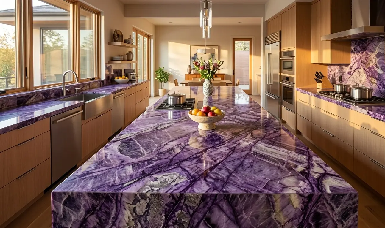
Not every trend for 2026 is quiet. Alongside the move toward warm neutrals, there is a smaller but noticeable shift toward colorful natural stone used as a statement surface, usually on an island rather than the full kitchen. Designers have observed that plain neutral slabs with no visual interest are being replaced by colorful marbles and quartzites, with violets and reds leading the way and greens, golds, and blues also gaining ground. This tracks with the broader color data as well, since green and blue both scored highly in the same survey that found neutrals dominant overall. In practice, this usually means a bold stone reserved for one focal surface, paired with simpler materials everywhere else in the room.
Darker Tones Work Best as Accents, Not the Whole Room
Charcoal, black, and deep brown countertops are having a comeback, but rarely across an entire kitchen. Instead, homeowners are more often reserving dark stone for one surface, such as a wet bar or a bathroom vanity, while keeping the perimeter countertops in a lighter tone. This mixed approach brings in a moody color without the maintenance concerns of an all-dark surface under bright task lighting, and it lets a kitchen feel warm and grounded rather than heavy.
Finish Is Carrying as Much Weight as Color
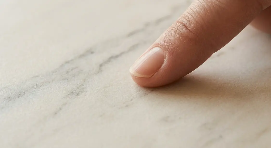
Color is only part of the story. Finish has become just as important to how a countertop reads in a room. High-gloss, ultra-polished surfaces that were popular for years are losing ground. Design commentary on countertop styles falling out of favor in 2026 points to ultra-glossy surfaces feeling artificial and overly polished, with homeowners instead gravitating toward matte finishes on materials like quartzite, soapstone, and honed stone. A matte or honed finish also changes how a color reads, softening warm whites and earthy neutrals so they feel calmer and less reflective, which is part of why the two trends, warmer colors and quieter finishes, tend to show up together in the same kitchens.
What These Trends Look Like in a Sparks, NV Home
Sparks sits in the Truckee Meadows valley alongside Reno, with a high desert climate that brings strong, direct sunlight for most of the year along with real seasonal swings between hot, dry summers and cold winters. That intensity of natural light matters when choosing a countertop color, since a stone that looks neutral in a showroom can read cooler or warmer once it is under the kind of light common in a Sparks kitchen with south or west-facing windows. These warmer tones tend to hold up well under that light without looking washed out, which is part of why they pair naturally with the wood cabinetry and desert-adjacent color palettes found throughout the area, from newer communities on the east side of the city to older, established homes closer to Victorian Square.
Matching a Material to the Look You Want
Once a color direction feels right, the next decision is material, since the same color can look and perform differently depending on the material it is made from. Natural stone, including quartzite, marble, and granite, offers unique veining and movement, with no two slabs looking exactly alike. Quartz is engineered, which makes it easier to get a consistent warm white or greige across an entire kitchen without variation between pieces. Sintered stone and porcelain slabs tend to perform well in bright, heat-exposed spaces, though exact heat and UV performance varies by product; check manufacturer specifications for installations near a range or south-facing window. Each of these materials, along with prefabricated options, is available to see and compare in person, since photos and screens rarely capture how a stone's color and movement actually look in daylight.
Visiting the Showroom That Serves Sparks, NV
Nova Tile and Stone's Reno showroom, located at 12835 Old Virginia Road, Suite 24, Reno, NV 89521, serves homeowners throughout Sparks and the greater Truckee Meadows area. The showroom carries thousands of slabs in the colors and materials covered above, along with flooring and tile, and the design team offers free consultations for anyone comparing options for a kitchen or bathroom project. The showroom can be reached at (775) 331-6682, with hours Monday through Friday from 7:30 a.m. to 6:00 p.m. and Saturday from 9:00 a.m. to 3:00 p.m.
Conclusion
2026's countertop trends come down to warmth and texture over stark contrast, whether that means a creamy white, an earthy neutral, or a quartzite slab with soft natural movement. Bolder colors and dark tones still have a place, but usually as a single accent surface rather than a full kitchen. For homeowners in Sparks, NV, the strong natural light and wood-toned interiors common throughout the Truckee Meadows make these warmer palettes an especially good fit, and seeing a few slabs in person under real light remains the most reliable way to choose.
Frequently Asked Questions
No, but the type of white in demand has shifted. Resale-focused buyers in particular still gravitate toward white and light-neutral countertops because they show well in listing photos and appeal to the widest range of future buyers, even as the specific shade moves from stark cool white toward warmer, creamier tones.
It depends more on finish than color. A polished dark surface shows fingerprints, water spots, and dust noticeably more than a matte or honed version of the same color, since the honing process diffuses light rather than reflecting it directly, which is one reason honed and leathered finishes have become more common on darker stone.
Visit the showroom and view the full slab under different lighting, since a slab that looks warm and neutral under showroom lighting can shift noticeably under direct sun or evening light.
Often, yes. Bathrooms tend to favor lighter, softer versions of the same warm neutral palette trending in kitchens, since the smaller scale of most vanities means a bold or dark stone can visually shrink the room, while a light warm tone helps the space feel larger and calmer.
It depends on the material. With quartz, an engineered warm white or greige typically costs about the same as any other standard color, since the manufacturing process is identical across shades. With natural stone, cost differences come from supply rather than color itself: quartzite in bold or unusual tones often costs more than common neutral quartzite, since it's quarried in smaller volumes and each block yields fewer matching slabs.
Note: Some images on this page may be conceptual renderings created to illustrate design possibilities and may not depict actual installations.