Should your backsplash be lighter or darker than the countertop? Either works, and there is no single correct answer, but four factors decide which one is right for your kitchen: how much natural light the room gets, the color of your cabinets, the size of the kitchen, and how much contrast you want between the backsplash and the countertop.
A lighter backsplash paired with a darker countertop is the more common choice, since it reflects light and helps dimmer kitchens feel more open. A darker backsplash against a lighter countertop creates a bolder, more dramatic look and tends to hide daily wear better. In South Lake Tahoe, where heavy tree cover and long, snowy winters can leave a kitchen short on daylight for months at a time, that light-reflecting effect carries more weight than it would in a sunnier climate.
Why Backsplash and Countertop Contrast Matters in a Tahoe Kitchen
The relationship between backsplash and countertop sets the tone for the whole kitchen. High contrast, such as a dark countertop under a light backsplash or the reverse, creates a defined line between the two surfaces and draws the eye toward the cooking and prep zone. Low contrast, where the backsplash sits close in tone to the countertop, produces a quieter, more seamless look that lets other elements, like cabinetry or lighting, take center stage.
Neither approach is objectively better, and the right call often depends on the kind of home you are working with. South Lake Tahoe's housing stock ranges widely, from older cabins near the Y and Al Tahoe with smaller windows and lower ceilings, to newer mountain-modern builds with larger glass and lake-facing layouts. That range changes how much contrast a kitchen can handle, a point worth keeping in mind as you weigh the options below.
Local Considerations for South Lake Tahoe Kitchens
Elevation and light exposure vary block by block across South Lake Tahoe, which sits within El Dorado County, depending on tree cover and which direction a home faces. That variation is exactly why there is no single right answer for the area: two homes a few streets apart, one shaded by pines and one facing open water, can call for opposite approaches. Coordinating the backsplash with whatever wood tones or stonework already exist in the room, rather than choosing it in isolation, also tends to produce a more cohesive result, especially given how many kitchens here share space with timber ceilings or stone fireplaces.
When a Lighter Backsplash Works Better
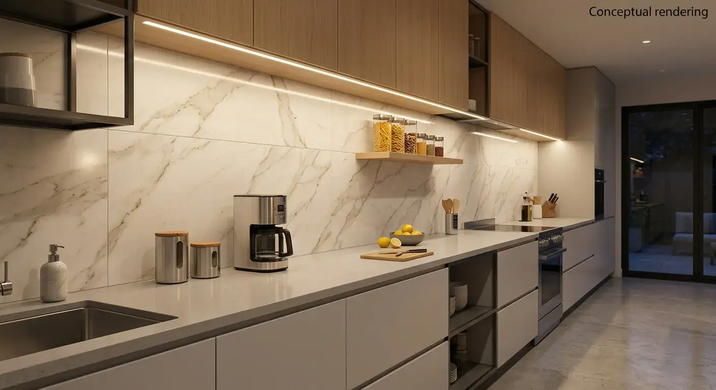
A lighter backsplash paired with a darker countertop is one of the most common combinations in kitchen design, and it is a particularly practical fit for South Lake Tahoe's wooded lots. Reflecting more light back into the room matters when a kitchen sits under tall pines or gets limited direct sun for much of the year, which describes a large share of homes throughout the South Shore. With substantial annual snowfall across the South Shore, winter weather is an important consideration for local homes, many kitchens go weeks at a time relying more on interior light than daylight, which makes a light backsplash more than a style preference. This is not just theory: real kitchen remodels have used light-reflecting tile and stone specifically to brighten dim, tight spaces, and the same approach translates well to a shaded cabin kitchen.
Best for:
- Kitchens with dark countertops or cabinetry that need visual relief
- Homes with heavy tree cover or limited window space
- A clean, timeless look that will not feel dated in a few years
This pairing works well with darker natural stone countertops, where the backsplash can pick up subtle veining or mineral tones from the stone without competing with it.
When a Darker Backsplash Works Better
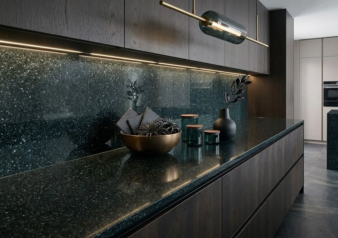
Going darker on the backsplash while keeping the countertop lighter flips the emphasis. Instead of brightening the room, a darker backsplash creates a strong visual anchor, especially behind a range, and can make a light countertop feel crisp by comparison. This combination tends to suit homes that already get good natural light, like newer builds with larger windows near the lake or in more open, less forested areas of town, since the darker surface will not make the space feel closed in.
Best for:
- Kitchens with white or light countertops that want a bolder contrast
- Larger, open-concept layouts with strong natural light
- Vacation rentals or busy households where hiding daily wear matters
- A modern or mountain-contemporary look
Darker backsplashes also hide daily wear, like water spots or grease near the stove, better than very light finishes, which is worth considering in a household that cooks often, whether that is a full-time residence or a busy vacation rental turning over guests throughout ski season.
Key Factors Beyond Light and Dark
The light-or-dark decision does not happen in isolation. Two other factors typically carry just as much weight.
Cabinet Color
Cabinets and backsplash work together to frame the countertop, so the pairing should be intentional rather than an afterthought. White or light cabinets, common in newer mountain-modern kitchens, give more room to go bold with a darker backsplash for contrast. Darker cabinetry, like espresso or navy tones seen in more traditional cabin remodels, usually benefits from a lighter backsplash to keep the kitchen from feeling heavy.
Kitchen Size
Smaller kitchens, common in many of South Lake Tahoe's older cabin layouts, tend to read as more open with a lighter backsplash, since light surfaces reflect more of whatever daylight or fixture lighting is available. Designers often recommend introducing color through the backsplash while keeping the surrounding cabinetry in a soft, neutral tone as a way to add character to a compact kitchen without overwhelming it, a principle that applies just as well to a Tahoe cabin kitchen as it does to any small urban space. Larger, open-concept kitchens have more room to experiment with a bolder, darker backsplash without it dominating the space.
Matching Tones for a Seamless Look in South Lake Tahoe Kitchens
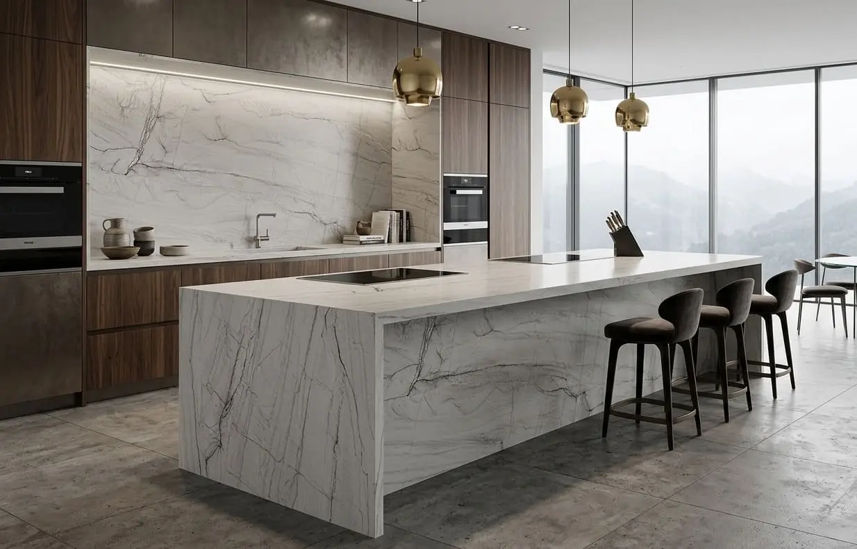
A third option skips the lighter-or-darker question by keeping the backsplash close in color and material to the countertop. This creates a monolithic, uninterrupted surface from countertop to wall, a look that has grown popular in mountain interiors because it lets textures, like a leathered or honed stone finish, do the visual work instead of color contrast.
This approach fits especially well in the timber-and-stone aesthetic common throughout South Lake Tahoe, where kitchens often share space with wood ceilings, stone fireplaces, or exposed beams. A quiet, tonal backsplash-to-countertop transition lets those existing materials stay the visual focus rather than competing with a high-contrast kitchen surface. If you're exploring options for your project, you can browse our website to see our complete offerings, or visit the Reno showroom to view available materials in person.
Conclusion
Whether a backsplash should be lighter or darker than the countertop comes down to natural light, cabinet color, kitchen size, and how much contrast feels right, not a single fixed rule. South Lake Tahoe homeowners working with dimmer, wooded lots often lean lighter to brighten the space, while those with strong lake-facing light have more freedom to go darker for drama. A close-tone, monochromatic pairing remains a solid middle ground for anyone who would rather let the existing timber and stone do the visual work. There is no wrong answer here, only the one that fits how the kitchen is actually used and lit throughout the year.
If you are weighing countertop and backsplash options for a home in South Lake Tahoe, Stateline, Tahoe Keys, or elsewhere around the South Shore, Nova Tile and Stone's Reno showroom offers free design consultations and can help you compare materials side by side.
Nova Tile and Stone
12835 Old Virginia Rd, Suite 24, Reno, NV 89521
(775) 331-6682
Frequently Asked Questions
No. A dark countertop can be paired with a light, dark, or similarly toned backsplash depending on the look you want. A lighter backsplash is a popular choice because it brightens the space and creates contrast, but it is not a requirement, and a close-tone pairing can look just as intentional.
There is no single right answer, since the backsplash sits between both surfaces. Some homeowners coordinate the backsplash with the countertop for a seamless look, while others use it to bridge a gap between contrasting cabinet and countertop colors. The best approach depends on which surface you want to stand out.
Generally, yes. Lighter backsplashes tend to show grease, water spots, and food splatter more visibly, especially near the stove or sink, while darker backsplashes are more forgiving of everyday wear. This is worth weighing alongside the lighting and contrast benefits of going lighter.
Yes. Smaller kitchens tend to feel more open with a lighter backsplash, since light surfaces reflect more of the available light in the room. Larger kitchens have more flexibility to use a darker backsplash for drama without the space feeling closed in.
It can, but it requires more planning. Dark backsplashes absorb light rather than reflect it, so a kitchen with limited windows or heavy shade may need stronger artificial lighting, such as under-cabinet fixtures, to keep a dark backsplash from making the room feel smaller or dimmer than intended.
Note: Some images on this page may be conceptual renderings created to illustrate design possibilities and may not depict actual installations.