The most popular quartz countertop colors for Reno kitchens and bathrooms in 2026 are warm white and cream with soft veining, warm gray and greige, deep charcoal, and nature-inspired greens and blues, with warm brown and taupe tones also common in homes built around natural wood cabinetry. Beyond personal style, color choice carries extra weight in Reno specifically: the city sits at roughly 4,500 feet in a high desert basin, and the strong, direct sunlight at that elevation can make a slab look noticeably different at midday than it does in early morning or evening light.
Quartz has become the default countertop material for Reno kitchens and bathrooms for practical reasons as much as aesthetic ones. Engineered from roughly 90 to 95 percent natural quartz crystal bound with resins and pigments, it's non-porous, resists staining without sealing, and holds its color consistently across an entire slab, which is useful for a kitchen island under a wall of south-facing glass or a bathroom vanity that gets steamed and splashed daily. This guide breaks down the quartz color families working well in Reno's light and architecture right now, how kitchen and bathroom applications differ, and what to check before finalizing a slab.
Why Color Choice Carries More Weight in Reno's Light
Northern Nevada's high desert climate produces sun that's brighter and more direct than what most homeowners are used to if they moved from the Bay Area, the Central Valley, or the Midwest. Rooms with south- or west-facing windows can wash out light, low-contrast surfaces at midday and then shift dramatically in tone as evening light turns warmer and lower. A quartz slab that looks soft and neutral in a showroom under even lighting can read differently once it's sitting under a skylight in a Damonte Ranch kitchen or catching afternoon sun in a Caughlin Ranch bathroom.
A small sample chip can hide undertones that only show up at full slab scale: warm whites can pick up a yellow cast in strong sun, while cool grays can read almost blue against Reno's characteristically clear blue-sky backdrop. None of this means certain colors are off-limits; it simply means undertone matters more here than it would in a market with flatter, more consistent light.
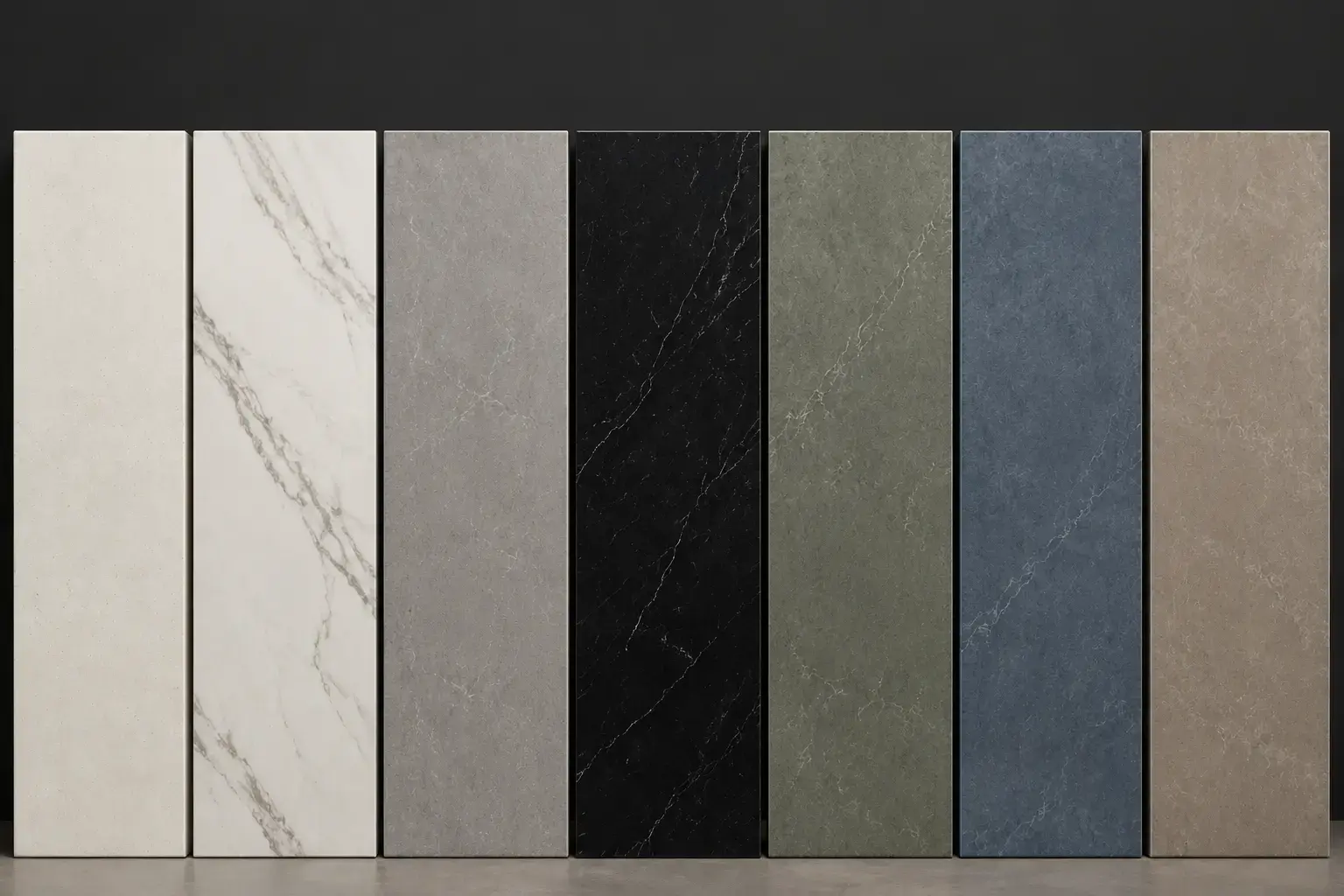
Popular Quartz Color Families for 2026
Quartz manufacturing has moved a long way past a handful of solid colors. Today's quartz countertop slabs are engineered to replicate the veining and depth of natural marble and quartzite while keeping the durability and low maintenance of an engineered surface. A few color directions are showing up consistently in current design work:
Warm whites and creams. Stark, cool white is giving way to warmer off-whites with soft gold or taupe undertones. These surfaces still brighten a room the way white always has, but they read less clinical and pair more naturally with warm wood tones (oak, walnut, alder) common in Sierra-style and transitional Reno homes.
Calacatta and marble-look veining. White or cream backgrounds with bold, sweeping gray or gold veins remain one of the most requested looks in quartz. The veining scale has grown too; some current slabs feature movement that travels several feet across a single piece, which suits the larger kitchen islands common in newer South Reno construction.
Warm grays and greige. A soft, warm gray quartz with taupe undertones sits between classic gray and true beige, and it's proven to be one of the more versatile choices for homeowners who aren't ready to commit to a strong white or a dramatic dark tone. It pairs well with both stainless and matte black appliances.
Deep charcoal and black. For homeowners wanting more contrast, charcoal and near-black quartz continue to be a strong choice for waterfall-edge islands or as a grounding element against lighter perimeter cabinetry. In a bright Reno kitchen with generous window light, a dark island doesn't feel heavy the way it might in a dimmer space.
Earthy greens and blues. Deeper, nature-inspired tones such as forest green, muted sage, and soft coastal blue have moved from accent status to a genuine countertop option, particularly on bathroom vanities and secondary kitchen surfaces like a wet bar or butler's pantry. These work especially well in the transitional and mountain-modern styles common in the foothill neighborhoods around Reno.
Warm browns and taupe. Toffee, caramel, and soft espresso-toned quartz continue to appeal to homeowners building around natural wood cabinetry and beam ceilings, an aesthetic that shows up often in the more rustic, ranch-influenced homes found throughout Washoe Valley and the outlying areas Nova serves.
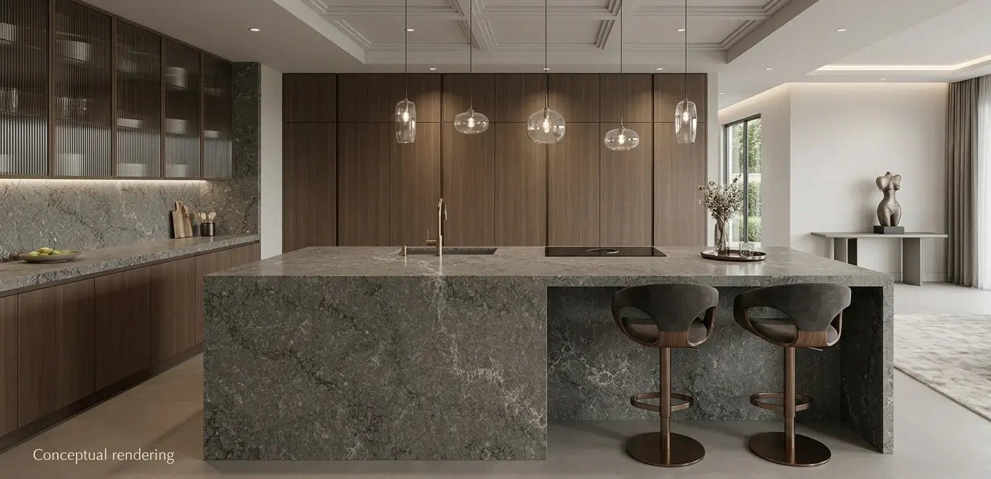
Choosing Colors for a Reno Kitchen
With those color families in mind, the next question is which one actually fits a specific room. Kitchens tend to be the highest-traffic, highest-visibility room in the house, and they're usually where homeowners are most willing to make a bolder color statement, particularly on an island that functions as a visual anchor.
A few practical starting points:
- South- and west-facing kitchens with strong afternoon sun generally do well with cooler-toned whites or grays, since warm light from the window will naturally add richness. A warm white in a room that already gets warm light can occasionally look overly yellow by late afternoon.
- North-facing kitchens, which get more consistent, cooler light throughout the day, tend to benefit from warmer quartz tones such as cream, taupe, or warm gray to keep the space from feeling flat or cold.
- Large islands are a natural place for a darker or more dramatic veined slab, since the surrounding perimeter counters and cabinetry can stay simpler and let the island do the visual work.
- Smaller kitchens generally read larger with lighter, less busy quartz colors, since large-scale veining can visually shrink a compact space.
Because quartz doesn't require sealing and resists staining from coffee, wine, and cooking oil, color choice in a kitchen is really a design decision rather than a maintenance one, since nearly every color on the market performs the same way day to day.
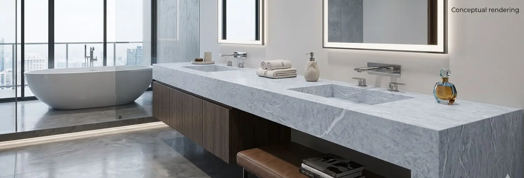
Choosing Colors for a Reno Bathroom
Bathroom vanities carry a different set of considerations than kitchen counters. They're smaller surfaces, usually viewed up close, and they interact constantly with tile, cabinetry, and plumbing fixtures in a tighter visual space. A quartz bathroom countertop needs to hold up to daily moisture as much as it needs to look right up close.
- Primary bathrooms with larger vanities and more natural light can handle the same bold veining or darker tones used in a kitchen, especially when paired with a single dramatic tile accent wall or shower surround.
- Powder rooms and secondary bathrooms, which are often smaller and more enclosed, tend to benefit from lighter quartz such as whites, warm creams, and soft grays to keep the space feeling open.
- Finish matters as much as color in a bathroom. A honed or matte finish diffuses light and hides water spots and fingerprints better than a high-gloss polished surface, which is a practical advantage on a vanity that sees daily use.
Quartz's non-porous surface is a genuine advantage in bathrooms specifically, since it resists the moisture and humidity exposure that can be harder on more porous natural stone.
Matching Quartz to Cabinets and Hardware
A few pairing patterns tend to hold up well across Reno's mix of transitional, mountain-modern, and farmhouse-influenced interiors:
- White or cream shaker cabinetry pairs naturally with warm-veined quartz and brushed gold or matte black hardware.
- Natural wood cabinetry (oak, walnut) looks best against warm quartz tones such as taupe, cream, or soft brown rather than stark cool white or gray, which can create a visual mismatch in undertone.
- Dark or navy cabinetry provides strong contrast against lighter quartz, particularly warm white or soft gray, and is a common choice in newer South Reno construction.
- Stainless appliances read cleanly against nearly any quartz color, while matte black appliances tend to pair best with warmer, higher-contrast slabs.
Finish Options: Polished vs. Honed
Color and cabinet pairing settle most of the decision, but finish is what determines how that color actually reads once it's installed. Quartz color reads differently depending on the finish. A polished surface reflects light and intensifies both the base color and any veining, which is why the same slab can look more dramatic in a bright polished sample than in a softer honed one. A honed finish mutes the sheen, softens color, and gives the surface a quieter, more matte appearance, which is useful in spaces where glare is a concern, such as a kitchen with large west-facing windows catching low afternoon sun. Both finishes deliver the same core durability: quartz ranks about a 7 on the Mohs hardness scale regardless of which finish is selected.
Bringing Samples Home Before You Decide
Because Reno's high desert light shifts so much between morning, midday, and evening, the most reliable way to choose a quartz color is to see a real sample in your own kitchen or bathroom rather than relying on a photo or a small chip under showroom lighting. Taking a sample home lets you check it against your cabinetry, your existing tile, and the specific light your windows let in throughout the day before committing to a full slab.
Conclusion
Choosing a quartz countertop color comes down to matching a slab to how a room is actually used and lit: a bold, veined white for a sun-washed island, a warmer neutral for a north-facing kitchen, a quieter honed finish for a compact powder room. Reno's high desert light is simply a reason to take that matching seriously, since the same slab can shift noticeably in tone across a single day. Warm whites, marble-look veining, warm grays, deep charcoal, and nature-inspired greens and blues each suit a different room and style; the right one comes down to orientation, cabinetry, and how the space is meant to feel.
Homeowners in the area can see these color families in person at the Nova Tile and Stone Reno showroom, located at 12835 Old Virginia Road, Reno, NV 89521, or by calling (775) 331-6682 to ask about current slab inventory.
Frequently Asked Questions
Warm white and cream quartz with soft gray or gold veining remains one of the most requested options, largely because it works with both traditional and contemporary cabinetry and brightens rooms without feeling stark.
Yes. Reno's high elevation and clear skies produce strong, direct natural light, which can shift how warm or cool a quartz color reads throughout the day. Viewing a full-size slab in your own space, at different times of day, is the most reliable way to judge true color.
Yes. Quartz is non-porous and moisture-resistant, which suits the humidity and daily water exposure common in bathrooms. A honed finish is often preferred on vanities since it hides water spots and fingerprints more effectively than a polished surface.
No. Quartz is not recommended for outdoor installations or spaces with heavy direct sun exposure, since prolonged UV exposure can cause the resin binders to fade or discolor over time. Natural stone or porcelain are better suited to exterior applications.
Nova Tile and Stone's Reno showroom, located on Old Virginia Road, carries current quartz slab inventory alongside natural stone, porcelain, and other countertop slab materials. Free design consultations are available to help match colors to your kitchen or bathroom.
Note: Some images on this page may be conceptual renderings created to illustrate design possibilities and may not depict actual installations.