Picking a stone color for a Nevada City home starts with three things: the fixed finishes already in the room, the view outside your windows, and how the space is lit throughout the day. Cabinetry, flooring, and hardware set the baseline a slab has to work with, since these are the surfaces that don't change once a project is finished. Nevada City homes are also typically surrounded by pine forests, granite outcroppings, and shifting foothill light, which means a stone color that looks good in isolation may not feel right against that setting. Warm neutrals tend to complement wooded, mountain surroundings, while cool grays suit homes with more contemporary finishes.
Below, we walk through how to approach a stone color decision for a Nevada City home, from the fixed elements already in your space to the natural surroundings outside your windows, along with a few of the practical steps that tend to make the process easier.
Start With What's Already Fixed in the Room
Before looking at stone, it helps to take stock of what cannot easily change. Cabinetry, flooring, and any existing tile work are usually the largest fixed surfaces in a kitchen or bathroom, and they set the tone for everything layered on top of them. If you're still finalizing other finishes alongside your countertop, it can help to browse the full range of tile, flooring, and stone options together so everything is considered as a set rather than in isolation.
If your cabinets lean warm, such as knotty alder, hickory, or a stained oak common in many Nevada City homes, a stone with warm undertones tends to sit more comfortably than a cool, blue-gray slab. Conversely, painted cabinets in white, sage, or a cool gray open up more room to introduce contrast with a darker or more dramatic stone.
Flooring matters just as much. Wide-plank hardwood or a rustic tile floor often carries its own warmth or coolness, and it helps to view stone slabs near a piece of your actual flooring rather than relying on memory. Bringing a cabinet door sample or a flooring swatch into our showroom, or a photo taken in natural daylight, gives us something concrete to hold slabs against.
It also helps to think about the other finishes in the room, such as hardware, faucets, and lighting fixtures, since these can shift how a stone's undertones read once everything is installed together. Our team can help you think through how these pieces work alongside a slab when you visit our showroom.
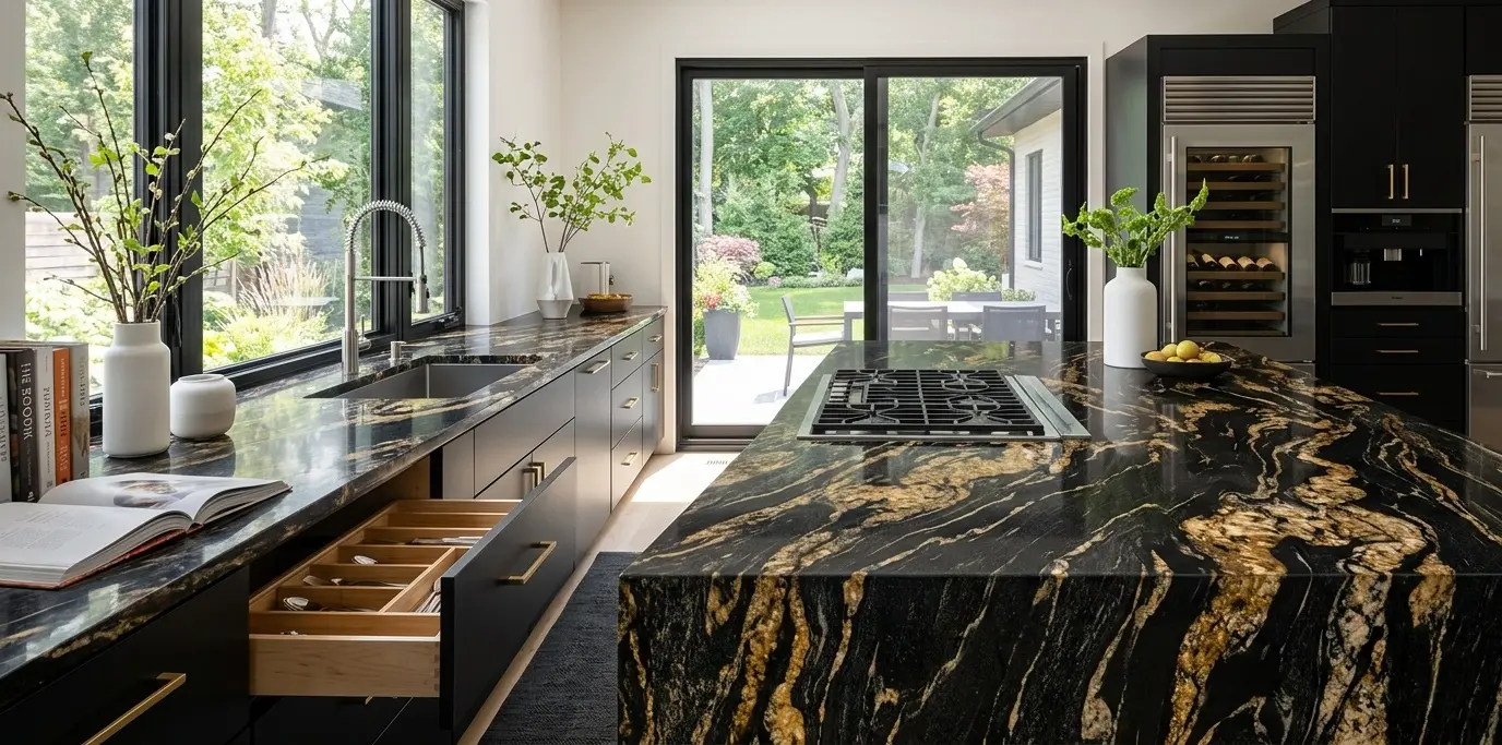
Consider the View Outside Your Windows
Many Nevada City properties sit among tall pines, cedars, and granite outcroppings, and quite a few have a seasonal view that shifts from green summer foliage to a dusting of winter snow. That backdrop is worth factoring into a stone decision, since a kitchen or bathroom with a large window often reads as an extension of the landscape outside it.
Warm, earthy stone tones with beige, gold, or soft brown undertones tend to echo the surrounding forest and granite in a way that feels grounded rather than jarring. Cooler grays and blues can still work, particularly in homes with more contemporary finishes, but they benefit from a bit more warmth introduced elsewhere in the room, whether through lighting, wood accents, or cabinetry.
If your home has a standout view, it can help to bring a photo of it when you visit us. Holding a slab up against a picture of the actual tree line or rock formation outside your window often clarifies which direction feels right far faster than picturing it in the abstract.
The time of year and time of day matter here too. A home with a heavily wooded, north-facing view tends to receive cooler, more diffused light throughout the day, while a home with more open exposure to the south or west often gets warmer, golden light in the late afternoon. Thinking about when you spend the most time in your kitchen, whether that's morning coffee or evening meals, can help point you toward a stone tone that will look its best during the hours you'll actually be looking at it.
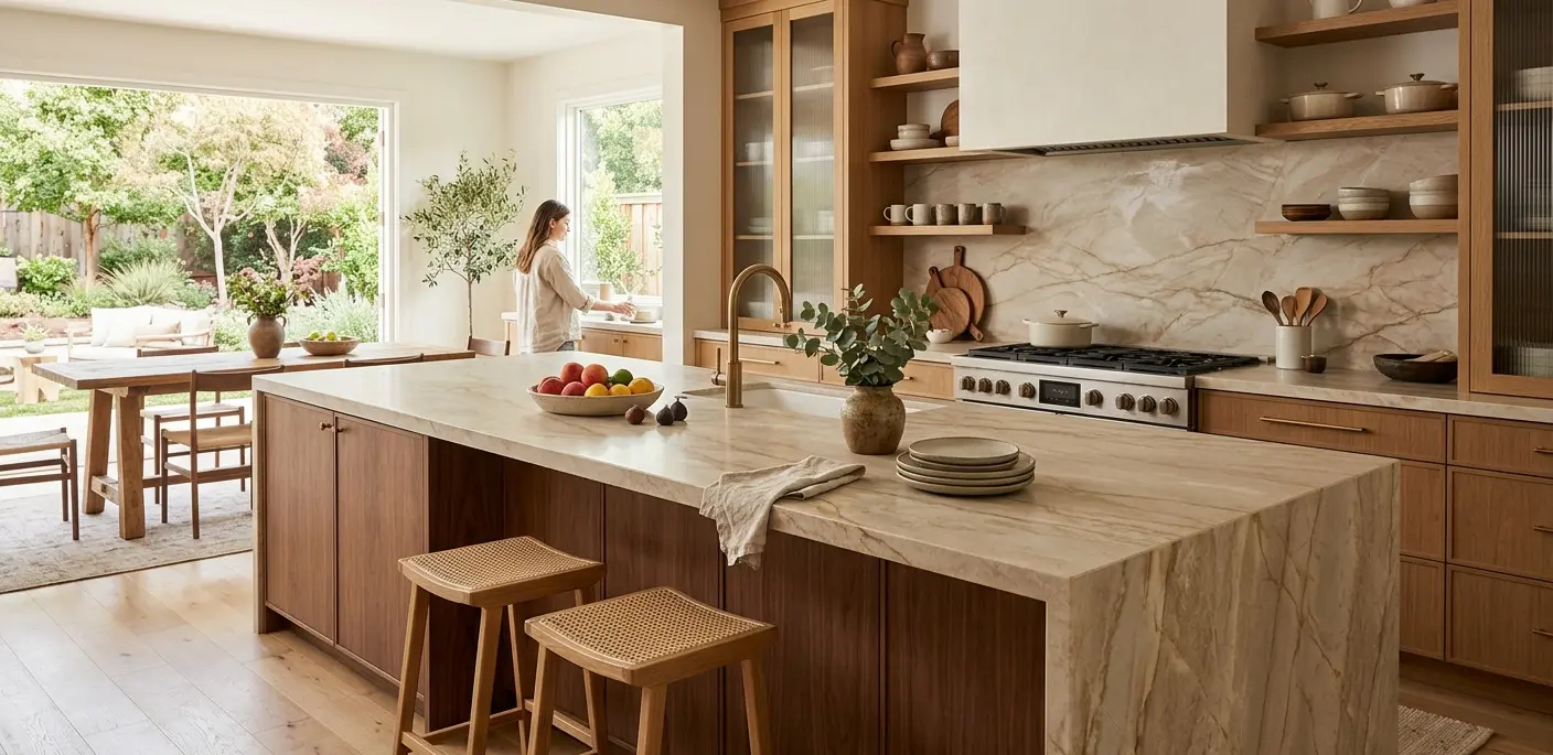
Warm Neutrals, Cool Grays, or Something Bolder
Once the fixed elements and the view are accounted for, the decision usually comes down to three broad directions.
Warm neutrals. Beige, tan, and soft brown stones with gold or copper veining are a common choice for mountain and foothill homes. They complement wood tones, stonework, and greenery without competing with any of it, and they tend to work well with changing decor over time.
Cool grays. Gray stones with white or silver veining bring a cleaner, more contemporary feel. These work particularly well in homes that have moved toward painted cabinetry or a more modern layout, and they can create a nice contrast against timber beams or exposed wood ceilings when the rest of the palette leans warm.
Bold or dramatic stones. Some homeowners want a slab with strong veining or a distinctive color as a focal point, often on an island or a feature wall. This works well when the surrounding cabinetry and flooring are kept simple, letting the stone carry the visual interest in the room.
There is no single right answer among these three directions. What matters is picking the one that fits your existing finishes and how you actually use the space day to day. A busy family kitchen that sees a lot of daily wear might lean toward a warm neutral with layered veining that hides everyday marks, while a primary bathroom or a less frequently used wet bar might be a better place to take a chance on a bolder color, since it carries less of the daily visual load that a main kitchen does. Since inventory changes as slabs come in and sell, it's worth checking our live slab inventory before your visit to get a sense of what's currently available in each of these color families.
It also helps to think beyond the countertop itself. If you're considering a matching or complementary stone for a backsplash, shower surround, or accent wall elsewhere in the home, deciding on a general color direction early on makes it easier to keep those secondary choices cohesive rather than picking each one in isolation.
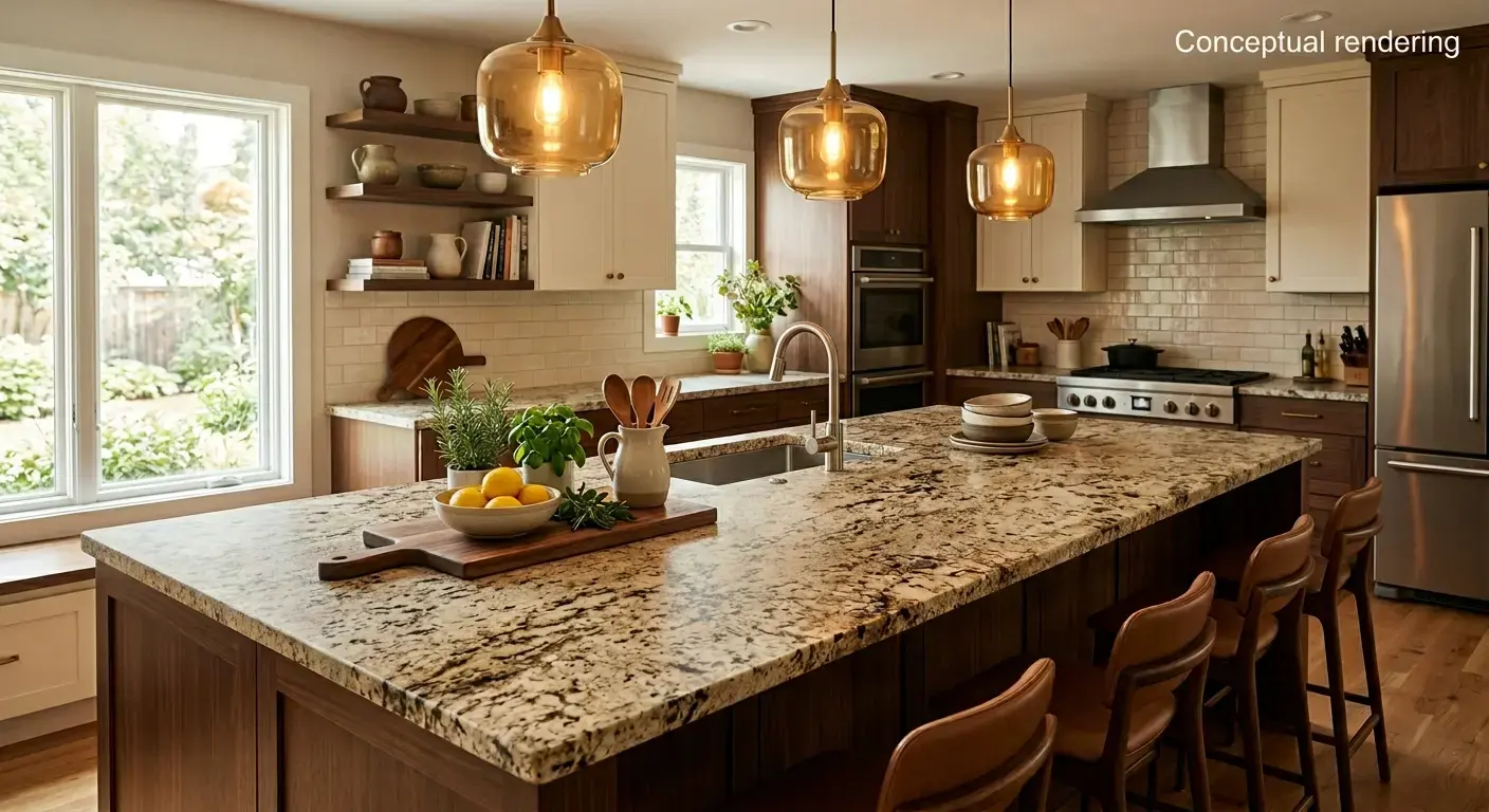
Pay Attention to Lighting
Stone color reads differently under different light, and this is especially true in Nevada City, where many homes get strong, direct daylight through large windows framed by surrounding trees. A slab that looks neutral under one type of lighting can shift noticeably warmer or cooler once it's under your own kitchen lighting, whether that's daylight, recessed LED fixtures, or warm pendant lights over an island. This isn't unique to mountain homes; as This Old House explains in its guide to stone countertops, lighting conditions can dramatically change how a stone's color and pattern appear from room to room.
Because of this, we recommend viewing any slab you're considering under a few different lighting conditions before finalizing a decision. If possible, ask to view a slab near a window in our showroom during the day, and again under overhead lighting, to get a fuller sense of how the color will behave once it's installed in your home.
The type of lighting in your kitchen matters too. Warmer light bulbs tend to bring out gold and amber tones in a stone slab, while cooler, brighter light can make the same slab look more neutral. If you already have a sense of how your kitchen is lit, or plan to update your lighting as part of the project, it's worth mentioning when you visit, since it can shift which slabs will look the way you expect once installed.
Study Slab Colors in Person at Our Showroom
Stone color is difficult to judge from a small chip or a photo online. Slabs vary piece to piece, and the only reliable way to evaluate a color and veining pattern is to see the full slab in person at our showroom.
We'd encourage you to bring in photos of your cabinetry, flooring, and any inspiration images you've collected, along with a sample of your cabinet finish if you have one on hand. Holding those references up against an actual slab, under real lighting, tends to make the decision far clearer than working from memory or a phone screen alone.
It's also worth taking a slower approach than you might expect. Rather than picking the first slab that catches your eye, spend some time walking through a handful of options in the color family you're leaning toward. Since natural stone varies from slab to slab, seeing a few side by side in the same general tone can help you notice subtle differences in veining density, background color, and movement that might not show up in a single slab. Fine Homebuilding's guide to natural stone countertops touches on why this variation happens, since every slab is cut from a unique piece of quarried stone. Once you've found a slab you're drawn to, we can help you request a quote on that specific slab so you have pricing in hand while you finalize your decision.
Conclusion
Picking a stone color is easier with some guidance, especially when you're trying to account for a home's architecture, its cabinetry, and a mountain or forest view all at once. Our team at the Sacramento showroom walks Nevada City homeowners through slab options in person, comparing tones and veining against the fixed elements already in a home, and offering a second perspective on which direction tends to fit best over time. Designers and contractors working on a Nevada City project are also welcome to apply for a trade account for access to pricing and support on larger jobs.
If you're in the early stages of narrowing down a stone color for your home, stop by our showroom at 6100 Warehouse Way in Sacramento, or give us a call at (916) 913-6682, and we'll help you work through the options in person. You can also book a design consultation ahead of time to make sure someone is ready to walk through slab options with you when you arrive. We're glad to spend time comparing slabs against your cabinetry, flooring, or a photo of your view so you can make a confident choice before committing to one.
Note: Some images on this page may be conceptual renderings created to illustrate design possibilities and may not depict actual installations.
Frequently Asked Questions
Bring a cabinet door sample, a paint chip, or clear photos taken in natural light when you visit. Viewing a slab next to your actual cabinet finish, rather than relying on memory, is the most reliable way to judge whether the tones work together.
They don't need to match exactly, but they should coordinate. A common approach is picking one dominant tone, warm or cool, and carrying it through both surfaces, while letting one of them serve as the more neutral base.
Warm neutrals tend to complement the wood tones, forest views, and granite outcroppings common around Nevada City, though cool grays can work well in homes with more contemporary cabinetry or finishes.
Yes. Stone slabs are best evaluated in person at our showroom, where you can view the full slab, including its natural variation and veining, rather than judging from a photo alone.
Lighting has a strong effect on how stone color reads. A slab viewed under showroom lighting can appear warmer or cooler once it's under your home's natural or overhead lighting, which is why we recommend viewing a slab under a few different light sources before deciding.