Coordinating countertops and flooring means choosing two surfaces that share a deliberate visual relationship through undertone, finish, texture, or intentional contrast, so the finished space reads as planned rather than assembled piece by piece. In Reno homes, where open-plan layouts mean a kitchen countertop and a living room floor share the same field of view, and where the regional design sensibility favors natural, earth-toned materials drawn from the High Sierra landscape, getting this pairing right has a visible effect on how a renovation feels overall.
The core decisions involved are: aligning undertones so warm and cool surfaces do not work against each other, establishing a hierarchy so one surface leads and the other supports, choosing finishes that create depth rather than monotony, and selecting material combinations that hold up in Northern Nevada's light conditions and housing contexts, from newer open-plan builds to mid-century ranch houses in Old Southwest and Old Northwest Reno where original hardwood floors and fixed cabinetry are already part of the equation.
Why Surface Coordination Matters in Reno Home Design
Understanding those decisions starts with understanding the homes they happen in. Reno's residential market has shifted considerably over the past decade. A large share of incoming residents relocated from California, bringing design expectations shaped by high-end Bay Area and Sacramento remodels. The dominant local aesthetic tends toward what designers loosely call a High Sierra style: natural materials, warm neutrals, stone and wood combinations that echo the landscape. Many of the homes where this plays out are stucco and stone builds from the 2000s through 2010s, with vaulted great rooms and open-plan kitchen and living areas where countertops and floors are visible from the same vantage point.
In open-plan homes like those in Damonte Ranch, Double Diamond, and Somersett, countertops and flooring become neighbors on the same visual plane. Choosing them in isolation is one of the most common reasons a finished renovation feels slightly off even when the individual materials are high quality.
Not every Reno home fits that profile, though. Old Southwest Reno and Old Northwest Reno represent a distinct segment of the market: established neighborhoods with homes ranging from 1920s Craftsman bungalows to mid-century ranch houses from the 1950s and 1960s. These homes have lower ceilings, wood trim, closed-off room configurations, and in many cases original hardwood floors under decades of carpet. For owners of these homes, the question is not how to create visual flow across a vaulted great room but how to introduce new materials that work with what is already there: existing trim color, original door hardware, the warm honey tone of 1950s oak uncovered after the carpet comes up.
Start with Undertone, Not Color
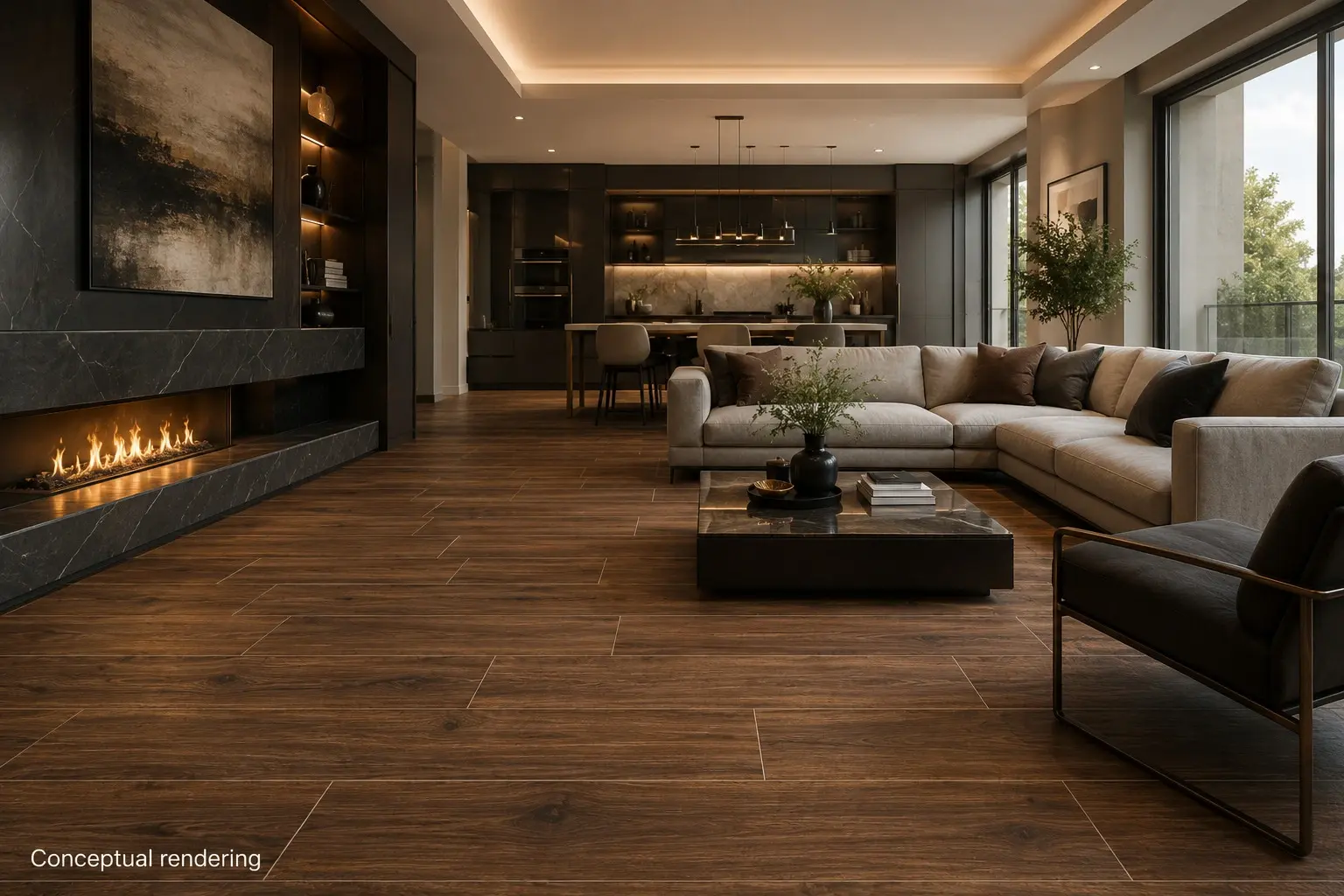
Whether the home is a 2010s open-plan build or a 1960s ranch, the same principle applies first: undertone alignment. An undertone is the subtle secondary hue beneath a surface's dominant color. A white quartz countertop might read as clean and neutral on its own, yet carry a cool gray undertone that clashes visibly against flooring with warm beige or amber tones. A warm-toned quartzite with cream and caramel movement pairs naturally with honey-toned hardwood because they belong to the same tonal family.
Warm undertones (yellows, reds, ambers, and browns) appear in many granites and quartzites, honey-toned hardwood, beige tile, and warm oak or walnut LVP. Cool undertones (grays, blues, and greens) appear in marble-look quartz, cool-toned porcelain, slate-look laminates, and light hardwood with an ashy finish.
The rule is not that everything must match. It is that undertones within the same space should stay consistent. Where pairings fall apart is when warm and cool tones are mixed without intention: a yellowish-beige floor tile against an icy white countertop creates a subtle discord that reads as carelessness even to people who cannot name why the room feels wrong.
In Reno specifically, the High Sierra design sensibility tends toward warm undertones: creamy natural stones, warm-toned hardwood, earthy tile. The landscape that surrounds the Truckee Meadows runs from desert sage and volcanic hills to the east to granite peaks and pine forest to the west, and warm, earthy interior tones tend to feel at home against that backdrop.
The Hierarchy Principle: One Surface Leads, One Supports
A practical decision-making framework for pairing countertops and flooring is to establish hierarchy: one surface is the focal point, and the other plays a supporting role. Trying to give both surfaces equal visual weight typically results in a busy, unresolved look.
When the countertop leads with prominent veining, movement, or a distinctive color, the floor should be calm. A large-format porcelain tile in a single tone or a wide-plank hardwood in a consistent grain anchors the room without competing.
When the floor leads with pattern or strong variation, the countertop should step back. A honed quartz in soft white or warm gray, a lightly veined quartzite, or a smooth granite in a single dominant tone all read as supports.
In open-plan Reno homes, the hierarchy question extends across rooms. If a kitchen countertop is visible from a living area with hardwood floors, the visual weight of both needs to resolve across that shared view. What looks balanced in isolation can read very differently when seen across a room.
How Finish Affects Coordination
Color and tone are the most visible coordination factors, but finish has a significant effect on how surfaces relate to each other. Countertop options include polished, honed, and leathered for natural stone, and polished or honed for quartz. Flooring finishes range from high-gloss and smooth to matte, wire-brushed, and hand-scraped.
A polished countertop paired with smooth tile flooring reads as sleek and modern but can feel clinical without warm accent materials. Paired instead with a matte or wire-brushed hardwood floor, the contrast between polished stone and textured wood creates dimension that most homeowners find more livable.
A leathered or honed stone countertop has a softer, less reflective presence and pairs naturally with matte tile, hand-scraped hardwood, or brushed LVP. This finish combination suits the earthy, mountain-influenced aesthetic common in Reno hillside communities.
The broader principle is that mixing finishes adds depth. Smooth against textured, polished against matte: these contrasts create visual interest without requiring a high-movement pattern.
Material Combinations That Work Well in Reno Homes
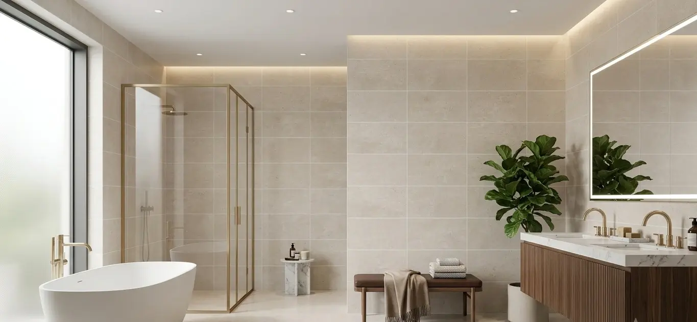
These reflect common pairings that perform well in Northern Nevada's light conditions and design sensibility.
Warm quartzite slab with wide-plank hardwood. Quartzite's natural veining and variation pair well with solid or engineered hardwood in a warm oak or walnut tone. Both draw from the same natural material family: textured, warm, and non-uniform. The combination is well-suited to mountain-influenced interiors common in Northwest Reno neighborhoods. You can view available quartzite and natural stone slabs in Nova Tile and Stone's live slab inventory.
White or light gray quartz with large-format porcelain tile. A clean quartz countertop with minimal veining pairs naturally with a large-format porcelain tile in warm gray, soft white, or stone look. This suits open-plan kitchens where a quieter palette is the goal. The key constraint is undertone: both surfaces should lean the same direction, either cool or warm.
Natural stone slab with LVP in a wood look. For homeowners who want wood warmth with better moisture performance, a quality LVP in warm oak or walnut can coordinate well with a natural stone countertop. Both belong to the same earthy, natural-material family, and the pairing works well in kitchens that open to living areas.
Granite with tile flooring in a pulled accent color. Granite slabs contain a dominant background tone, a secondary mineral pattern, and flecks of a third color. Choose a floor tile that picks up one of the minor colors rather than matching the dominant tone. A granite with cream background and rust-brown movement pairs well with a warm gray tile.
Refinished original hardwood with an updated countertop. In older Reno homes where original hardwood has been uncovered, the floor is already decided. Warm honey-toned oak, common in mid-century ranch houses in Old Southwest and Old Northwest Reno, pairs well with a natural stone countertop in cream or warm gray, or a quartz with soft warm movement.
Coordinating Surfaces Across an Open-Plan Home
Choosing individual pairings well is one part of the problem. The harder challenge is making those pairings work together across an entire home. The hierarchy principle works within a single room. The harder problem in many Reno homes is that the surfaces needing coordination span multiple rooms: kitchen, living area, hallway, bedrooms, and bath. Making those decisions one room at a time is how combinations end up feeling inconsistent even when each room looks fine on its own.
The solution is to choose one material early and treat it as the fixed reference point. In most open-plan Reno homes, that anchor is either the main living area floor or the kitchen countertop slab, whichever is most prominent and least likely to change.
Flooring continuity is the most powerful tool for visual cohesion. Running the same floor material from the kitchen through the living area rather than switching at every threshold makes the space read as unified. When a change is necessary, keeping the transition low-contrast in both tone and finish prevents the space from feeling pieced together.
Practical Steps Before Committing to a Pairing
A few concrete habits make the coordination process more reliable:
Identify undertone before anything else. Hold your sample against a pure white surface and look at what color leans out of it. Any surface you pair with it should share that lean, whether warm or cool.
Test under your actual light. Reno's high-elevation sunlight is intense and directional. A material that reads warm in a showroom may look cooler under bright midday light through a south-facing window. Evaluate samples in the room where they will be installed, at different times of day.
Consider the room's other fixed elements. Cabinet color, wall tone, trim, and hardware all influence how a pairing reads. Bring samples of those elements into the evaluation before committing.
Evaluate at the scale it will be seen. A small sample looks different from the same material installed across 200 square feet. Where possible, view installed examples in a showroom display.

Conclusion
Together, undertone alignment, surface hierarchy, finish contrast, and material pairings suited to how Reno homes actually look and live give you a decision-making structure that works before every sample is in hand. Whether the starting point is a new open-plan kitchen in South Reno or a mid-century ranch in Old Southwest where the original oak floors just came out from under the carpet, the logic is the same: identify what is fixed, establish which surface leads, and build the palette around those two decisions.
Nova Tile and Stone's Reno showroom carries natural stone slabs, quartz, sintered stone, porcelain, tile, hardwood, LVP, laminate, and carpet. You are welcome to sit down with our team for a complimentary design consultation.
Nova Tile and Stone – Reno
12835 Old Virginia Road, Reno, NV 89521
(775) 331-6682
Monday through Friday, 7:30 am to 6:00 pm | Saturday, 9:00 am to 3:00 pm
We serve homeowners and trade professionals throughout Reno, Sparks, Spanish Springs, Washoe Valley, Verdi, Incline Village, and surrounding Washoe County communities.
Frequently Asked Questions
No. The goal is coordination through shared undertone, complementary finish, or intentional contrast, not an identical color.
Choosing surfaces independently rather than evaluating them together. A countertop and a floor tile selected at different times often clash in undertone or finish in ways that are hard to predict without seeing them side by side.
Choose one anchor material, typically the largest or most prominent surface, and evaluate everything else against it. Running the same flooring through connected open spaces is the most direct way to create visual continuity.
Yes. Natural stone with strong veining or color variation pairs best with calmer flooring that does not compete for attention. Solid or low-movement countertops allow more freedom to introduce pattern or texture on the floor.
Yes, for tile. Nova's $1 sample program lets you take tile samples home to evaluate them in your own space under your own lighting. For slabs and other materials, the showroom displays are available to view in person at the Reno location on Old Virginia Road during store hours.
Note: Some images on this page may be conceptual renderings created to illustrate design possibilities and may not depict actual installations.