A cohesive countertop, tile, and flooring design comes from matching undertone, balancing pattern scale, and coordinating finish across all three surfaces before any material is purchased.
- Undertone: Compare physical samples of the countertop, tile, and flooring side by side in the actual room's natural light, since warm undertones (beige, gold, taupe) and cool undertones (gray, blue-gray) rarely blend well when mixed.
- Pattern scale: Let one surface, typically the countertop or the tile, carry the primary visual movement while the remaining materials stay more restrained to avoid competing patterns.
- Finish: Coordinate polished, honed, matte, and glossy finishes intentionally, since combining several high-gloss surfaces in a small space can read as visually busy.
- Anchor material: Start with one material, most often a natural stone slab such as granite, marble, quartzite, dolomite, or travertine, and select tile and flooring to support it.
- Lighting: Sacramento's strong natural light can shift how undertones appear compared to showroom lighting, so samples should be checked in the room at different times of day.
Sacramento homeowners remodeling a kitchen or bathroom often approach countertops, tile, and flooring as three separate decisions made at different points in the project. The result is frequently a space where each material looks fine on its own but does not read as a unified design. This guide walks through how to think about countertops, tile, and flooring together, with attention to the design and climate considerations relevant to Sacramento homes. For homeowners who want to see the range of options before narrowing things down, browsing slabs, tile, and flooring in one place is a useful starting point.
Why Material Coordination Matters More Than Any Single Choice
A kitchen or bathroom typically combines at least three hard surfaces: the countertop, a tile application (backsplash, shower surround, or floor), and a flooring material. Each has its own color, pattern, and reflectivity. When chosen independently, without reference to one another, the room can end up visually fragmented, with competing undertones or clashing scales of pattern.
Coordinating these materials does not mean matching them exactly. A cohesive design usually relies on a shared undertone (warm or cool), a consistent value range (how light or dark each surface reads), and an intentional relationship between pattern scale, such as a bold-veined countertop paired with a quieter, more uniform tile and flooring.
Start With the Anchor Material
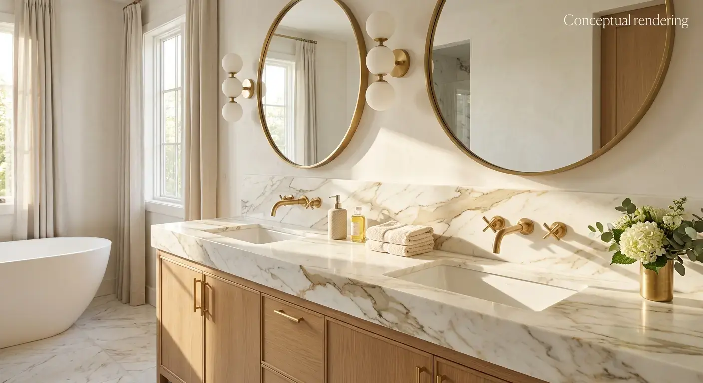
Most successful designs begin with one anchor material and build outward from it. In kitchens, this is often the countertop, since natural stone slabs like granite, marble, quartzite, dolomite, and travertine carry the most visual movement and widest range of undertones. In bathrooms, the anchor might instead be a feature tile, such as a patterned floor or an accent wall in the shower.
Once the anchor is selected, the remaining materials should support it rather than compete with it. If a countertop has strong veining and high contrast, tile and flooring choices generally read more cohesively when they are calmer and more restrained. If the countertop is more uniform in color and texture, there is more room to introduce pattern or contrast elsewhere, such as through a patterned tile floor or a textured backsplash. Viewing current slab inventory is a useful way to see the range of veining and color available before settling on an anchor material.
Matching Undertones Across Materials
Undertone is one of the most common places a design falls apart. Natural stone, porcelain tile, and hardwood or LVP flooring can each carry warm undertones (beige, gold, taupe) or cool undertones (gray, blue-gray, taupe-gray). Mixing warm and cool undertones across countertops, tile, and flooring in the same room is a frequent cause of a space feeling visually off, even when the individual materials are attractive.
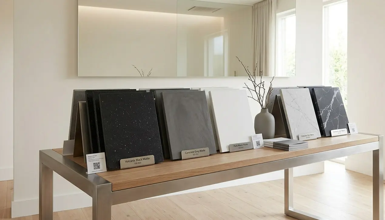
A practical way to check undertone compatibility is to view physical samples of the countertop, tile, and flooring together in the same lighting the space will actually receive, since Sacramento's strong natural light can shift how undertones read compared to a showroom environment. Comparing samples side by side, rather than relying on memory or photos, is the most reliable way to confirm materials share a consistent temperature. Our showroom, with roots going back to 2005, keeps a wide enough range of stone and tile on the floor to make this kind of comparison possible in one visit.
Coordinating Pattern and Movement
Natural stone slabs vary in the amount of visual movement they carry, from more subdued options like some dolomites to slabs with pronounced veining. Tile also spans a wide range, from small-format subway tile with minimal pattern to large-format tile designed to mimic natural stone movement, to patterned cement-look tile with strong graphic repeats. Browsing tile by pattern and format online before a showroom visit can help narrow down which level of visual movement fits a given room.
When combining these materials, it generally helps to let one surface carry the primary pattern interest. A heavily veined countertop paired with a heavily patterned tile floor can create visual competition, where the eye does not know where to rest. Pairing a high-movement countertop with a simpler tile format, or a bold patterned tile with a calmer, more monochromatic countertop, tends to create a more balanced result.
Flooring plays a supporting role in most kitchens and bathrooms. Hardwood and LVP flooring in a mid-tone, consistent grain pattern typically works as a neutral base, letting the countertop and tile carry more visual interest, though patterned tile flooring can also serve as the anchor in bathrooms or entryways.
Working With Finish and Reflectivity
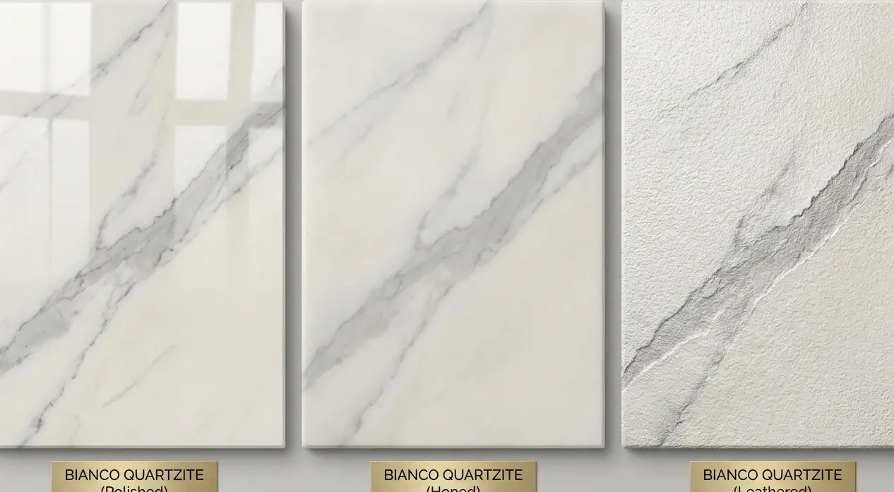
Finish is often overlooked in material coordination, but it has a significant effect on how a room reads overall. Polished stone countertops reflect light and read as more formal, while honed finishes are more matte and diffuse light more softly. Tile finishes range from glossy to matte to textured, and flooring can be similarly glossy or subdued.
Mixing high-gloss and matte finishes throughout a single room is not inherently a problem, but it tends to read more intentionally when the combination is planned rather than incidental. A polished countertop paired with a matte tile backsplash and a satin-finish floor can create a layered look with contrast between surfaces. Combining several high-gloss surfaces in a small space can sometimes read as visually busy, particularly under strong overhead lighting.
Designing for Sacramento's Light and Climate
Sacramento's climate and light conditions are worth factoring into material coordination beyond aesthetics alone. Interiors here often receive strong, direct natural light for much of the year, which can make cooler-toned materials appear more blue or gray than under showroom lighting, and can make warmer materials appear more golden or amber.
Bringing physical samples home and observing them at different times of day, particularly in the specific room where the materials will be installed, helps confirm that the coordinated palette will hold up under the home's actual lighting conditions rather than only under the lighting at a showroom. Our Sacramento showroom keeps enough stock on display that pulling several countertop, tile, and flooring samples together in one visit is usually possible.
A Practical Sequence for Choosing Materials Together
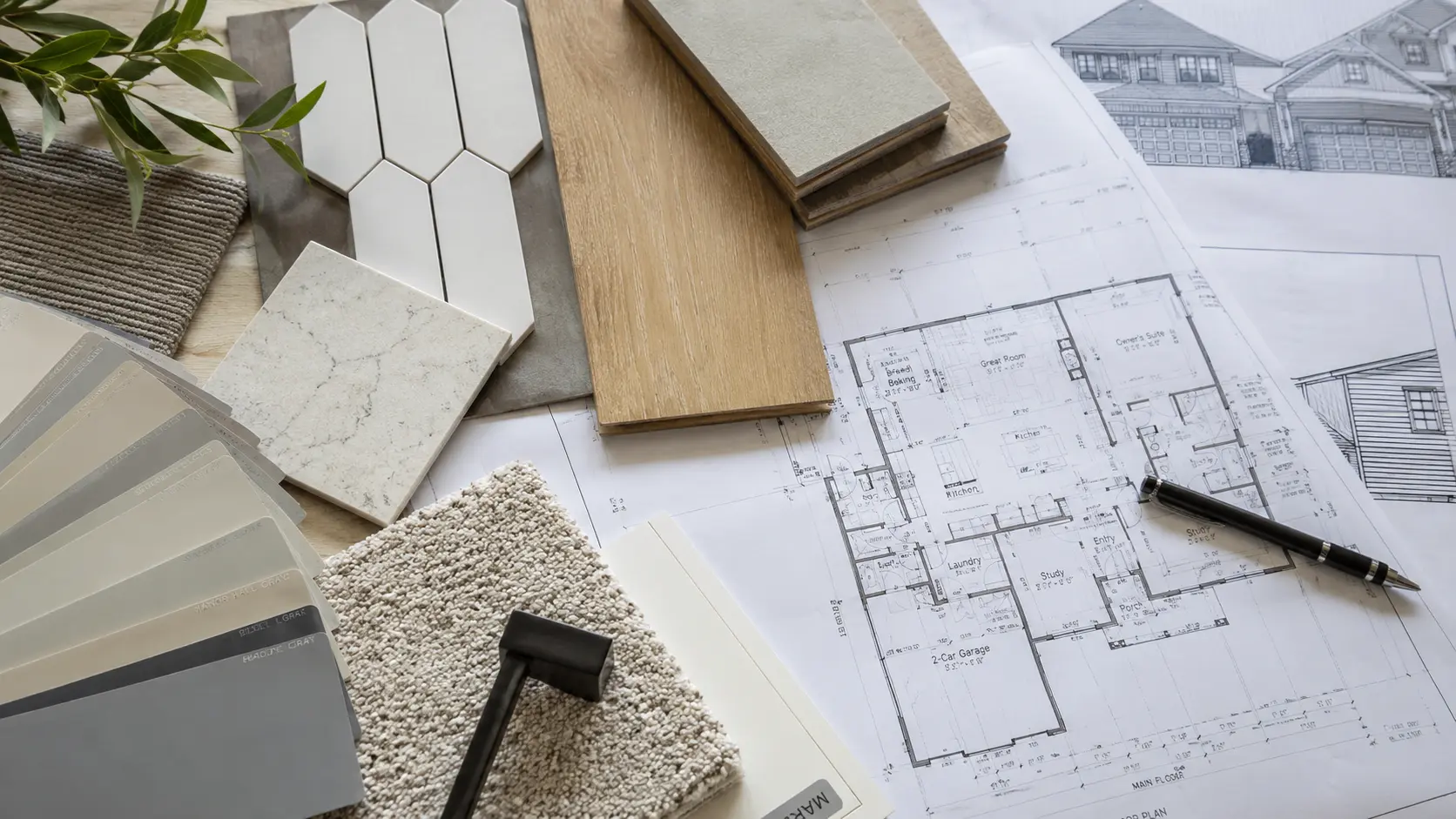
For homeowners planning a kitchen or bathroom remodel, a useful sequence is to select the anchor material first, pull physical samples of that material, and then bring those samples along when evaluating tile and flooring options rather than selecting each material in isolation. Viewing samples of countertop, tile, and flooring side by side, in the room's actual lighting, is the most direct way to confirm that undertone, pattern scale, and finish are working together rather than against one another. The same approach applies at our other Northern California and Northern Nevada locations, including Reno, Minden, and Fernley; finding the closest showroom is a reasonable first step before the sample-gathering stage.
For remodels involving multiple rooms, such as a kitchen and an adjoining living space, or a primary bathroom and an attached closet, it can also help to establish one flooring material that runs consistently between spaces, using countertop and tile choices to introduce variation from room to room within that shared base. For anyone who wants a second opinion partway through the process, reaching out to our design team directly is generally faster than working through every combination alone.
Common Coordination Mistakes to Avoid
A few recurring issues tend to disrupt an otherwise well-planned material palette. One is selecting tile and flooring from small digital images without placing them next to the actual countertop slab, since color and undertone rarely translate accurately from a screen. Another is choosing materials under showroom lighting that differs from the home, then being surprised when the combination looks different once installed.
A third issue is treating grout color as an afterthought. Grout occupies a meaningful visual area within a tile installation, and a grout color that clashes with the surrounding undertone can undercut an otherwise coordinated palette. Selecting grout alongside the tile, countertop, and flooring samples, rather than after installation, helps keep the material system aligned.
Finally, it is worth considering how transitions between rooms will look, particularly where flooring changes from one material to another. Planning these transition points during material selection, rather than after installation has begun, helps avoid awkward seams or abrupt changes in tone between adjoining spaces.
Conclusion
A cohesive kitchen or bathroom design comes from treating countertops, tile, and flooring as parts of a single connected system rather than as three unrelated purchases. Starting with an anchor material, matching undertones, balancing pattern scale, and paying attention to finish and Sacramento's natural light all help every surface support the others. Comparing physical samples together, in the actual space, remains the most reliable way to confirm a coordinated palette will look as intended once installed.
Frequently Asked Questions
Either can serve as the starting point, but most designs are more cohesive when one material is chosen first as an anchor and the remaining materials are selected to support it. Natural stone slabs are a common anchor choice in kitchens because of their range of undertone and pattern, while a feature tile often serves as the anchor in bathrooms.
The most reliable method is to compare physical samples of both materials side by side in the room where they will be installed, under the natural light that space receives throughout the day, rather than comparing them from memory or under showroom lighting alone.
It is possible, but pairing two high-pattern materials in the same room can create visual competition. A more balanced approach is to let one material, either the countertop or the tile, carry the primary pattern interest while the other surfaces stay more subdued.
Finish has a meaningful effect on how a room reads overall. Mixing polished, honed, matte, and glossy finishes across countertops, tile, and flooring is common, but it tends to read more deliberately when done intentionally rather than by default, since combining multiple high-gloss surfaces in a small space can read as visually busy.
Sacramento interiors often receive strong, direct natural light for much of the year, which can shift how undertones appear compared to showroom lighting. Cooler materials may read more blue or gray, and warmer materials may read more golden, so viewing samples in the actual room and at different times of day helps confirm the final look.