AT A GLANCE
- Material sets the tone. Natural stone like travertine, bluestone, limestone, and quartzite carries color variation from the stone itself, and textured concrete or porcelain pavers can achieve a similar look.
- Larger pavers, such as 24-by-24-inch or 24-by-36-inch units, create fewer joints and a calmer surface.
- Blended, earthy tones that pick up a color from your roof, siding, or trim look richer than flat, single-color pavers.
- Simple patterns like stack bond and running bond usually look more upscale than busy, intricate designs.
- A defined border, consistent joints, and clean edges are what make a patio look finished.
- Too many colors, undersized pavers, and no defined edge are the most common reasons a patio looks cheap.
IN THIS POST
- What Makes a Paver Patio Look Expensive?
- Does Paver Material Change How Upscale a Patio Looks?
- Which Paver Sizes and Shapes Look Most High-End?
- How Does Paver Color Affect the Look?
- Which Laying Patterns Look Most Upscale?
- Do Borders, Joints, and Finishing Details Matter?
- What Makes a Paver Patio Look Cheap?
- Conclusion
- Frequently Asked Questions
- Sources
A paver patio looks expensive when it combines a material that suits the home’s architecture, large-format pavers with fewer joints, a blended natural color palette, a simple laying pattern, and a defined border with clean, consistent joints. Natural stone pavers such as travertine, bluestone, limestone, and quartzite tend to read as high-end because their color variation comes from the stone itself. Textured concrete and porcelain pavers can achieve a similar look when they are chosen with the same care.
Cost is not what separates an upscale patio from an ordinary one. Planning is. Patios that look custom use one main paver, one accent, a limited color range, and a scale that fits both the yard and the house. Patios that look cheap usually mix too many colors, use pavers that are too small for the space, or have no clear edge where the paving meets the lawn.
In this guide, we explain how material, paver size, color, pattern, and finishing details each contribute to a high-end patio, and what to avoid when planning your own.
What Makes a Paver Patio Look Expensive?
An expensive-looking patio feels intentional. Every element appears chosen for the space rather than picked at random, and the patio looks like it belongs to the house instead of being added later.
When we look at high-end outdoor spaces, the same qualities show up again and again:
- Restraint. One main paver, one accent, and a limited color range.
- Proportion. Paver size and patio size suit the scale of the home and yard.
- Texture. Surfaces with natural variation catch light and add depth.
- Clean lines. Straight, even joints and crisp edges where the patio meets lawn or planting beds.
- Connection. Colors and materials that echo the home’s exterior, from the roof to the trim.
None of these require the most expensive product on the market. They require a plan. If you are working with a tighter budget, our overstock sale is worth checking for discounted materials before you settle on a final choice. The sections below show how each choice contributes to the finished look.
Does Paver Material Change How Upscale a Patio Looks?
Yes. Material is the first thing people notice, even if they cannot name it. The surface texture, color depth, and natural variation of a paver shape how the whole patio reads from across the yard.
Natural stone pavers such as travertine, bluestone, sandstone, limestone, and quartzite carry color variation that comes from the stone itself. That variation gives a patio depth that a single manufactured color rarely matches. Travertine has a warm tone and a gently textured surface that suits Mediterranean and transitional homes. Bluestone and limestone in a thermal or honed finish read as clean and tailored, which fits both traditional and modern architecture, while natural cleft bluestone has a more rustic character. Porosity varies from stone to stone, so in areas with freezing winters, ask whether a specific stone is suited to freeze-thaw conditions before choosing it.
Concrete pavers have improved a great deal. Many current lines offer textured faces, blended colors, and crisp edges that mimic cut stone. The key is choosing a product with surface texture and color variation rather than a flat, uniform face.
Porcelain pavers offer a refined, consistent look with very clean edges. They work especially well on modern patios and around pools, where a sleek surface supports the architecture. For outdoor use, choose porcelain pavers rated for exterior applications with a textured, slip-resistant finish.
Clay brick pavers look rich in the right setting. On a historic, colonial, or cottage-style home, brick can feel more fitting than stone.
The most upscale choice is the one that matches your home’s style. A sleek porcelain paver can look out of place next to a rustic farmhouse, while tumbled stone can feel busy beside a minimalist modern home. Because the right paver often depends on what surrounds it, it helps to browse our full range of tile, stone, and outdoor materials and think about the patio alongside the rest of your home.
Which Paver Sizes and Shapes Look Most High-End?
Larger pavers usually look more upscale because they create fewer joints and a calmer surface. A patio made of 24-by-24-inch or 24-by-36-inch units reads as open and uncluttered. The same space built with small 4-by-8-inch units has many more lines competing for attention.
That does not mean small pavers look cheap. Scale should match the space:
- Large patios and open yards handle large-format pavers well. Big units keep a wide surface from looking busy.
- Small patios and courtyards can still use larger pavers, which often make a tight space feel bigger. Very small units can work too when laid in a fine pattern.
- Paths and walkways often look best with long, linear pavers that draw the eye forward.
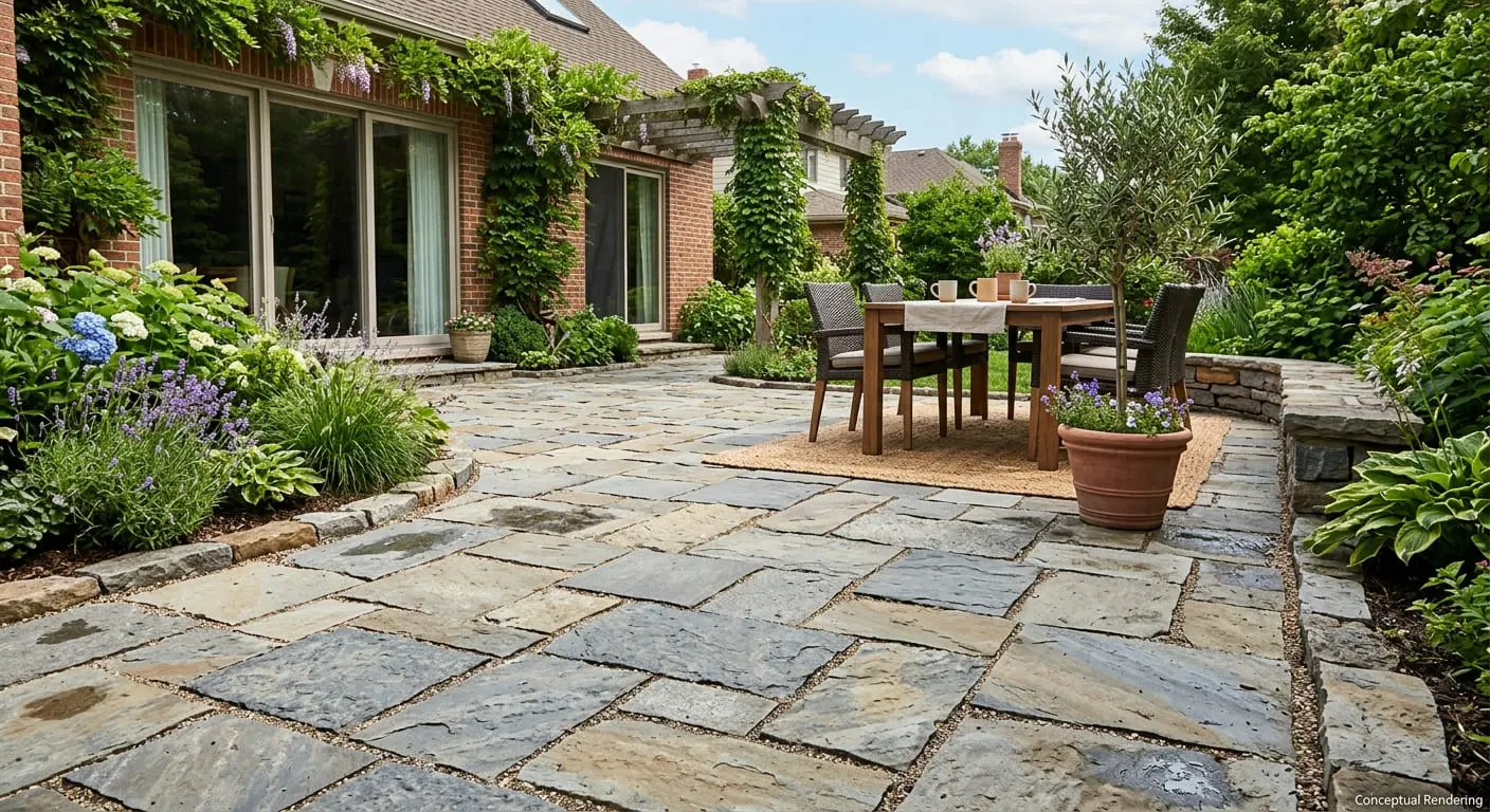
Shape matters as well. Rectangular and square pavers suit both modern and classic homes. Irregular flagstone creates a relaxed, garden-style feel. A mix of two or three sizes from the same product line, often sold as a modular or random pattern set, adds natural variation without looking chaotic.
A simple rule we share with homeowners: if you are unsure, go one size larger than your first instinct. A slightly larger paver usually looks more relaxed, while undersized ones can make a patio feel fussy. Scale is hard to judge from a photo, so seeing pavers in person at one of our local showrooms makes the decision much easier.
How Does Paver Color Affect the Look?
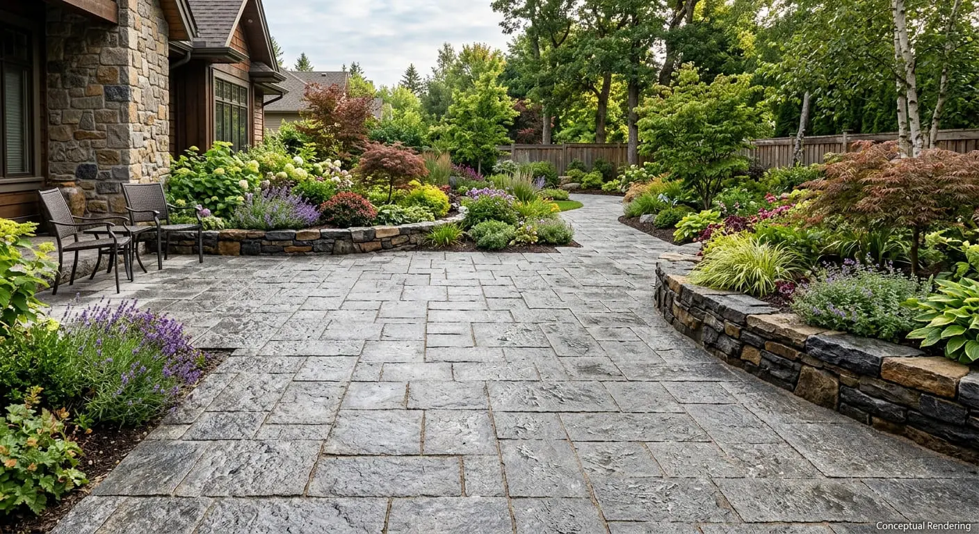
Color is where many patios either come together or fall apart. High-end outdoor spaces tend to use blended, earthy tones that look like they came from nature. Flat, single-color pavers in very bright or very saturated shades often look manufactured.
A few color principles go a long way:
- Choose blends over solids. A paver with subtle shifts in tone, such as warm grays with hints of tan, helps hide dirt and looks richer than one flat shade.
- Pull from the house. Look at your roof, siding, stone veneer, and trim. A paver that picks up one of those colors ties the patio to the home.
- Limit the palette. One main color family and one accent is usually enough. Three or four competing tones can make a patio look patched together.
- Think about light. Lighter pavers brighten shaded areas and stay cooler underfoot in summer sun. Darker pavers add contrast and depth but absorb more heat.
Warm neutrals like sand, ivory, and soft tan have a relaxed feel that suits many homes. Cooler tones like charcoal, slate gray, and blue-gray look crisp and tailored. Neither is more upscale on its own. What matters is choosing a tone that fits your exterior and sticking with it.
We always recommend viewing paver colors outdoors in natural light before deciding. Showroom lighting and photos online can shift a color noticeably. If you would like a second opinion on how a color will work with your home, you can book a free design consultation and bring photos of your exterior so we can compare options together.
Which Laying Patterns Look Most Upscale?
The most upscale pattern is usually the simplest one that suits your paver and your home. Complex patterns can look impressive in photos, but on a real patio they often compete with furniture, planting, and the house itself.
Here is how common patterns tend to read:
- Stack bond (grid). Pavers line up in straight rows in both directions. It looks clean and modern, especially with large square pavers.
- Running bond. Each row is offset from the one beside it, typically by half a paver, like brickwork. It feels classic and works with almost any home style.
- Random or modular patterns. Several paver sizes combine in either a set layout that repeats (modular) or a looser arrangement with no visible repeat (random). Both look natural and relaxed and suit stone pavers in particular.
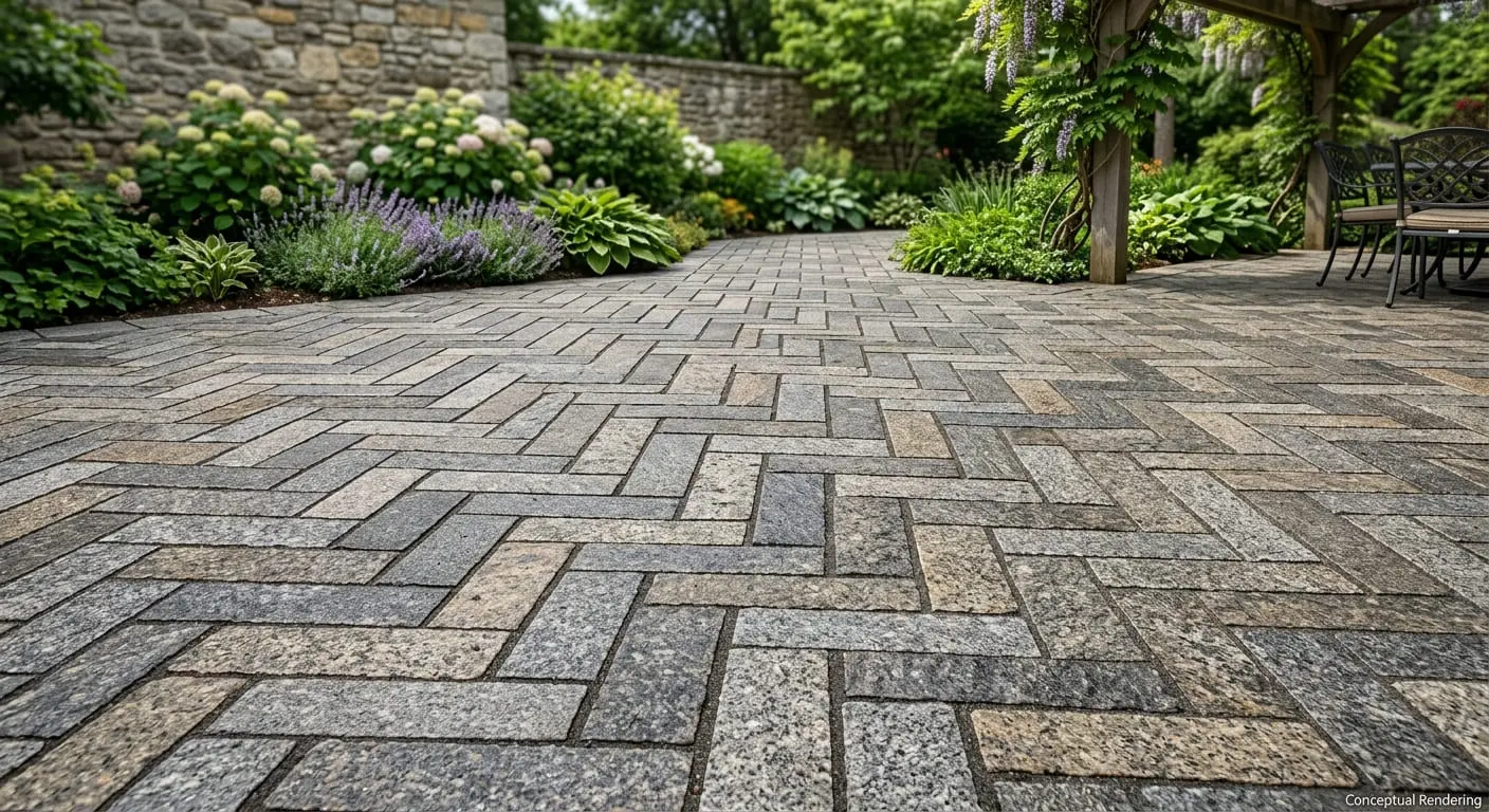
- Herringbone. Rectangular pavers set at right angles to each other in a zigzag, with the pattern laid at either 45 or 90 degrees to the patio edge. It works best with pavers about twice as long as they are wide, such as brick-sized units, and adds movement to a space.
Direction is a detail many people overlook. Running long pavers across a narrow patio can make it feel wider. Running them toward a view or focal point pulls the eye outward.
If your patio connects to an indoor room through a door or glass wall, consider aligning the paver lines with the interior flooring. That small step makes the indoor and outdoor spaces feel like one continuous area, a hallmark of custom design.
Do Borders, Joints, and Finishing Details Matter?
They matter a great deal. Finishing details are often what make a patio look professionally designed rather than simply paved.
Borders. A border is a row of pavers set around the edge of the patio, and it frames the space the way a rug border frames a room. The two most common styles are a soldier course, where rectangular pavers are set with their short ends facing the edge, and a sailor course, where pavers run lengthwise along the edge, though some suppliers use these terms differently. Borders often look best in a color one or two shades darker or lighter than the main field, or in a contrasting material such as brick around a stone field.
Joints. Narrow, consistent joints give a patio a tailored look. Uneven gaps or mismatched joint colors draw attention in the wrong way. Joint material that blends with the paver color keeps the surface calm, while a contrasting joint color highlights the pattern.
Transitions. Pay attention to where the patio meets the house, the lawn, steps, and planting beds. Clean, defined edges look intentional. Soft, crumbling, or uneven edges make even good pavers look unfinished.
Coordinated elements. Matching or complementary stone on steps, seat walls, pillars, and fire features ties the outdoor space together. Using the same material family across these elements creates a cohesive look without much extra effort.
Lighting. Low-voltage lighting along borders, steps, and walls makes a patio usable at night and shows off paver texture after dark. It is a relatively small addition that changes how the space feels.
What Makes a Paver Patio Look Cheap?
Knowing what to avoid is just as useful as knowing what to aim for. These are the patterns we see most often in patios that fall flat:
- Too many colors. Mixing several unrelated tones in one patio makes it look like leftovers were used.
- Pavers that are too small for the space. A large patio covered in small units can look busy and dated.
- No connection to the house. A paver color or style that clashes with the home’s exterior makes the patio look like an afterthought.
- A patio that is too small. If chairs and a table barely fit, the space feels cramped no matter how nice the material is. Plan the size around how you will use it.
- No defined edge. Without a border or clean transition, the patio can look unfinished where it meets lawn or soil.
- Overly busy patterns. Intricate designs and multiple pattern changes in a small area compete for attention.
- Ignoring the setting. Bright white pavers in a dusty yard or very dark pavers in full afternoon sun can create practical and visual problems.
Most of these issues come from choices made quickly or in isolation. Taking time to plan the patio as a whole, with the house and yard in mind, avoids nearly all of them. Landscape designers and contractors sourcing materials for client patios can apply for a trade account for trade pricing and job-site delivery.
Conclusion
An expensive-looking paver patio is less about spending more and more about choosing well. Pick a material that suits your home’s style, go generous on paver size, keep the color palette tight, and choose a pattern that supports the space instead of overpowering it. Then finish strong with a defined border, consistent joints, and clean transitions. Those decisions, made together, are what give a patio that polished, custom feel.
If you are planning a new patio and want to compare materials in person, our team is happy to help. Visit one of our showrooms in Sacramento, Reno, Minden, or Fernley, and we can talk through colors, sizes, and patterns that fit your home and the way you want to use your outdoor space.
Frequently Asked Questions
No single color looks the most expensive on every home. Blended, natural-looking tones such as warm grays, soft tans, and muted blue-grays tend to look richer than flat, single-color pavers. The best choice picks up a color from your roof, siding, or trim so the patio feels connected to the house.
Large pavers often look more upscale because they create fewer joints and a calmer surface. Small pavers can still look high-end in the right setting, such as brick in a herringbone pattern on a traditional home. Match the paver scale to the size of your patio and the style of your house.
Natural stone offers color variation and texture that come from the stone itself, which many homeowners find hard to match. Quality concrete pavers with textured faces and blended colors can also look refined. The right choice depends on your home’s style, your budget, and how you plan to use the space.
A stack bond, or grid pattern, with large square or rectangular pavers is one of the most popular modern choices. It creates clean, straight lines that suit contemporary architecture. A running bond with long, slim pavers is another common option for a modern patio.
Small updates can make a noticeable difference. Cleaning the surface, refreshing the joints, defining loose edges, and adding outdoor lighting all help. Adding a border, matching stone on nearby steps or walls, and coordinating furniture and planters with the paver color can also give an older patio a more finished look.
SOURCES
- Natural Stone Institute: Travertine, Limestone, and Dolomitic Limestone - https://www.naturalstoneinstitute.org/consumers/varieties/limestone/
- County Materials: Paver Pattern Guide for Patios, Pools, Driveways, and Walkways - https://www.countymaterials.com/news/paver-patterns/
- Why Tile (Tile Council of North America): ANSI A326.3 Product Use Classifications for Slip Resistance - https://whytile.com/2022/03/a-significant-step-forward-to-reduce-slip-and-fall-incidents/
- U.S. Environmental Protection Agency: Using Cool Pavements to Reduce Heat Islands - https://www.epa.gov/heatislands/using-cool-pavements-reduce-heat-islands