Three important qualities for landscaping are unity, balance, and proportion. These core landscape design principles determine whether a yard looks cohesive and finished. Unity connects every element into one design, balance distributes visual weight evenly, and proportion sizes plants, paving, and structures to fit the space and the people using it.
The same principles apply to every part of a yard, from planting beds to patios, walkways, and garden walls. The sections below explain how each quality works in practice, where function fits in, and how paving and stone choices affect the result.
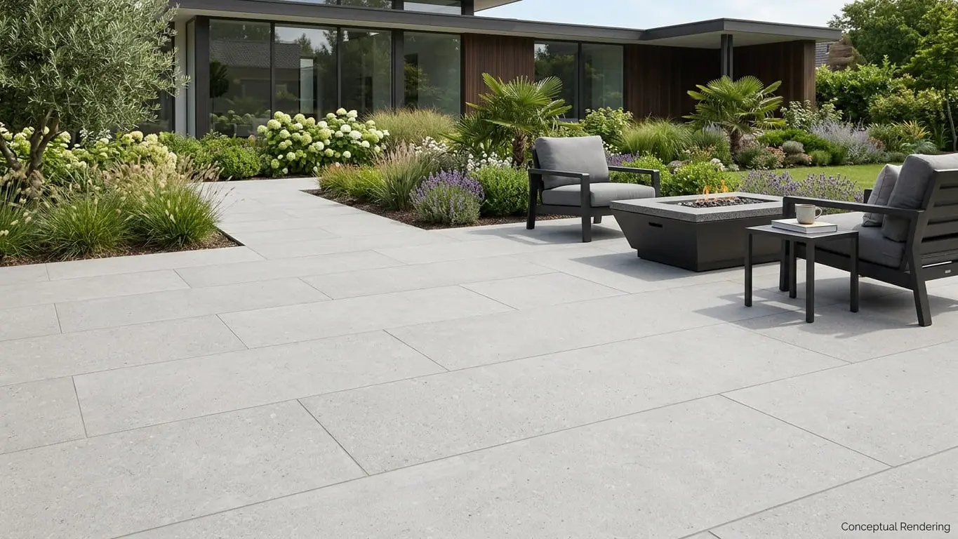
Unity: Making the Yard Feel Like One Design
A unified landscape reads as one connected composition rather than a series of separate projects. When unity is missing, a yard can feel like a patio from one decade, a retaining wall from another, and a walkway from a third, each chosen without reference to the others.
Repetition is the most reliable way to create unity. Repeating a color, a texture, a shape, or a material in several places gives the eye something familiar to follow. Design guidance also suggests that repeating some of a home's architectural details and materials in the landscape creates a more cohesive look. A brick house might pair well with brick edging, and a house with stone accents might call for a garden wall in a related stone.
Plants follow the same logic. Shrubs grouped in beds look more cohesive than single shrubs dotted across a lawn, because the group reads as one mass. Many designers plant in odd numbers, such as three, five, or seven, since small even-numbered groups can visually split into pairs, though even numbers still suit formal layouts.
Simplicity and Transitions
Two related ideas support unity:
- Simplicity: Overcomplicating a design is one of the most common ways to lose unity. Limiting the variety of colors, textures, forms, and construction materials, and staying within one style, keeps a yard from feeling cluttered. The goal is restraint rather than monotony.
- Transitions: When neighboring areas are similar in scale, changes work best when they happen gradually, such as plant heights stepping down from a small tree to shrubs to ground cover. Between very different spaces, such as a narrow side yard opening into a large back yard, a gate, arbor, or hedge can mark the change.
Unity doesn't require everything to match. A contrasting border around a field of pavers can still feel cohesive as long as the difference looks deliberate.
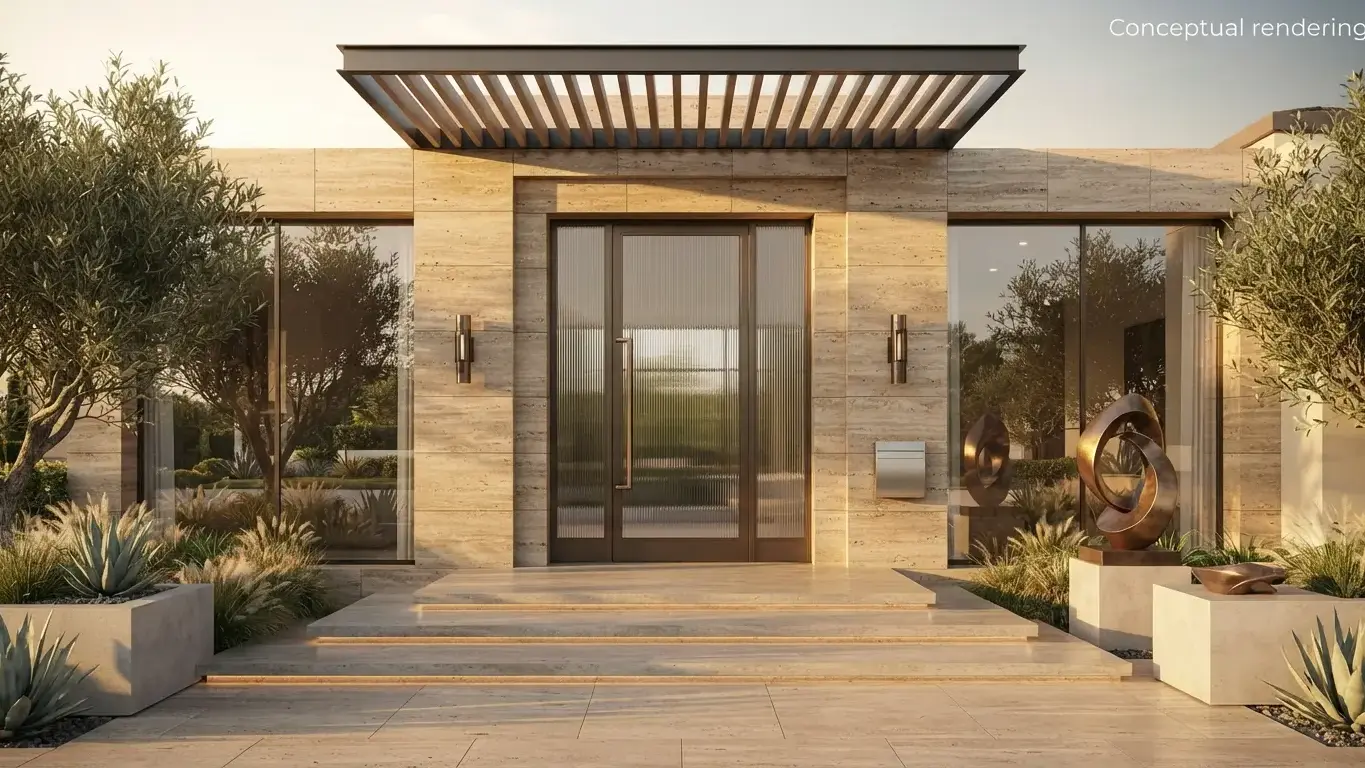
Balance: Spreading Visual Weight
Once the parts of a yard feel related, the next question is how they're arranged across the space. Balance comes from how visual weight, or mass, is distributed. When one side of a yard holds a large patio, a pergola, and a cluster of trees while the other side is open lawn, the space can feel lopsided even if each element is attractive.
Symmetrical balance uses mirror images. If you divide the space down the middle, both sides share the same shapes, forms, and plantings, such as twin planters at the front door. Symmetry feels formal and often suits houses with a centered entry and evenly spaced windows, but it can feel rigid and doesn't fit many landscapes.
Asymmetrical balance uses different elements with comparable overall weight. A single large tree on one side might be balanced by two or three smaller shrubs on the other. This approach feels more relaxed, but it takes more planning, because there's no formula for when unequal elements feel even.
How Color, Texture, and Focal Points Affect Balance
Hardscape and plants both carry visual weight, and a few characteristics change how much:
- Color: Bright colors tend to jump out at the viewer and draw attention, so a small, brightly colored feature can hold as much visual weight as a much larger, muted one.
- Texture: Coarse textures, such as large leaves, bold forms, or rough stone, carry more visual weight than fine ones. Designers generally use more fine texture than coarse, so the coarse elements stand out against a calmer background.
- Height: Walls, raised beds, and stacked stone add vertical mass that a flat surface does not.
Because pavers and stone often cover the largest surfaces in a yard, their color and texture can shift the balance of an entire layout. Nova Tile and Stone carries pavers and exterior stone for landscaping, so tones and textures can be compared side by side when deciding where heavier and lighter materials should go.
Focal points matter too. In a front yard, the entry is usually the main focal point, with plantings and paving guiding the eye toward the door. Crowding too many attention-grabbers, such as several specimen trees, statues, and bold accent plants, into one view tends to create visual confusion rather than interest.
Balance also has to hold up across seasons. Hardscape is the most permanent part of a landscape and stays visible all year, so a layout that feels balanced in summer may look uneven in winter once deciduous shrubs and perennials die back.
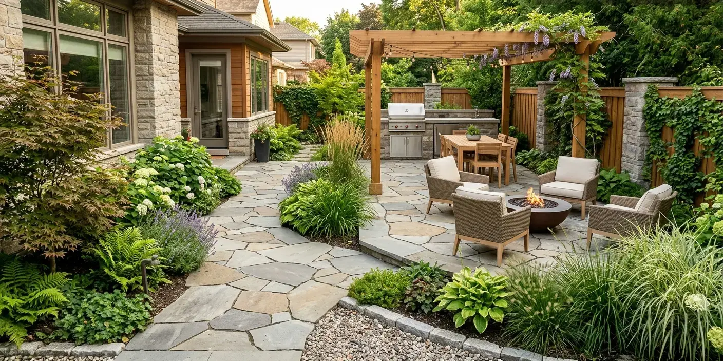
Proportion: Getting the Sizes Right
Proportion, often called scale, is the quality people notice without always being able to name. In landscape design, scale describes the size relationships among plants, structures, and open spaces, and the most important reference point is the human body. Steps are sized to a comfortable stride, and views are planned around eye level. A shrub that grows four feet tall and wide can be too large in front of low windows, yet that same shrub would look undersized beside a tall building.
One of the most common proportion problems comes from planting for today rather than for maturity. Placing plants too close together, only to have them outgrow the space within a few years, is a frequent landscaping mistake. Large shrubs placed right beside a front door can also hide the entry. Checking the mature height and spread of each plant before placing it avoids most of these issues.
Hardscape decisions involve proportion as well:
- Patio size: A patio should fit its intended use, such as a dining table with room to pull out chairs, without squeezing out planting areas.
- Path width: Main entry walks wide enough for two people to walk side by side tend to feel more welcoming, while secondary garden paths can be slimmer.
- Wall height: Garden walls and raised beds should relate to nearby windows, doors, and rooflines so they frame the house rather than hide it.
- Paver format: Large-format pavers have fewer joint lines breaking up the surface, which can give a patio a smoother, more open look. Smaller units offer more flexibility for curves and irregular shapes, and in a small, oddly shaped space, very large pavers can make the area feel tighter.
Where Function Fits In
Looks are only part of the picture. A well-designed yard also has to work for the people using it. A walkway that doesn't follow the route people actually take will be bypassed, and the worn trail across the lawn undercuts the design.
It helps to think of the yard as a set of outdoor rooms: a public front yard that leads guests to the door, a screened service area for bins or storage, and a private back yard for dining, play, or relaxing. Plants, fences, and paving can define where one room ends and the next begins. Paths can curve to add interest, but curves look most natural when something gives them a reason, such as a planting bed or tree.
Water matters too. Paved areas change how rain moves across a property, and permeable surfaces allow stormwater to soak into the soil instead of running off. Drainage is worth discussing with a qualified landscape professional before the layout is finalized.
How Paving and Stone Choices Affect the Result
Porcelain Pavers
Porcelain pavers come in many looks, including stone, wood, and concrete styles. That variety makes it easier to coordinate an outdoor surface with interior flooring or the materials on the house, which helps build unity between indoor and outdoor spaces.
Porcelain is defined by its density. According to the ANSI A137.1 standard, porcelain tile has a water absorption of 0.5% or less. Denser tiles tend to resist frost damage better, and many less dense ceramics may not achieve the same freeze-thaw and thermal shock performance outdoors. For areas that freeze in winter, check the manufacturer's spec sheet for freeze-thaw results under the ASTM C1026 test method. Those results, finish options, and exterior ratings can also be reviewed during a free design consultation at a Nova Tile and Stone showroom.
Natural Stone
Natural stone varies in color and pattern from piece to piece, which can soften a design and help hardscape sit comfortably among plants. Not every stone suits outdoor use. In Nova Tile and Stone's material specifications, granite, quartzite, and travertine are marked as suitable for outdoor applications, with granite and quartzite marked as UV resistant. Marble is not marked for outdoor use. For budget-conscious projects, our overstock sale lists close-out materials at reduced prices. Inventory changes, so it’s worth confirming that any discounted stone is suitable for outdoor use before buying.
Stone on Walls and Vertical Features
Vertical surfaces play a large role in both balance and proportion. Stone on a garden wall, an outdoor kitchen base, a fireplace, or the front of the house can repeat the colors and textures of the paving below, linking vertical and horizontal surfaces into one composition.
Conclusion
Unity, balance, and proportion are easiest to get right when they guide decisions from the start rather than being used to fix problems later. They also depend on each other. Adding a new material affects unity, placing a large feature shifts the balance, and resizing a patio changes how every nearby plant and wall relates to it. Considering all three together, with function in mind, leads to a yard that looks intentional and works well day to day.
Materials are worth seeing in person, ideally at full size and in daylight, since color, texture, and scale are hard to judge from a screen. Nova Tile and Stone offers free design consultations at its showrooms in Reno, Minden, Fernley, and Sacramento for anyone who wants to compare pavers and stone side by side.
Frequently Asked Questions
Unity, balance, and proportion work alongside several other principles. Simplicity and transition, covered in the unity section, are commonly included, along with emphasis, which covers focal points. Rhythm is the predictable repetition of elements that moves the eye through a space. Line and space are also frequently listed, covering how edges and paths guide movement and how open areas are shaped.
Straight lines tend to feel formal and direct, and designers often use them to extend or parallel the lines of the house and property. Curved lines feel softer and more natural, and loosely curved bed edges are also easier to mow around. Sharp, jagged lines can add excitement, but they can also be distracting if overused.
Open areas, such as a lawn or an uncluttered patio, give the eye a place to rest and help connect the surrounding plantings and structures. An open lawn bordered by taller plantings or walls can even act as the dominant feature of a space. Filling every area with plants or decor tends to make a yard feel crowded.
Yes, and they often matter more in a small space. Limiting the variety of materials, colors, and textures keeps a small yard from feeling cluttered, and keeping furniture and features in proportion helps it feel open.
Porcelain can't be reliably identified by eye. The only definitive way to confirm it is a laboratory test showing water absorption of 0.5% or less. A practical alternative is to look for the Porcelain Tile Certification Agency mark, which identifies products certified to meet the porcelain definition in the ANSI A137.1 standard.
Note: Some images on this page may be conceptual renderings created to illustrate design possibilities and may not depict actual installations.